Hi friends!
I hope you had a great Fourth of July!
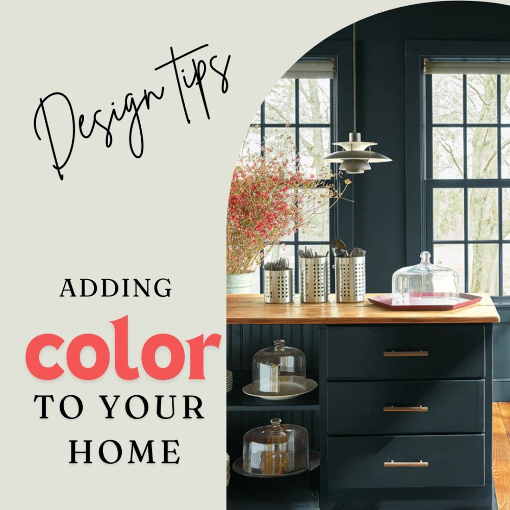
In today’s Tuesday’s Treasure, I want to help guide you through one of the biggest design trends we are seeing right now: Adding Color to your Home! Certainly, incorporating color into our homes is not a new idea, but embracing this idea can be overwhelming. First, let’s get one thing straight…I am not really an advocate for embracing a trend just because it is a trend! Trends should never define nor dictate who we are as people! But also please don’t mistake me, I am also not suggesting that trends are bad and you should avoid them. I see a lot of positives when we take time to evaluate trends. Trends can help shape new parts of ourselves and give us a push to think outside of our comfort zones. In a sense, trends can be viewed as opportunities to grow!
Okay, well now that I have waxed philosophic (I think that’s how the expression goes!), let’s get back down to it. Today, we’ll tackle incorporating color into your home! You may have seen on my social media channels (and perhaps others) that adding color to your home is currently on trend. Beyond shades of blue which delightfully have had staying power since the beginning of 2024, we are seeing this color trend is not limited to just one hue. From deep and moody earth tones to bright and bold greens and corals to calming and rich blues, the gambit is full! I also think that we will continue to see this trend stick around for a while, so go ahead- get bold and try out something new!
Here are some colors I would like to suggest:
You might not know, but my go to paint is Benjamin Moore. I love the quality of the paint but I also love the color options that have been added to their repertoire over the years-such longevity! Here are three options that hit three trends happening now:
- Benjamin Moore Regent Green for deep, monochromatic designs
- Benjamin Moore Blue Nova (actually the color of the year) in keeping with the blue palette popping up everywhere
- Benjamin Moore Dark Salmon to add bright coral tones for a 2024 beachy vibe


Here are some ways to incorporate this:
Painting Walls
Featured here is Benjamin Moore’s Regent Green. I think what works really well with this a deep, moody color is to go ahead and paint your trim the exact same color as the walls. Notice the richness and depth that is created with this!

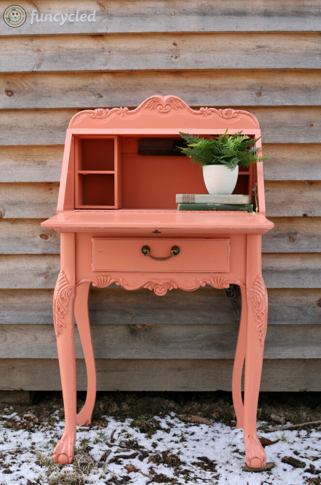
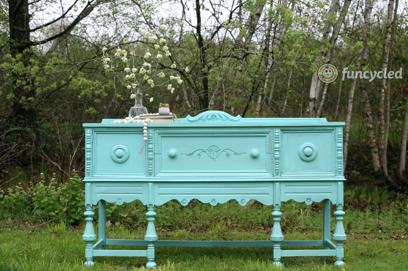
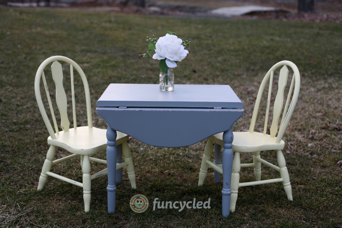
Painting Furniture
Furniture that is tired and already searching for a new lease on life is just asking to be painted! Why not consider selecting a bold color to add bright and maybe even surprising moments sure to bring a smile to your face every time you look at it! These are some of our past furniture flip projects and can be a source of inspiration to you!
Adding Pattern
One great way of adding color is by adding a colorful area rug to your room. Similar to adding or changing throw pillows, selecting a rug with a multicolor pattern keeps your design changeable. I have selected a couple for inspiration for you. Large geometric shapes in complementary colors will serve as a statement piece, so when making this type of choice for your room, make sure you the other patterns and colors you choose serve to complement the rug, not take away from it.
A second rug option for inspiration is this braided rug. What works well when adding color is that the background of the rug is actually just a neutral tone but it has bold colors woven throughout. Even though this rug has several colors represented here, the pattern is subtle and it will allow for other colors and patterns to take the focus if you decide you want to add even more color into your room!


Here is how I have incorporated color into my designs:
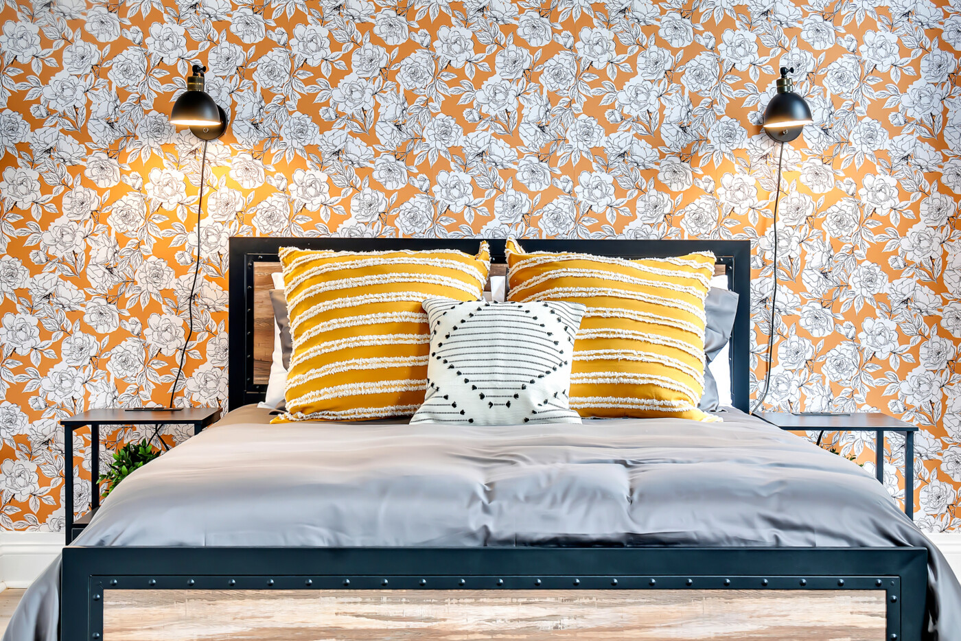
Mixing bold patterns that share a color palette.
In one of our Airbnb designs, we chose this gorgeous wallpaper as our feature and then selected subtle patterns to support and reinforce the statement of the room! If you want to see the whole story of this Airbnb transformation in downtown Schenectady, click here.
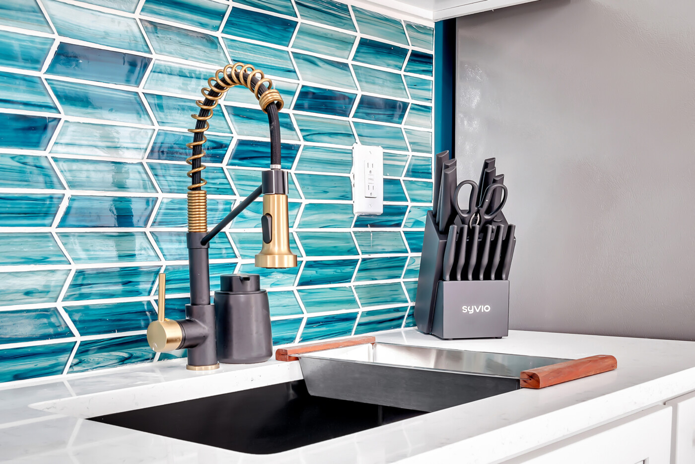
Adding rich tile for a kitchen backsplash.
In another Airbnb design, we selected turquoise blue as a theme color throughout the space. This photo features the geometric tile in a rich palette of turquoise and aquas to add depth and character to the kitchen area. I love how the pattern and color create the illusion of waves, making something so bold feel really organic! For the full transformation of this Schenectady, NY Airbnb, click here.
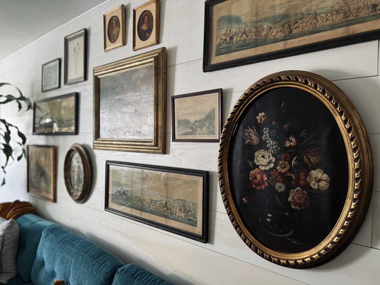
Swapping the white backdrop for my art gallery for a deep and moody wall painted black.
Ahh…I love this wall! It holds some of my most treasured vintage art which serves as the backdrop for our living room! Oh, and a bonus, here, I have my turquoise sectional–love it! But for now, I want to focus on the moody black wall. Although the white certainly works, making the change to black elevates the look and feel of this room! When given the chance to add a dark moody color into your home, I say go for it!

I hope that you have found some inspiration in how to add color into your home! If you take the time to really consider some of these suggestions, I think you will find a good jumping point! Of course, if you aren’t sure where to begin, I would love to help you!
If you would like me to help out with your next design project, check out more details about our Interior Design Services.
Thank you all for following along! If you’d like to get this blog in your email once a week, please sign up for our weekly newsletter by adding your email in the little box below my picture.
If you’ve enjoyed this post, please like FunCycled on Facebook, Instagram and Pinterest if you don’t already. Keep up to date on the newest finds, vote on colors and give your input on our creativity. We share fun tutorials, great before and after, and new design inspirations.
We offer interior design, kitchen cabinet painting, and custom built tables, barn doors, and repurposed furniture. Thank you, again, for working with us and for taking the time to spread the word about what we do.
Happy FunCycling Friends,
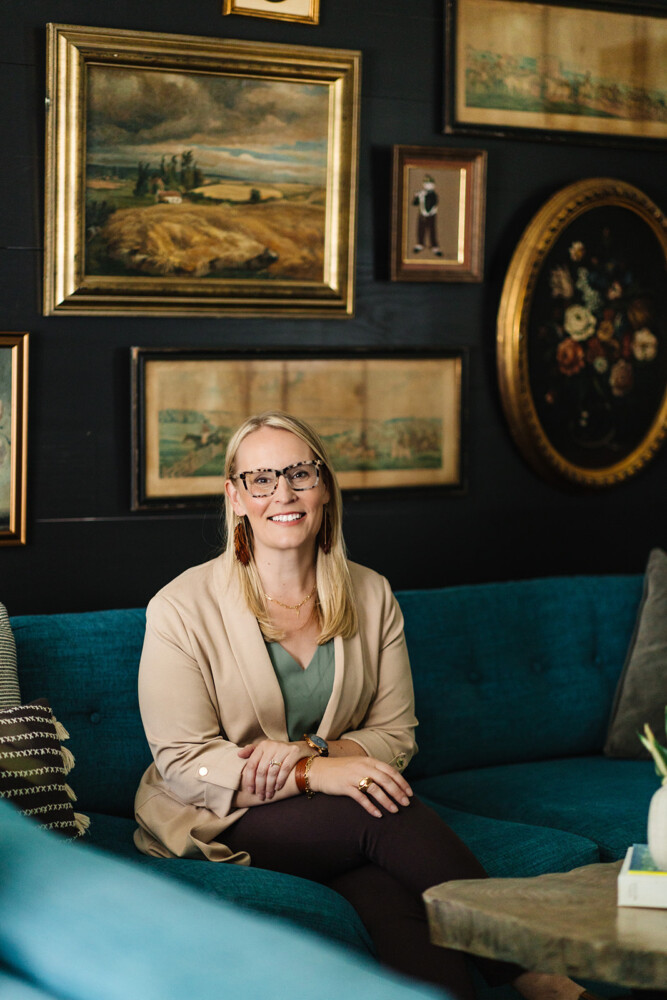
Sarah ;)