Hi friends!
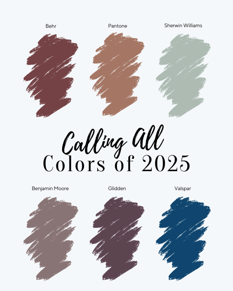
I am excited to share this post with you because it includes several of the top paint companies and the paint colors they have deems as “The Color of the Year for 2025!” Typically, these colors are determined each fall, beginning as early as September each year and emerge through December. Anticipating new colors and ideas gives a sort of energy to the design world, and for me and so many others, this energy drives us and helps us continue to grow as creative people!
In this post, I will be sharing the 2025 Colors of the Year as announced by five of the most influential paint companies (listed below) as well as the 2025 Color as deemed by Pantone (which for those who may not know, Pantone is a little different from paint companies. Pantone is a company that works to define a universal language and color system which informs and unites industries that use color.
Okay, so let’s jump in!!
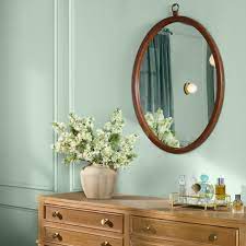
#1 Sherwin Williams: Quietude- HGSW6212
Description
Here is how Sherwin Williams describes this lovely hushed tone, “…Quietude, finds its power in its transcendent tranquility. A soft sage with a whisper of blue influence, Quietude is an emerging color for enduring design and soothes any space inside or out.”
FunCycled’s Picks for the Home
It may not surprise you, but this is a color that could easily be used pretty much anywhere in your home, and the outcome would be beautiful. But, we are encouraging you to be a little more considerate and intentional about where and how to play around with this color (even in its quietness!) Using it on walls in a bedroom or bathroom next to warm earth tones or as an accent color on a kitchen island in a warm white kitchen will add just the right amount of depth and character while maintaining a gentle elegance in your home.

#2 Benjamin Moore: Cinnamon Slate 2113-40
Description
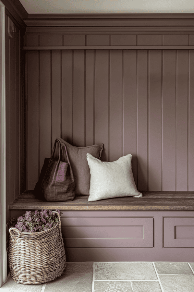
On paper this color may even sound too good to be true, but the reality is, the blending of plum and soft brown create a hue that is described as, “a nuanced color (that) brings a smooth familiarity to any design.”
FunCycled’s Picks for the Home
For some this color may feel too feminine and consequently too quickly peg its use only for a bedroom or bathroom for a woman. I challenge you to look beyond that. Because of the subtle chocolate undertones, cinnamon slate adds a touch of nostalgia and history into a design. In keeping with this feeling, we recommend using it on textured walls in any living area or surrounding a sitting nook or niche with bench seating.


#3 Behr: Rumors MQ1-15
Description
This deep red adds richness and warmth to a home. It can easily create drama or evoke a sense of luxury that will stand the test of time.
FunCycled’s Picks for the Home
No matter how you slice it, this red is timeless and elegant when painted on kitchen cabinets and paired with brass or gold hardware. We love how rich each of these kitchen designs are, all outfitted in a deep burgundy inspired by this lovely hue!


#4 Valspar: Epic Adventure/Blue Olympus/Encore
Description
This vivid blue is described as, ” an anchoring shade that embodies constancy and confidence to let you create a joyful respite from the ebbs and flows of life.” Don’t let any name confusion deter you from choosing this rich color for your next project. Depending on where you shop, you can make this selection for your home under one of these names: Epic Adventure, Blue Olympus or Encore.
FunCycled’s Picks for the Home
We love how this color quickly makes a statement in any space! Given its boldness, we recommend using it is smaller doses, especially if you have other colors within the home. A great way to do this is to paint a door or a piece of furniture.


#5 Glidden: Purple Basil #1046-7
Description
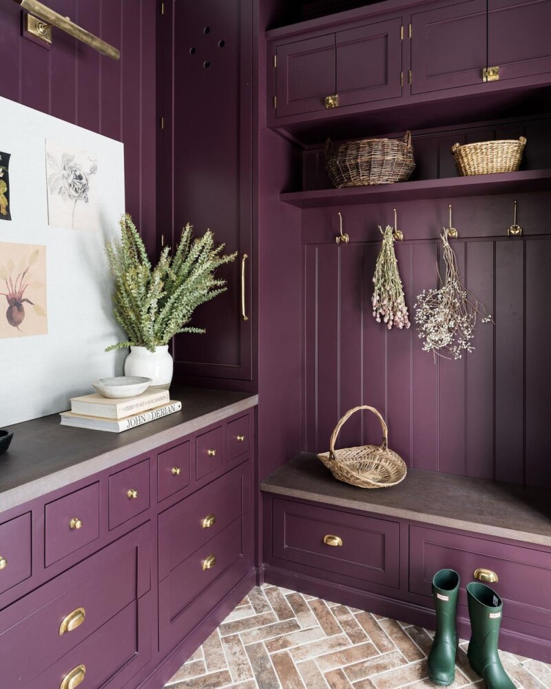
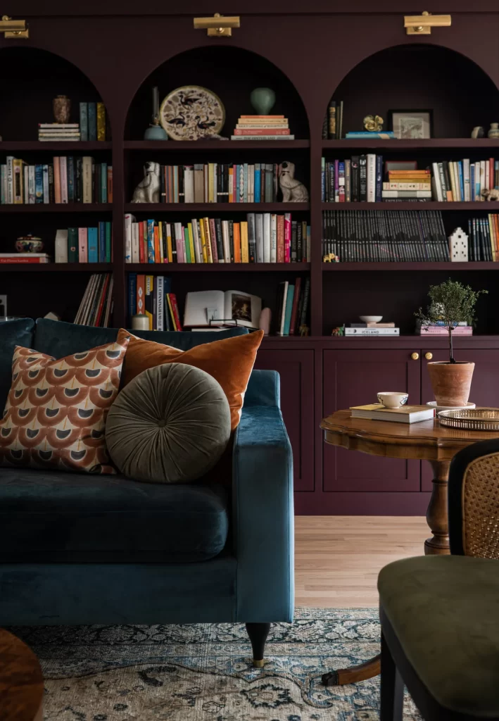
Purple has long been a color to represent status or wealth associated with royalty, and today’s modern take is no less rich. The makers of this color describe it best saying, “Purple Basil represents the appreciation for self-discovery and self-expression that has led to the rise of maximalism across industries, including design, fashion and consumer goods.” Well, maximalists, look out!
FunCycled’s Picks for the Home
In keeping with its purpose and close connetion with a maximalist approach, we recommend using purple basil to make a statement. Whether it is used to paint a mudroom or built in bookcases, this color should douse a whole space floor to ceiling!
#6 Pantone: Mocha Mousse 17-1230
Description
The color is all about comfort and quiet luxury and global connection! NOTE, the Pantone color is different than a paint color. The Pantone Color Matching System (PMS) is part of the Pantone company which is a company that works to define a universal language and color system which informs and unites industries that use color.This includes Fashion, Product design, Graphic design, Lifestyle, Textiles, Beauty, Interiors, and Architectural and industrial design.
Pantone further describes this color as follows: “PANTONE 17-1230 “Mocha Mousse, a warming, brown hue imbued with richness. It nurtures us with its suggestion of the delectable qualities of chocolate and coffee, answering our desire for comfort.”
FunCycled’s Picks for the Home
Since this color is different than a paint color, I like to recommend it for other uses beyond paint. True, I could easily suggest some paint colors that align with the richness of the Mocha Mousse, but I am excited to share some other ways to incorporate this color into your home. Given the sense of luxury and comfort the color elicits, I suggest incorporating this into your home with textiles.


I hope you have found some new inspiration or ideas to try out this year for yourself!
Thank you all for following along! If you’d like to get this blog in your email once a week, please sign up for our weekly newsletter by adding your email in the little box below my picture at the top of this page.
If you’ve enjoyed this post, please like FunCycled on Facebook, Instagram and Pinterest if you don’t already. Keep up to date on the newest finds, vote on colors and give your input on our creativity. We share fun tutorials, great before and after, and new design inspirations.
We offer interior design, kitchen cabinet painting, and custom built tables, barn doors, and repurposed furniture. Thank you, again, for working with us and for taking the time to spread the word about what we do.
Happy FunCycling Friends,
Sarah ;)
Note some of the the links provided are affiliate links, and as an Amazon Associate, I earn from any qualifying purchases.


