Each year, the announcement of the 2026 Paint Colors of the Year offers a glimpse into the moods and aesthetics shaping design. For 2026, the leading paint brands have leaned into warmth, natural inspiration, and quiet sophistication, offering tones that encourage both creativity and calm. From earthy neutrals and muted greens to smoky jewel tones and rich reds, this year’s palettes celebrate balance and timeless beauty. Whether you’re planning a full home refresh or simply exploring what’s trending, these standout shades from Sherwin-Williams, Behr, Valspar, Glidden, Dutch Boy, and Benjamin Moore set the stage for inspired spaces in the year ahead.
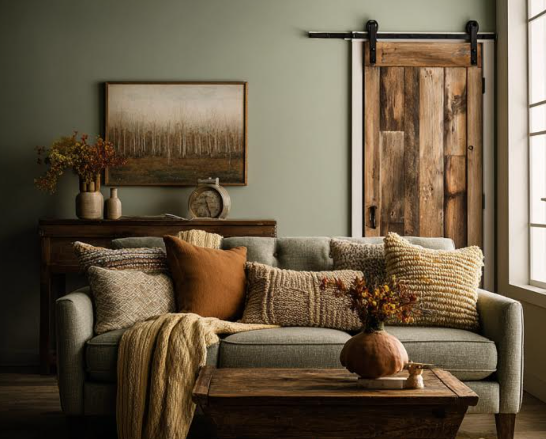
I thought it might even help us be inspired by the muted earth tones commensurate with the colors of 2026 in one photo. Check out the lovely balance I was able to create this photo below (generated with the help of AI).
Sherwin-Williams 2026 Color of the Year: Universal Khaki
Sherwin-Williams’ Universal Khaki is a timeless, grounding neutral that brings warmth and balance to any space. This adaptable shade sits comfortably between beige and taupe, offering a sense of calm that feels both classic and current.

What Colors to Pair
- Crisp White
- Deep Greens
- Black Accents
These effortless pairings allow it to be a perfect foundation for layered, lived-in interiors. Whether used on walls, cabinetry, or trim, Universal Khaki invites a feeling of understated sophistication and lasting comfort.
Valspar 2026 Color of the Year: Warm Eucalyptus
Warm Eucalyptus by Valspar captures the serenity of nature in a muted sage tone that’s both fresh and familiar. Its soft green hue carries subtle warmth, creating a soothing atmosphere that feels restorative and modern.

What Colors to Pair
- Warm Whites
- Terracotta Earth Tones
- Brushed Brass Accents
Warm Eucalyptus is a versatile color that works well in wide variety of styles, ranging from organic modern spaces to cozy, plant-filled rooms. When paired with these listed colors, everyday rooms are transformed into relaxing, grounded retreats.
Behr 2026 Color of the Year: Hidden Gem
Behr’s Hidden Gem is a smoky jade that delivers both richness and restraint. Its deep, jewel-like undertone makes it an elegant choice for walls, cabinetry, or even ceilings when you want to introduce drama without overpowering a space.

What Colors to Pair
- Creamy Whites
- Natural Wood Accents
- Charcoal Details
Hidden Gem works especially well in transitional and modern interiors, where its cool depth contrasts beautifully with creamy whites, natural wood & charcoal finishes. The result is a look that feels elevated yet approachable.
Glidden 2026 Color of the Year: Warm Mahogany
With Warm Mahogany, Glidden embraces a return to richness and warmth. This luxurious red, inspired by natural wood tones, adds instant depth and sophistication to a room. It’s a perfect choice for accent walls, built-ins, or furniture pieces that call for a touch of bold personality.

What Colors to Pair
- Natural Beiges & Taupes
- Clean Whites
- Muted Greens
When paired with these soft tones, Warm Mahogany creates a welcoming and refined palette that evokes both comfort and confidence.
I recommend using a deep terracotta red like this as your accent color. Allow it’s richness and depth to provide strength to a relaxing and grounded backdrop.
Design Tip from Sarah Trop
Dutch Boy 2026 Color of the Year: Melodious Ivory
Dutch Boy’s Melodious Ivory is a soft, luminous neutral that radiates calm and timeless beauty. With its warm undertones, it creates a serene backdrop that enhances both traditional and contemporary interiors.

What Colors to Pair
- Soft Silvery Blues
- Pure Whites
- Deep Navy Accents
The shade complements natural materials like wood and linen, offering a versatile base for layering textures and colors. When paired with cooler tones, Melodious Ivory brings a quiet & warm elegance to spaces, proving that simplicity can be the most sophisticated statement of all.
Benjamin Moore 2026 Color of the Year: Silhouette
Benjamin Moore’s Silhouette introduces a refined moodiness with its blend of gray, brown, and subtle plum undertones. It’s a deeply sophisticated shade that evokes intimacy and comfort, ideal for dining rooms, bedrooms, or statement-making accent walls.

What Colors to Pair
- Soft Neutrals
- Creamy Whites
- Warm Metallic Finishes
These complemented combinations allow Silhouette to take on a layered, luxurious quality. It’s a color that encourages a sense of depth and character, providing a more dramatic yet timeless aesthetic to a space.
Graham & Brown 2026 Color of the Year: Divine Damson
Graham & Brown’s Divine Damson is a deep, moody plum that brings instant drama and sophistication to any interior. Its rich tone captures the perfect balance between boldness and elegance, making it a standout choice for those who want to create a statement.

How to Use
For a truly immersive look, consider color-drenching a study, reading nook, or auxiliary space: painting the walls, trim, and even the ceiling in this luxurious shade for a cocooning effect. If a full-room commitment feels too daring, try introducing Divine Damson as an accent through furniture or art. Paired with brushed gold or warm metallics, it lends a refined and opulent touch that feels both modern and timeless.
Deep rich colors, like Divine Damson, offer elegance and luxury when used on heirloom piece or vintage accent furniture.
Design Tip from Sarah Trop
PPG 2026 Color of the Year: Secret Safari
Secret Safari from PPG is a vibrant, energizing green that instantly enlivens a space. Playful yet sophisticated, this bold hue brings a modern, artistic spirit to interiors when used thoughtfully.

How to Use
Because of its intensity, Secret Safari shines brightest when employed with restraint. I recommend adding this hue into a room through accents like throw pillows, blankets, or even the matting of framed artwork. The key is small doses. Subtle touches allow the color to energize the space without overwhelming it. Used in this way, Secret Safari becomes a creative thread that adds personality, movement, and just the right amount of daring to contemporary design.
Final Thoughts
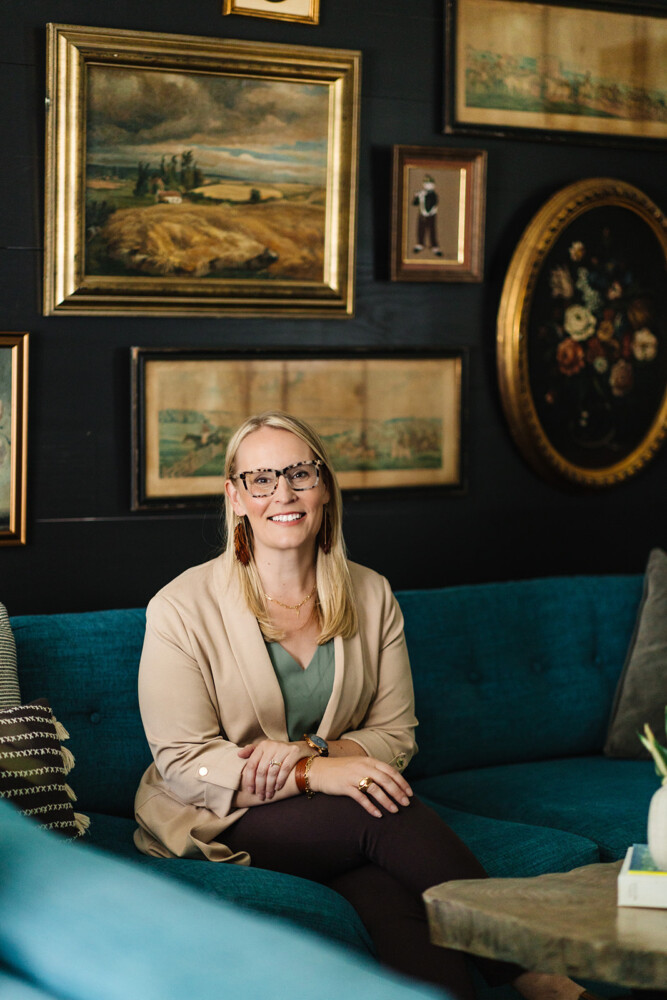
Thank you all for following along! If you’d like to get this blog in your email once a week, please sign up for our weekly newsletter by adding your email in the little box below my picture at the top of this page.
If you’ve enjoyed this post, please like FunCycled on Facebook, Instagram and Pinterest if you don’t already. Keep up to date on the newest finds, vote on colors and give your input on our creativity. We share fun tutorials, great before and after, and new design inspirations.
We offer interior design, kitchen cabinet painting, and custom built tables, barn doors, and repurposed furniture. Thank you, again, for working with us and for taking the time to spread the word about what we do.
Happy FunCycling Friends,
Sarah ; )
Exquisite Spaces. Sustainable Designs. Brighter Futures.
Note some of the the links provided are affiliate links, and I may earn from any qualifying purchases.