Hi Friends!
It is so exciting when I get to share with you stunning makeovers that display the correct way to add color to a home! This summer, I have focused on incorporating color into your design which I know can be a scary or intimidating idea. That’s why I am glad to share today’s kitchen makeover story with you. Julie and her family reached out to us knowing they wanted to update their kitchen but needed some guidance on making the right selections for their project. Thanks to our team, we were able to completely change the look of their kitchen while keeping the cost down.
Here are a few before photos of Julie’s kitchen. This kitchen is what I would call a busy or disjointed kitchen. There are 2 different colors of wood tones between the cabinets and island, 2 different countertops, and 2 different colors of hardware used throughout the space. The good news…everything was in good condition, so we knew we could use the existing cabinets and drawers.
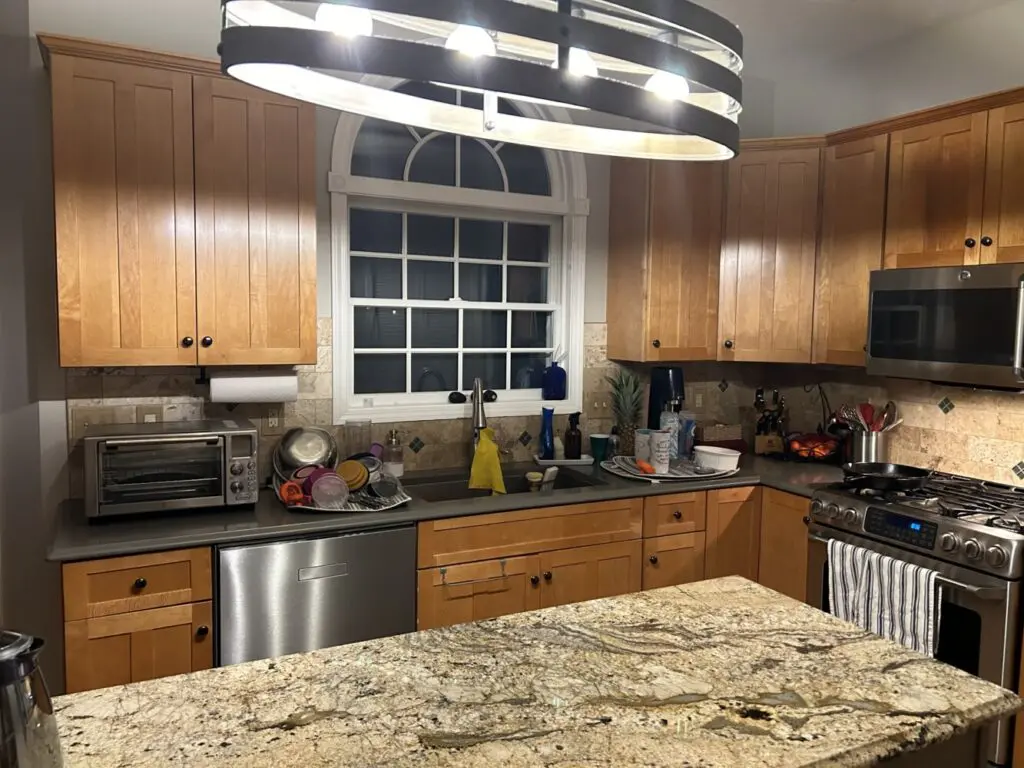
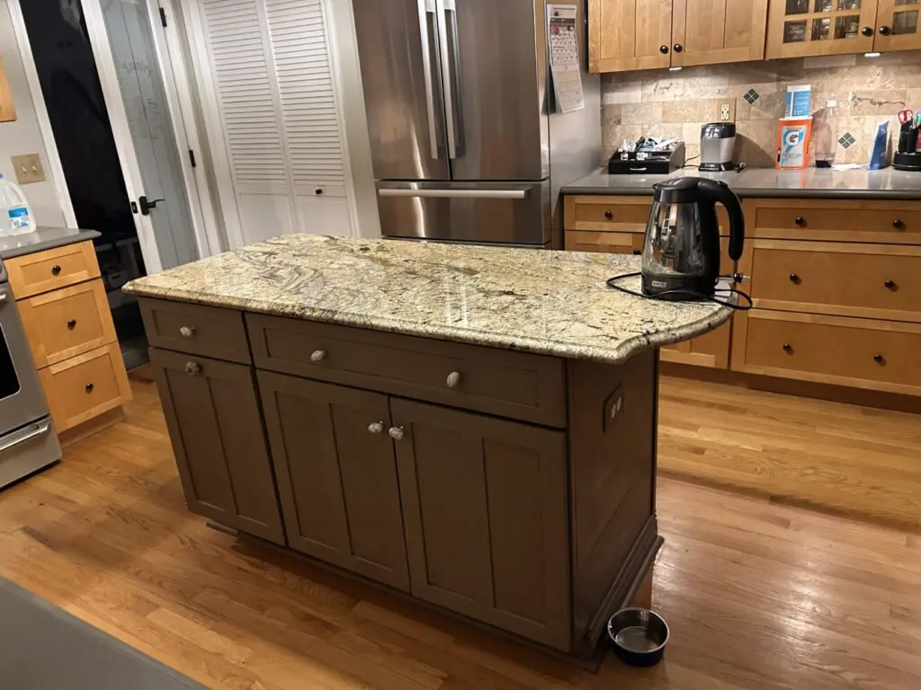
Here are a couple more photos
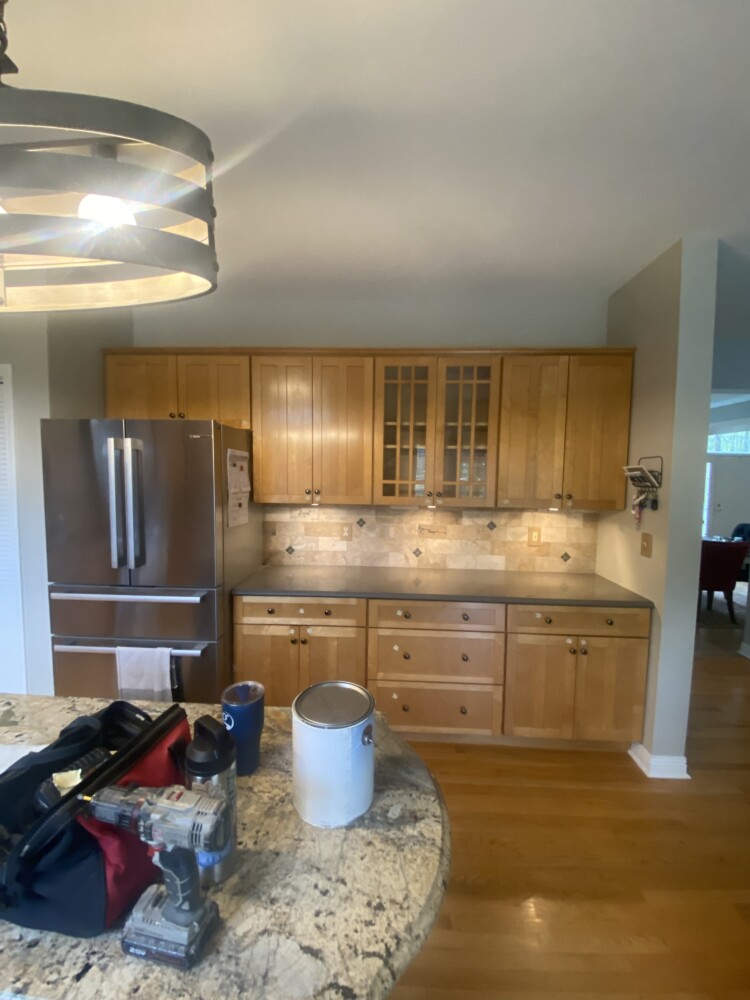
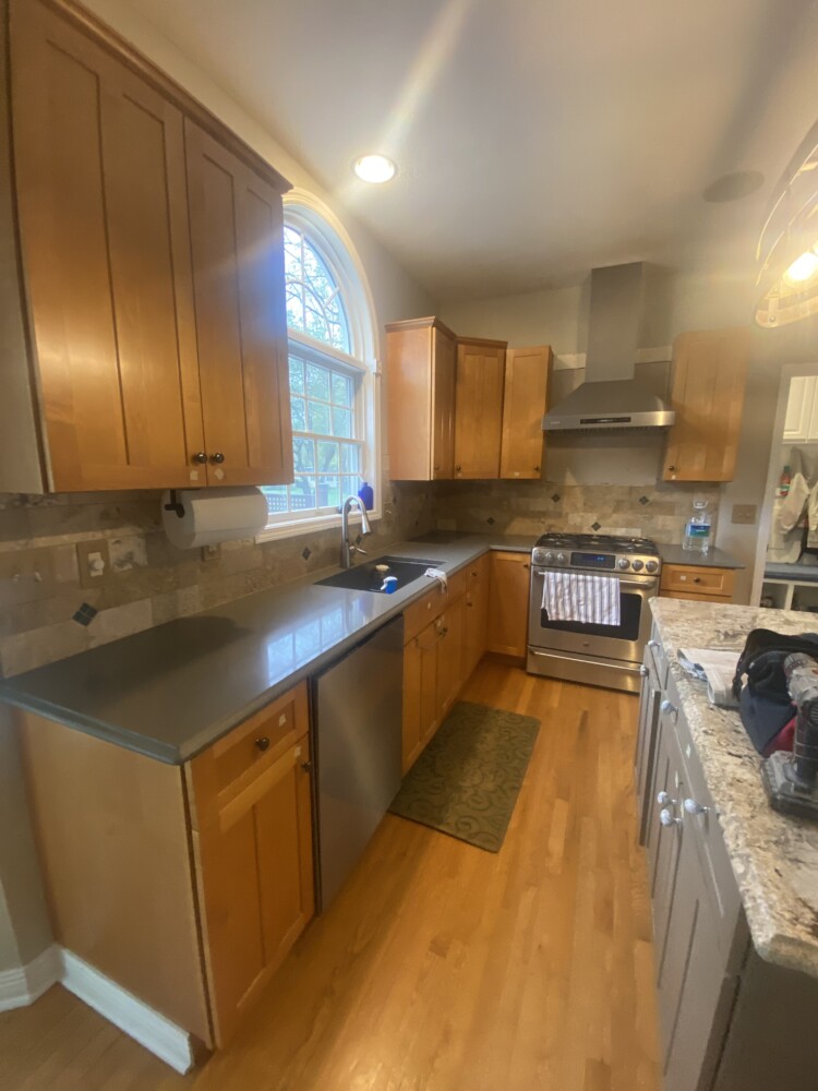
Next we determined that Julie and her family were going to keep the counters and backsplash. Yes, the two different counters were mismatched, but they are solid surface and in really good shape. As for her backsplash, it actually contained all of the colors that were present in her heavily veined granite counter AND the even, streamlined dark gray countertop. Now, we just needed to make all of the elements tie in together.
Here is a close up of the backsplash and the paint swatch we decided to use for the cabinets.


It was great that their tile actually contained ALL of the elements that we needed to pull together a cohesive plan. Plus, it helped to confirm our color choice!
This color is by Behr. It’s called Black Evergreen. It is a rich, deep green and can be used to add a dramatic element to a room or to provide a moody space that helps warm and welcome a room.
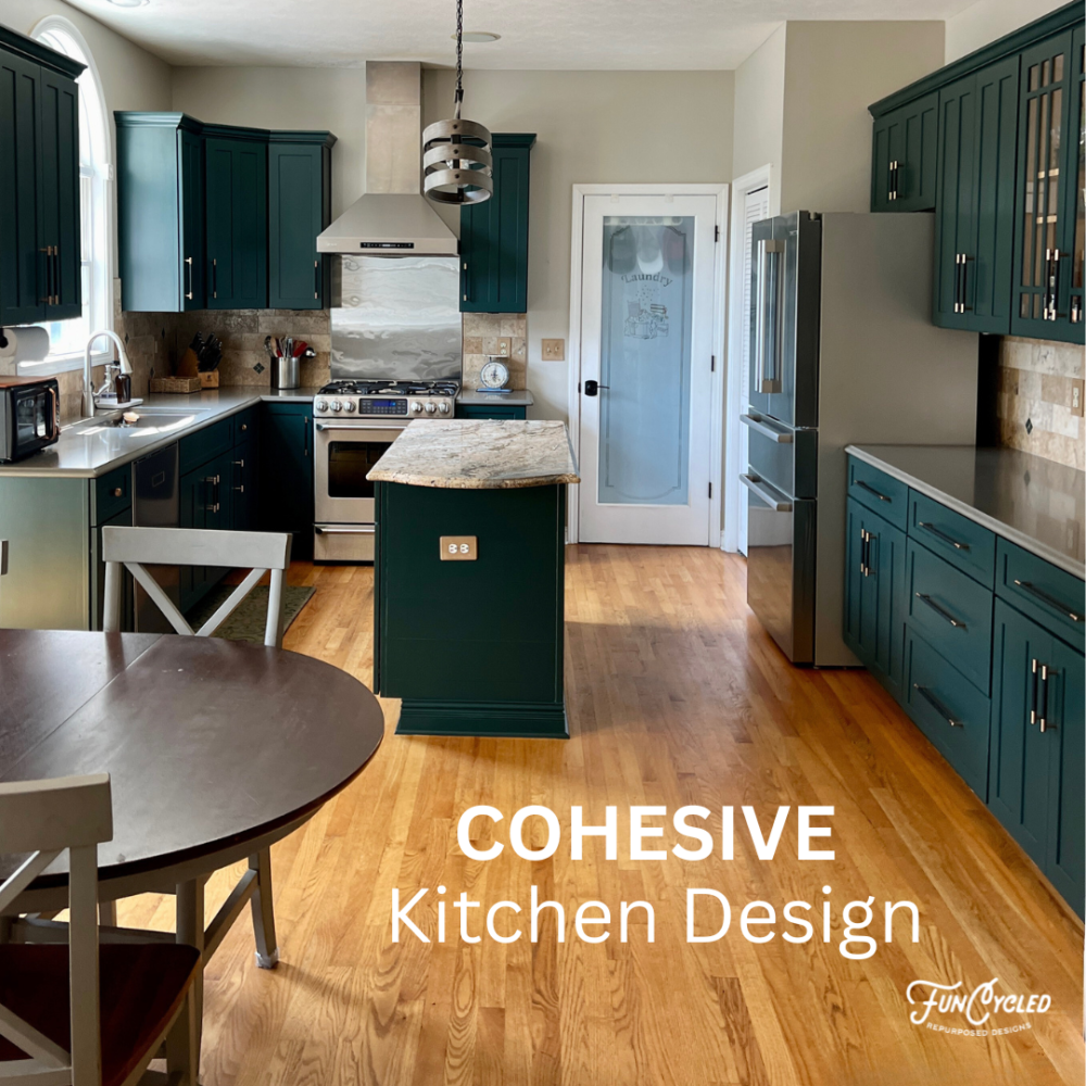
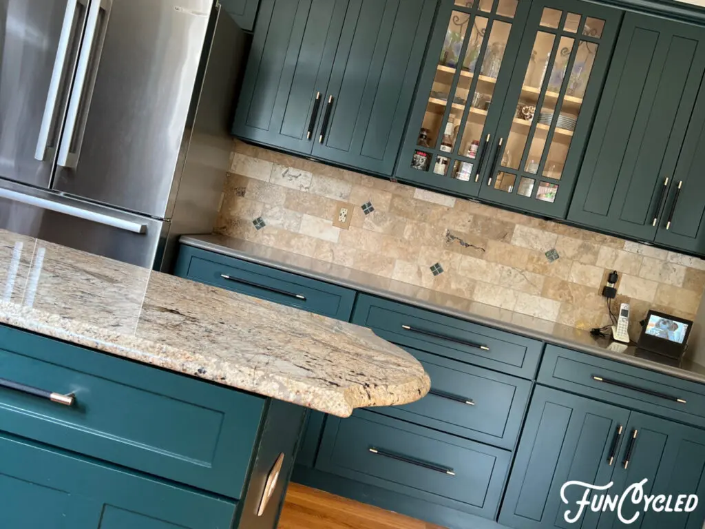
And here is the beautiful outcome with our cohesive design plan!
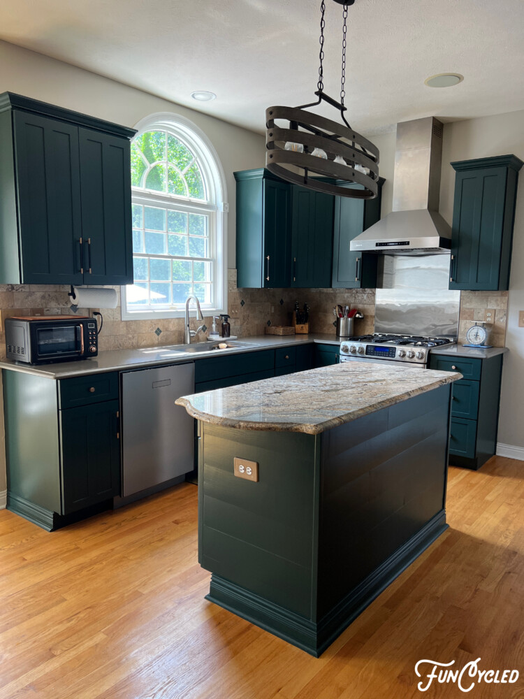
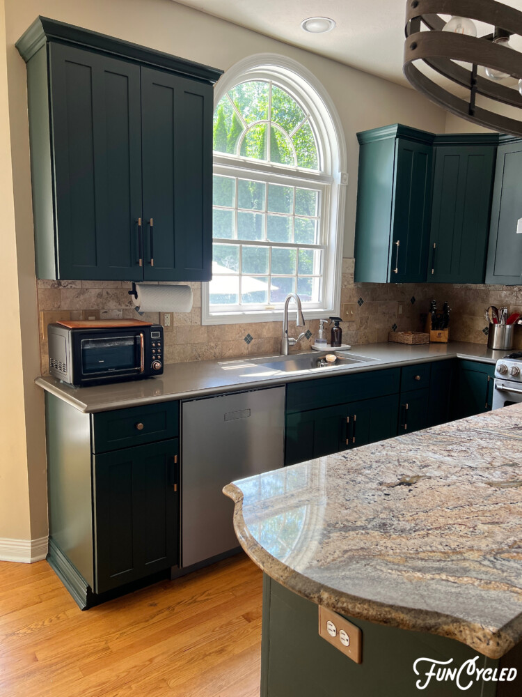
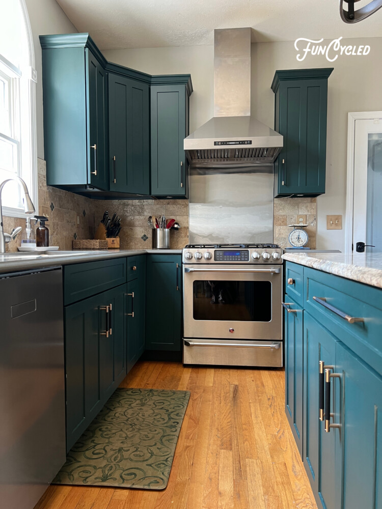
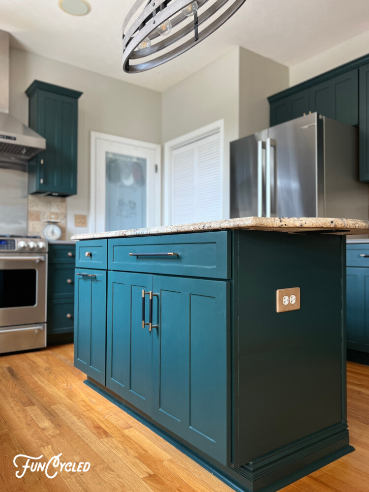
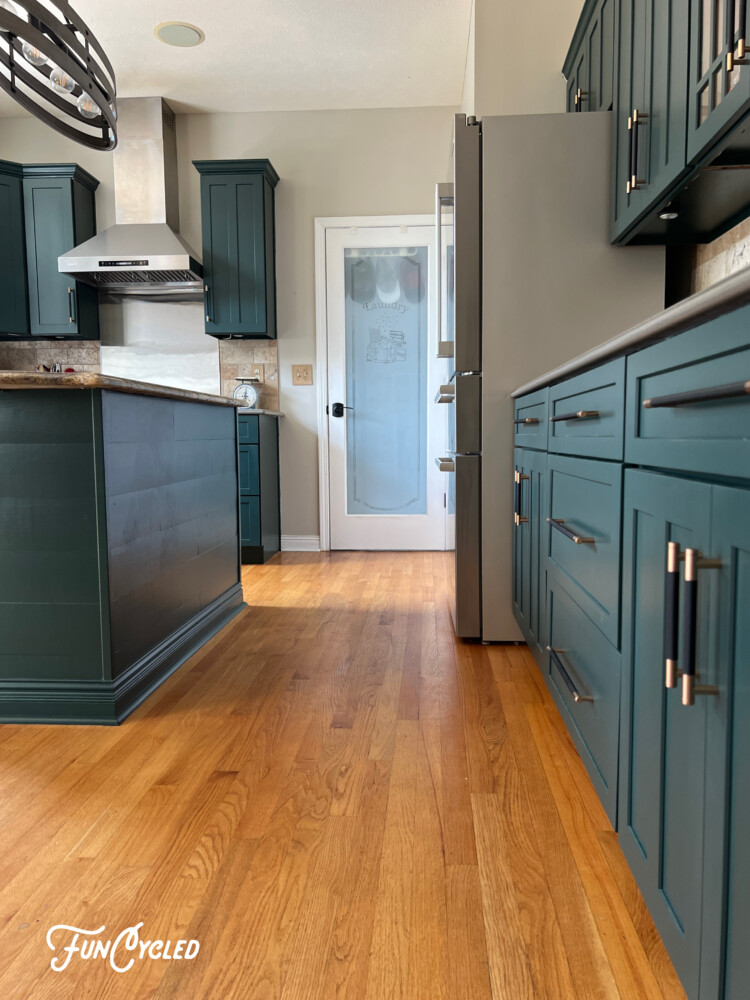
In addition to selecting the right paint color, we decided to paint the underside of the cabinets. For Julie’s kitchen, this was an important component in achieving a cohesive design plan. It’s a good idea to do this when you want to ensure the visual appearance is not interrupted and the colors are evenly spread out around a room. Choosing the right color, ensuring a continuous visual presence, and selecting matching hardware were the essential
See how well this paint color works with both counters?
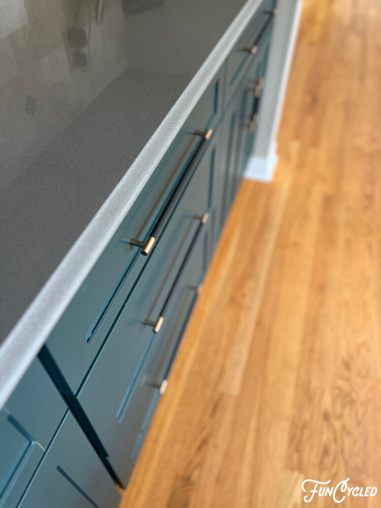
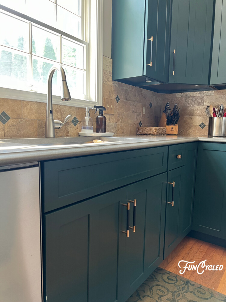
Look at how well the color works with both counters…and check out the rich tone of the deep green next to the movement of the granite on their island. Isn’t is just stunning?!
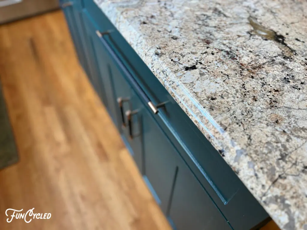
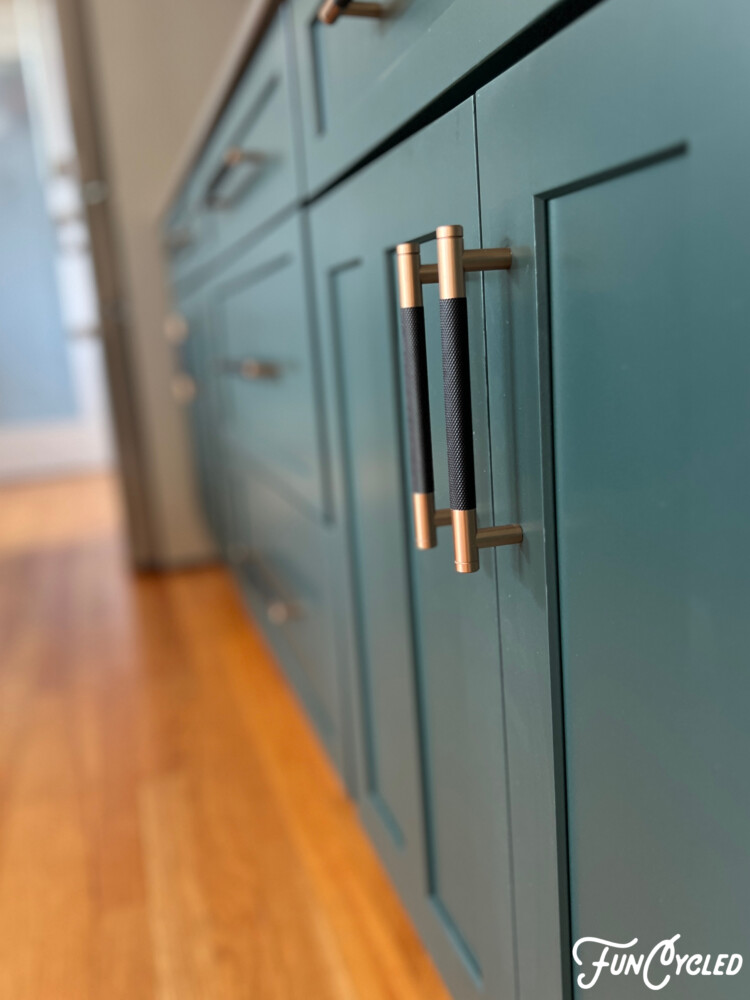
And the last detail to complete the cohesive plan was to ensure we used the right hardware. Sometimes using one kind for your doors and another for your drawers is a good idea, but since Julie’s kitchen plan was to pull everything together, we decided the best option would be to select all of the same hardware. And to add just a little more interest, we decided on these black and gold handles. Here is the link where you can purchase them: Black and Gold Cabinet Pulls.
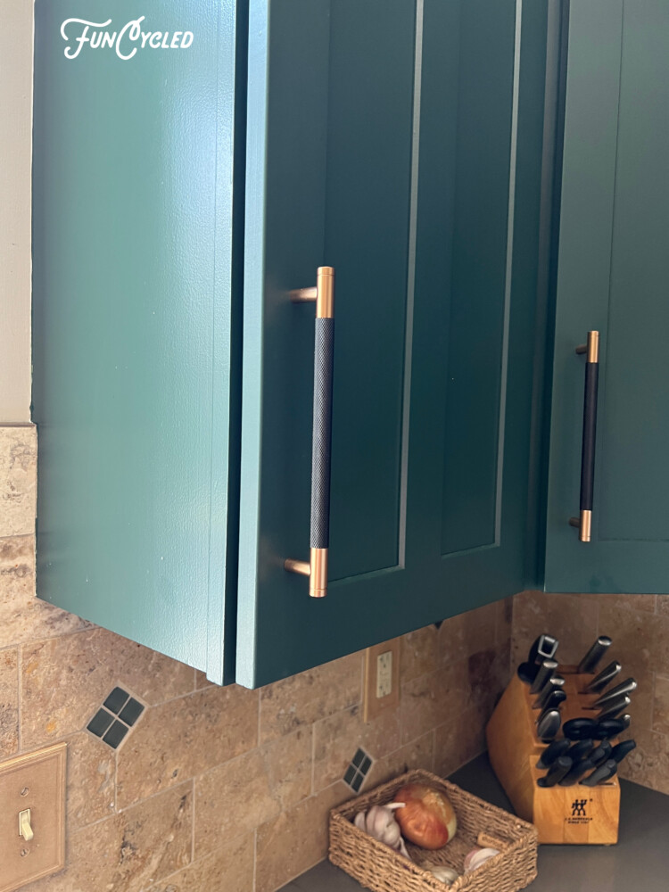
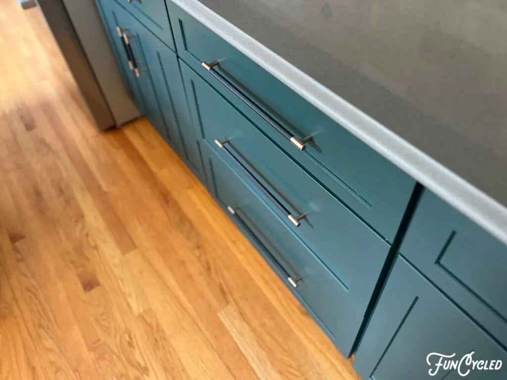
We just loved completing this project! Thanks, Julie, for working with us and for trusting FunCycled with your design plan!
Thank you all for following along! If you’d like to get this blog in your email once a week, please sign up for our weekly newsletter by adding your email in the little box below my picture at the top of this page.
If you’ve enjoyed this post, please like FunCycled on Facebook, Instagram and Pinterest if you don’t already. Keep up to date on the newest finds, vote on colors and give your input on our creativity. We share fun tutorials, great before and after, and new design inspirations.
We offer interior design, kitchen cabinet painting, and custom built tables, barn doors, and repurposed furniture. Thank you, again, for working with us and for taking the time to spread the word about what we do.
Happy FunCycling Friends,
Sarah ;)
Note some of the the links provided are affiliate links, and as an Amazon Associate, I earn from any qualifying purchases.


