Hi Friends!
I hope you had a wonderful weekend! I’m giddy, excited to share with you all about the kitchen makeover in our Trolley House Flip. It might just knock your socks off! As you may know by now, we purchased an old trolley stop in 2022, and completely remodeled it before putting it on the market at the end of October.
If you have trouble viewing the photos on this post, click here.
Here’s what the kitchen part of the trolley house looked like the day we bought it:


This was the most damaged section of the house! John actually fell through the floor after we closed on it. We ended up ripping this whole section off, adding a foundation and all new framing. My favorite part about this design is that we also peaked the ceiling to match the roof line of the rest of the house. The roof before wasn’t even 6′ tall on the door side.
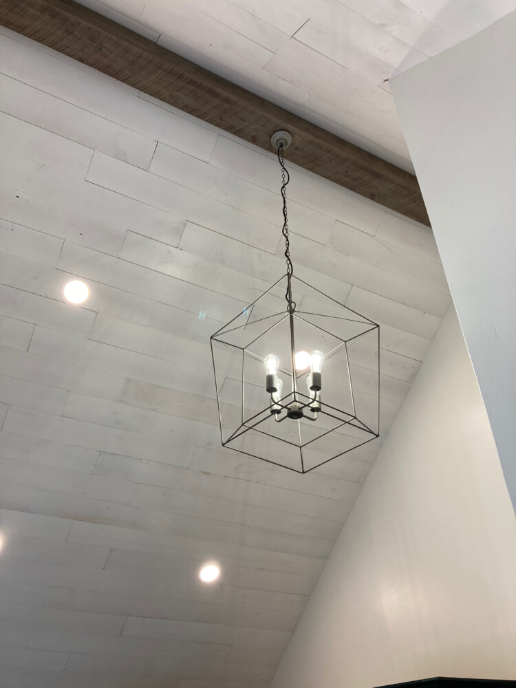
Check out this ceiling!!! We installed shiplap on the ceiling and a large beam to add visual interest.
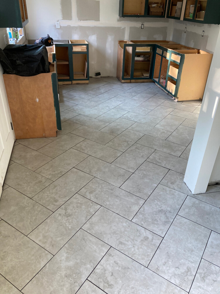
Next, we worked on the flooring. I knew I wanted rectangular tile that wouldn’t show dirt easily since it’s the main access area to the house. I really wanted to do a herringbone pattern with the tile which is not a great return on investment since a 1-2 day project turned into over a 4 day project. I was so happy with how it came out though!
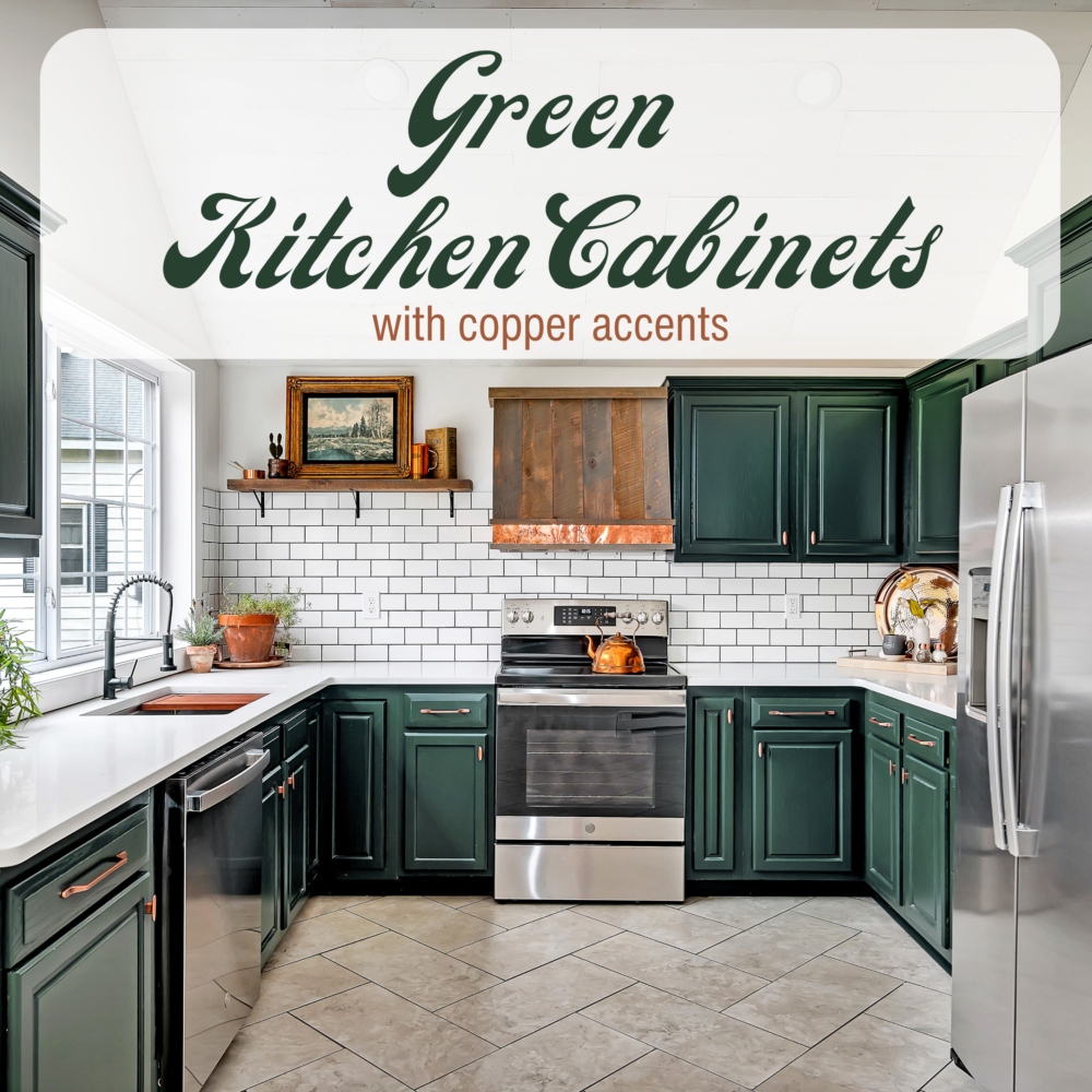
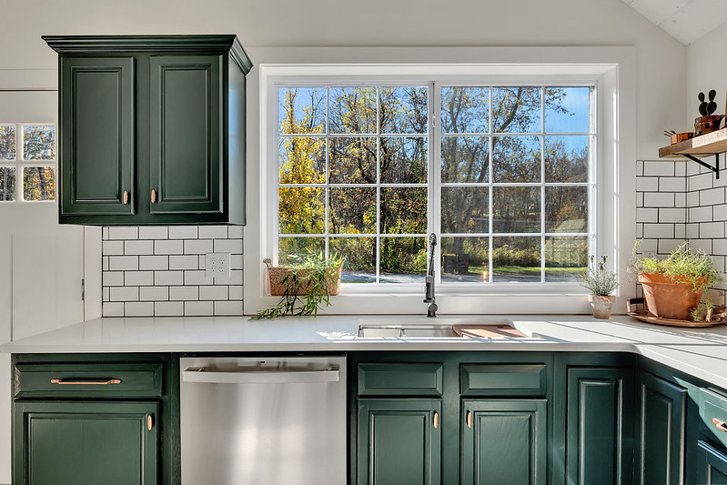
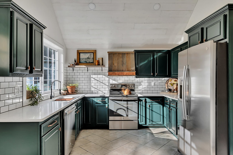
I went back and forth about the color of the cabinets. I know white sells quickly, but I really wanted to do something with a custom feel. So we asked our FunCycled fan’s on social media and they voted! It was almost a 50/50 vote so I went with my gut and painted them green.
We repurposed most of the kitchen cabinets by buying them on a local online marketplace, then we bought a few extra to make the whole configuration match.
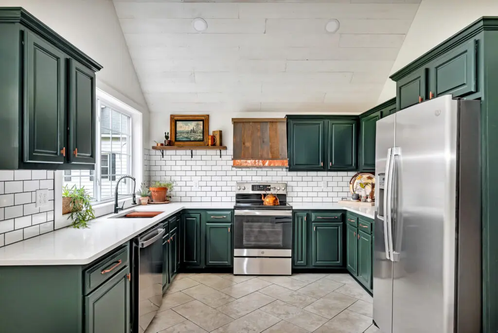
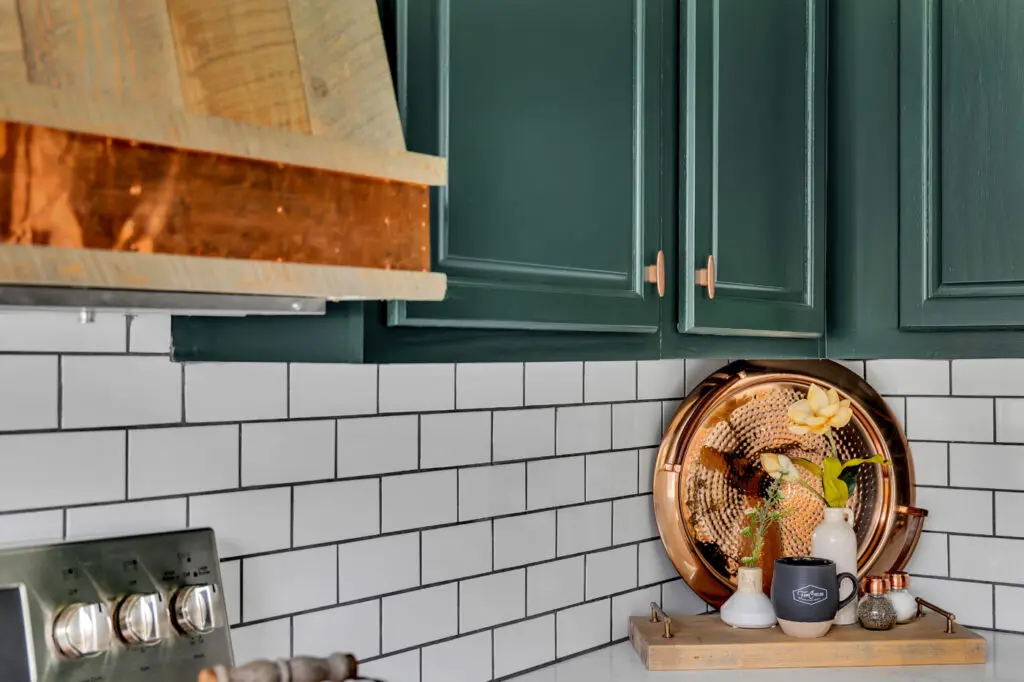
John reminded me that we had strips of copper from a project that we could use in this space if I wanted. I LOVED that idea because I love how copper and dark green go together! We custom built the hood vent; adding the copper strip at the bottom. We also added all copper hardware. This is a good example of how mixed metals work together well in one space. We have gold, black, and copper, and it looks so high end.
The cabinets are painted a Behr color Black Evergreen MQ6-44. I love how in some lighting it looks black, other lighting it’s almost evergreen, and then in others it’s almost teal. This picture is a good example of the way lighting affects this color.
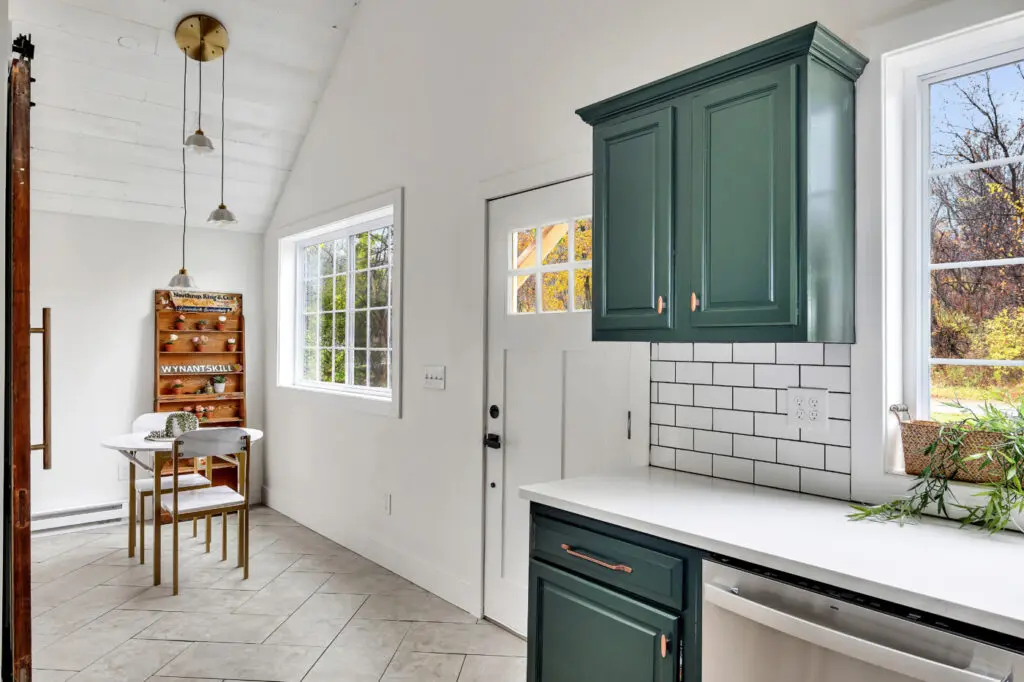
On the right side of the front are, we create a small eat in nook and laundry room!
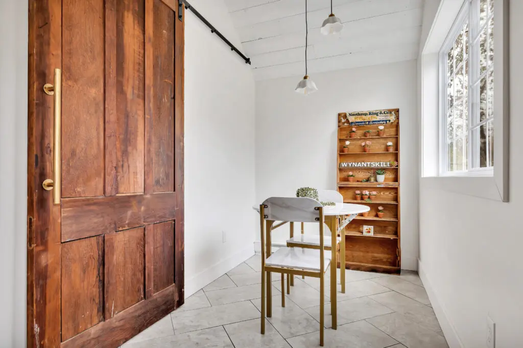
We purchased a huge, old door for the Historic Albany Foundation, and it completely makes this space.
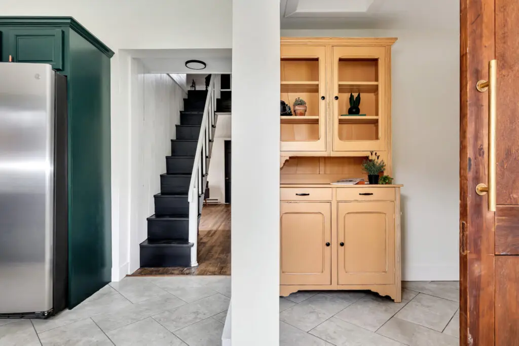
We also found a hutch in the house when we bought it. We completely redid it and added it to the laundry room. One of my favorite parts about the trolley house when we came to look at it was the stairs. They were so tiny and adorable:
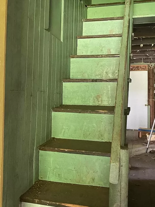
But would you look at them now!!
We also installed beautiful subway tile with dark gray grout, picked Quartz counters, and a black faucet.
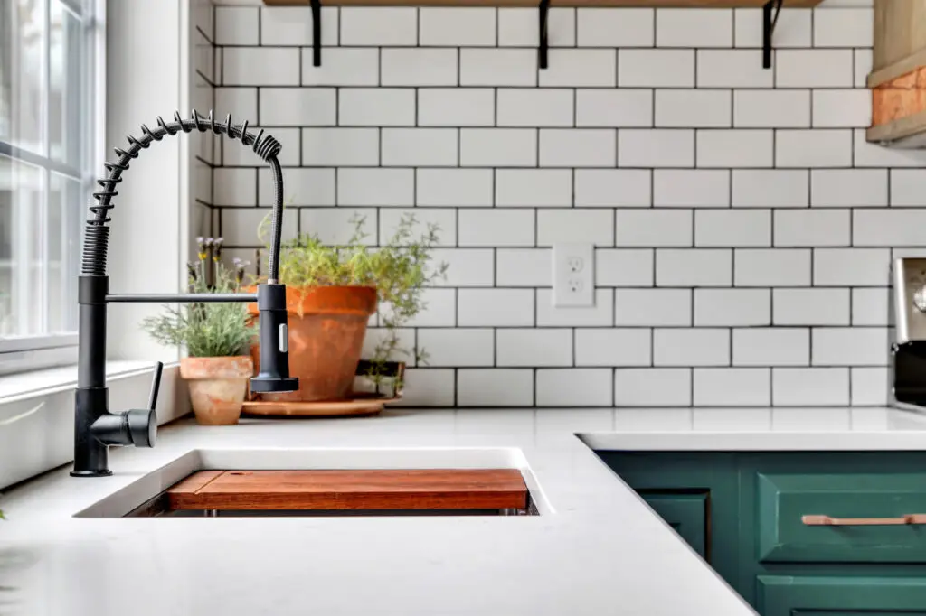
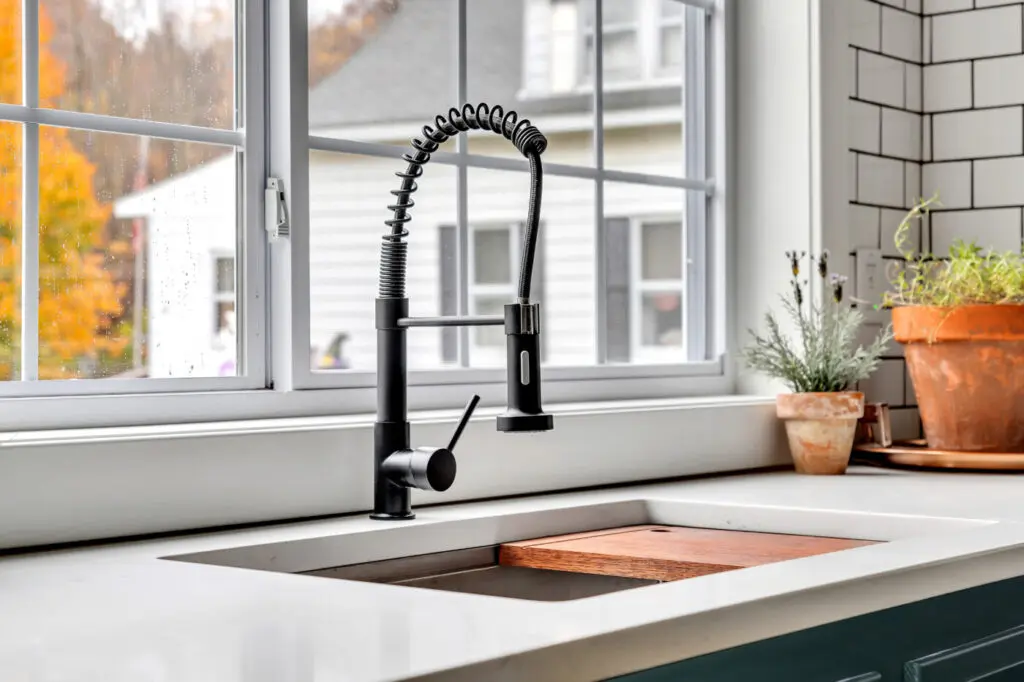
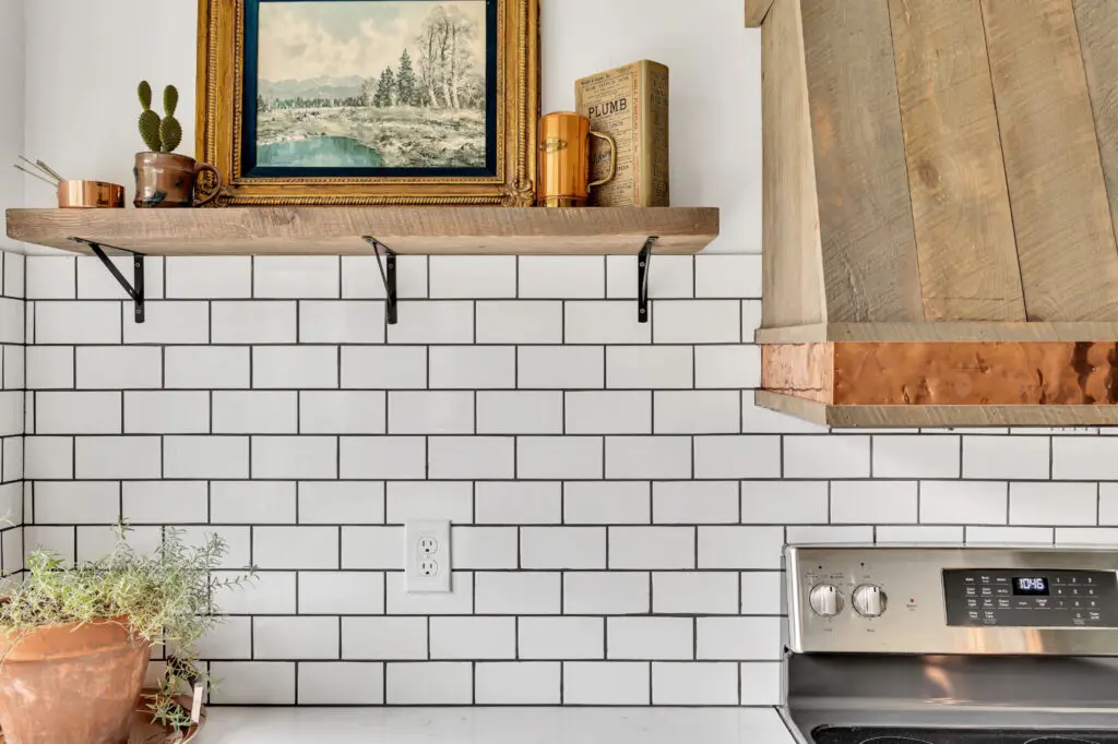
I couldn’t love it all more!!
Would you like help designing your kitchen? Check out our Interior Design Services page or book your consult today!
Thank you all for following along! If you’d like to get this blog in your email once a week, please sign up for our weekly newsletter by adding your email in the little box below my picture.
If you’ve enjoyed this post, please like FunCycled on Facebook, Instagram and Pinterest if you don’t already. Keep up to date on the newest finds, vote on colors and give your input on our creativity. We share fun tutorials, great before and after, and new design inspirations.
We offer interior design, kitchen cabinet painting, and custom built tables, barn doors, and repurposed furniture. Thank you, again, for working with us and for taking the time to spread the word about what we do.
Happy FunCycling Friends,
Sarah ;)

