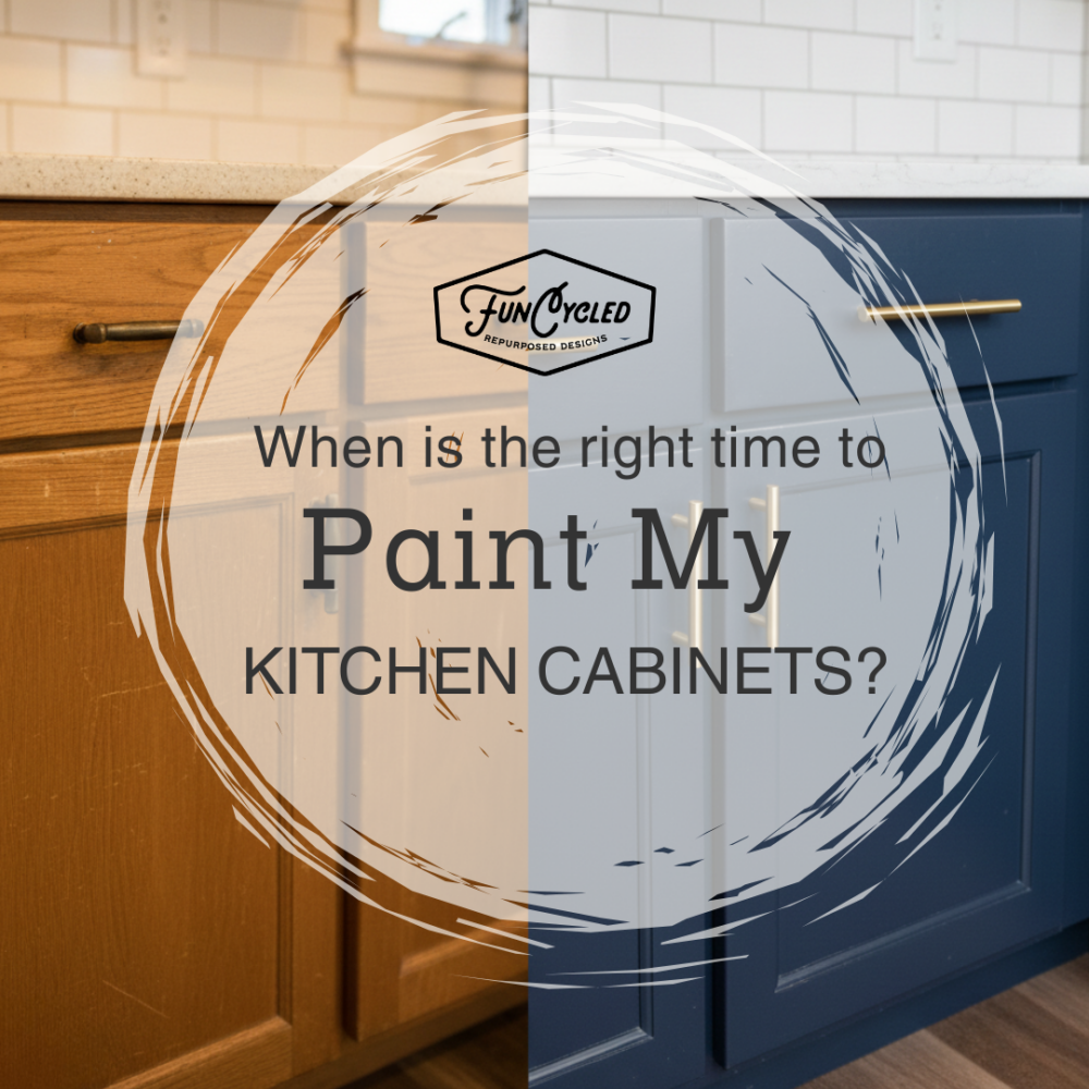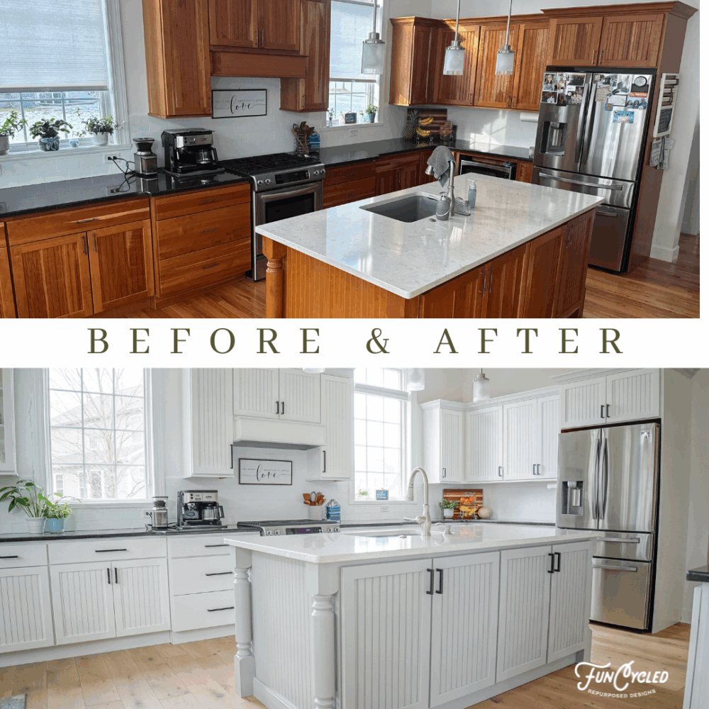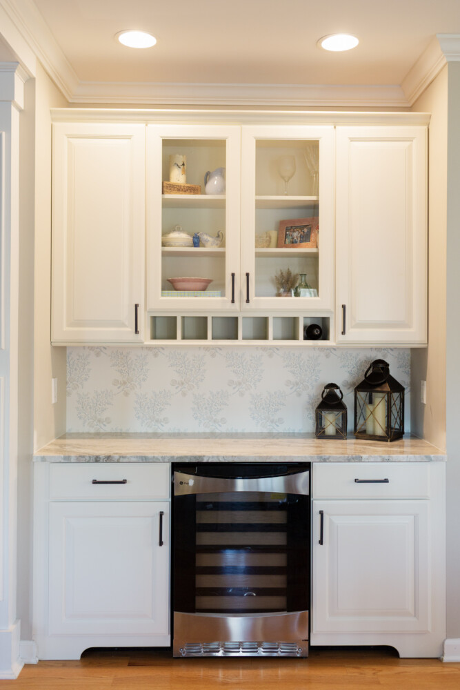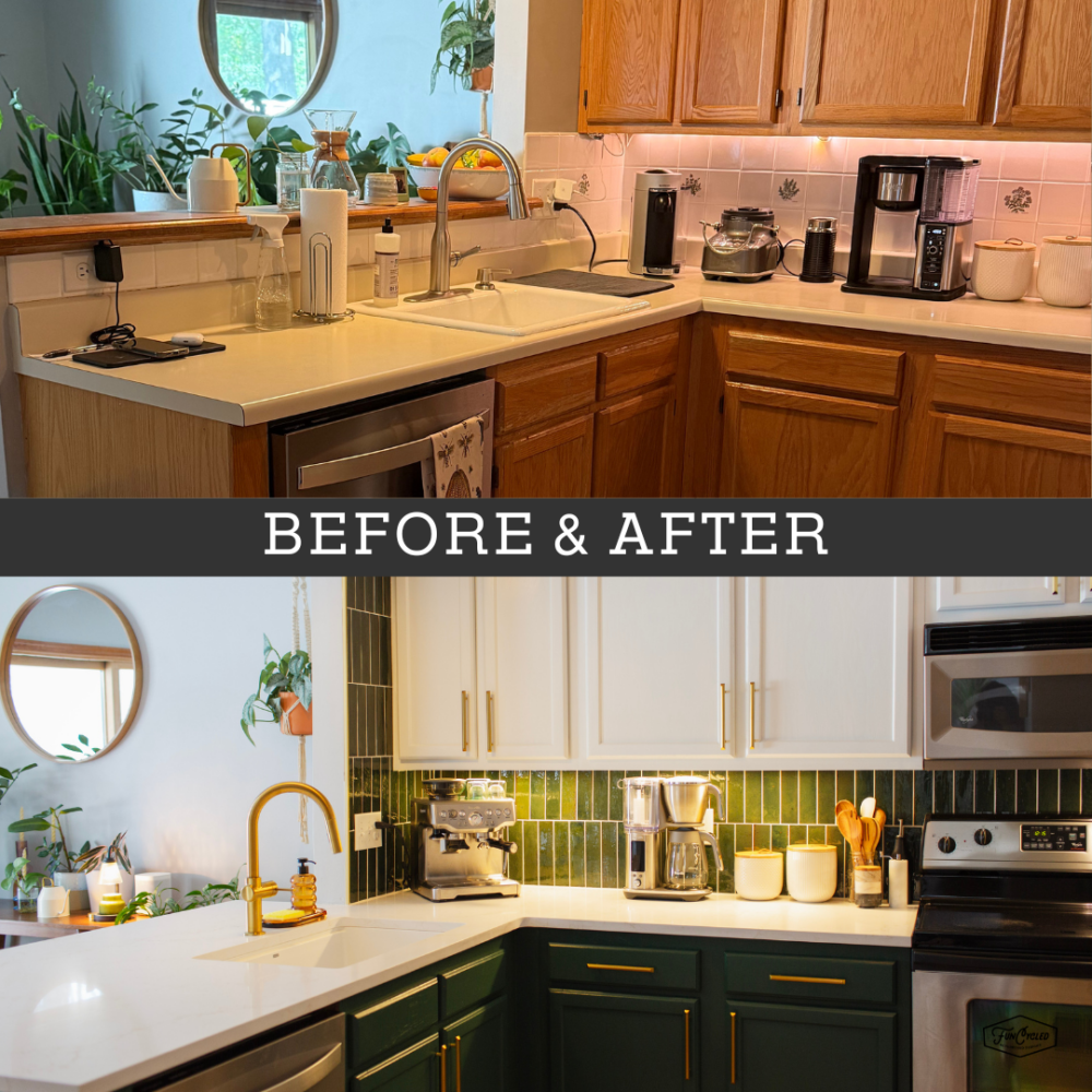
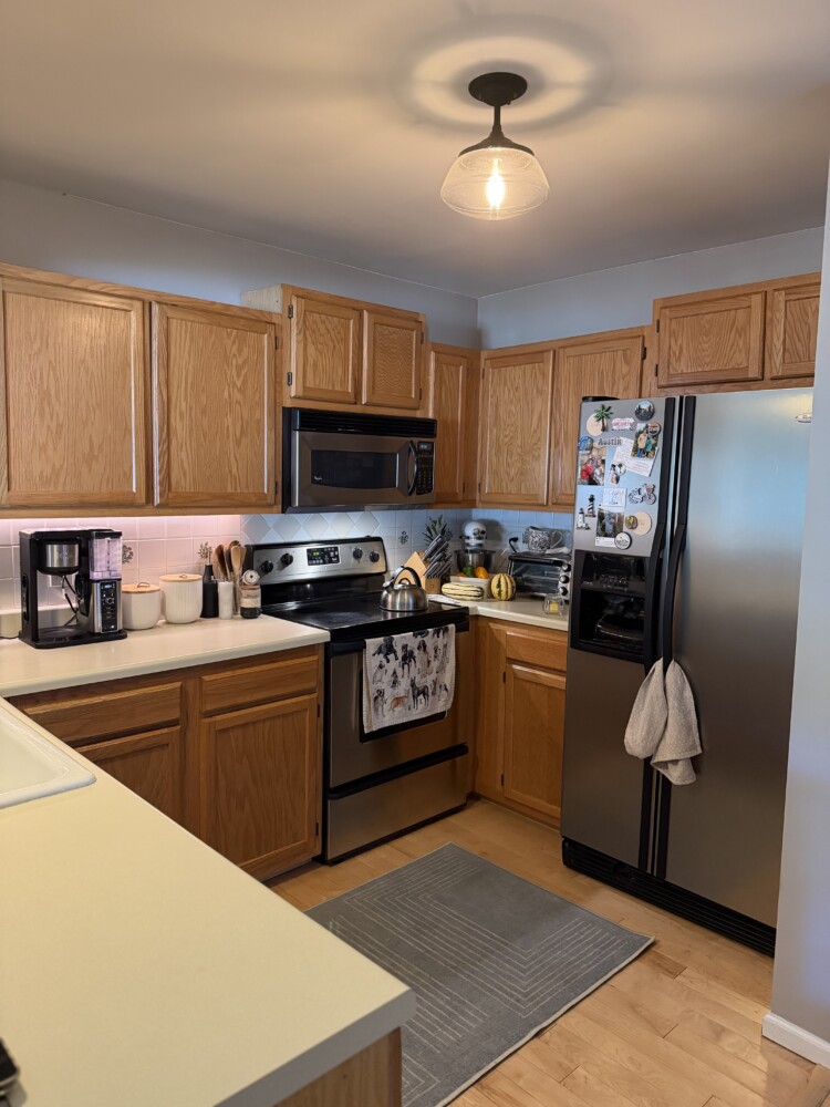
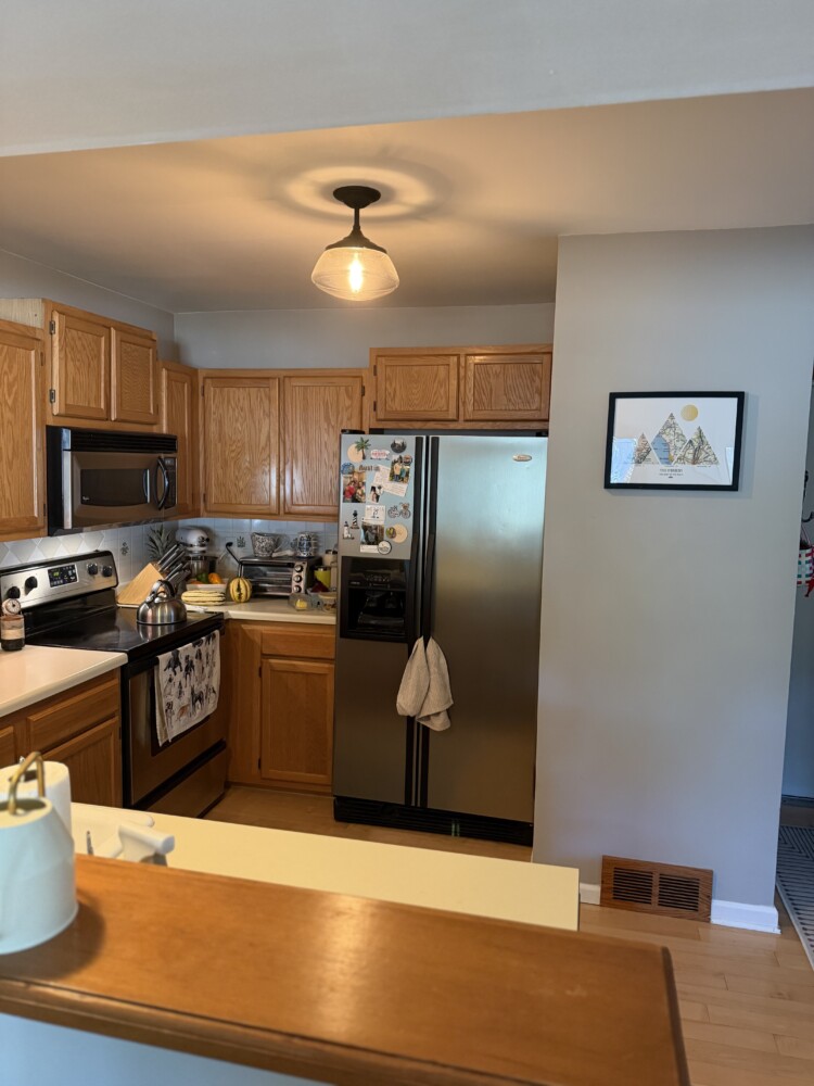
Honey oak cabinets have had a legendary run, but for most kitchens, this finish does not stand the test of time and often makes your kitchen stuck in the past. We recently took on an oak kitchen that was structurally solid but aesthetically… well, outdated and dark. By trading the dated tiers for a seamless, one-level white quartz counter and swapping the “builder-grade” vibe for the moody, sophisticated depth of Benjamin Moore Lafayette Green, we completely redefined the heart of this home. If you’ve been staring at your own cabinets wondering if professional paint and some fresh backsplash tile can actually save you money over a full gut, grab a coffee. Because this transformation is proof that you don’t need a sledgehammer to get a designer finish.
Here’s where we started:
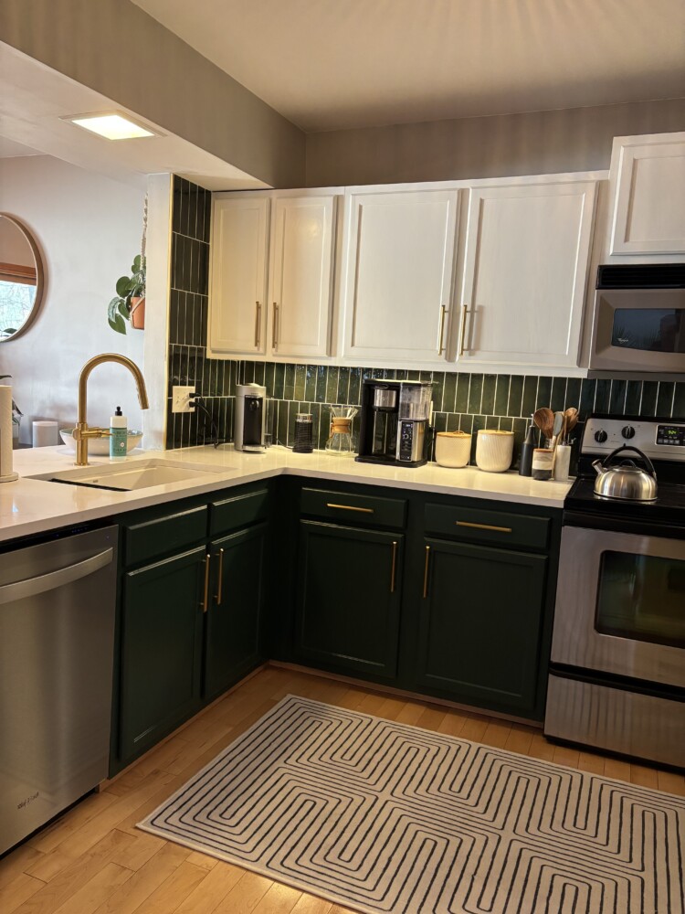
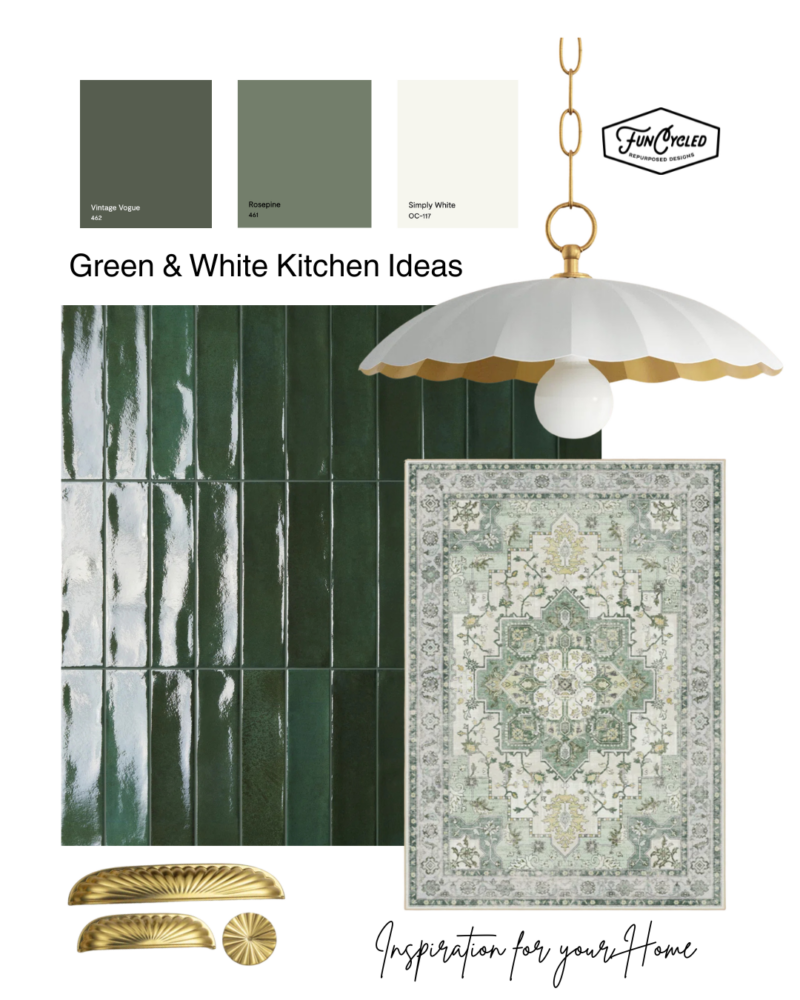
The Power of Paint: BM Lafayette Green & Simply White
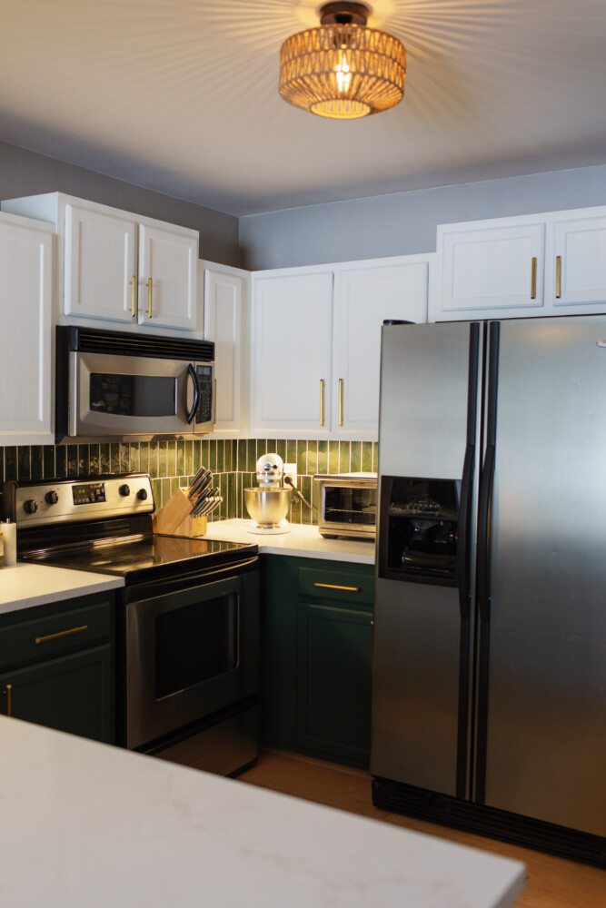
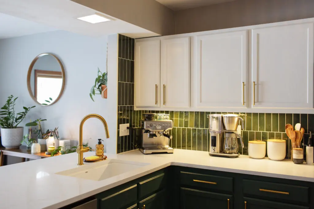
When it comes to high-impact transformations, never underestimate the “power of the brush.” For this project, we leaned into one of our absolute favorite, fail-safe color combinations: the marriage of a soft, warm white with a deep, soulful green. By anchoring the lower cabinets in BM Lafayette Green (HC-135) and lifting the uppers with Simply White, we achieved a “Tuxedo” look that feels intentional and grounded rather than just “painted.” This isn’t just a fleeting trend, either—this specific pairing of organic, forest-inspired tones and creamy whites is a classic aesthetic that truly stands the test of time. It provides enough drama to make a statement, but enough warmth to ensure your kitchen still feels like the coziest room in the house ten years from now.


When you have a lighter color on the top of your kitchen and a darker or more bold color on the bottom, the effect is referred to as a “Tuxedo Kitchen.” What people may not realize is that employing this technique can actually make a kitchen look bigger. Here’s a comparison of the kitchen side by side.
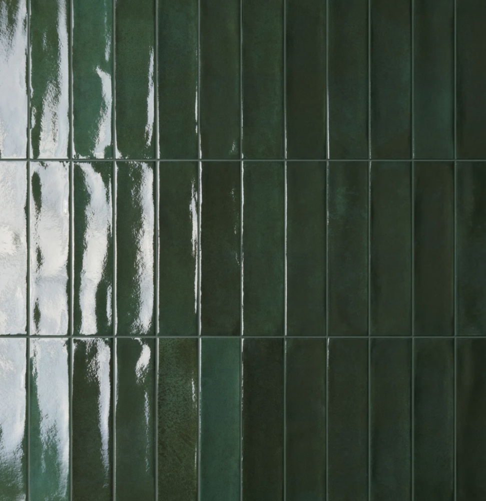
Subway tile is a classic for a reason, but if you’re looking to incorporate design that moves beyond a standard look, the secret is often found in the orientation. We decided to ditch the traditional offset “brick” pattern in favor of a vertical offset, and the impact was immediate.
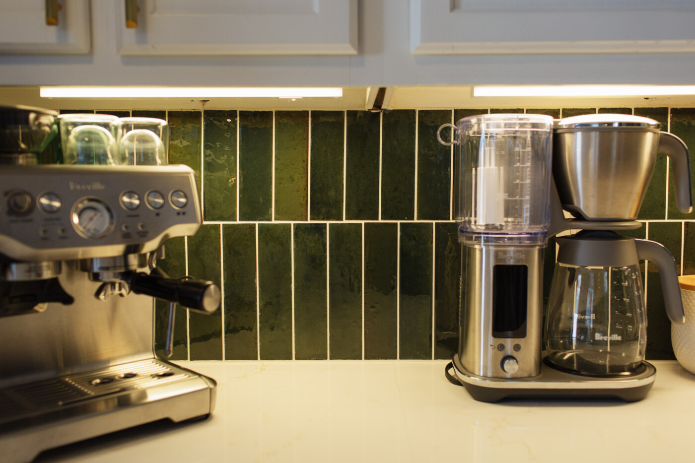
By flipping the green subway tile on its end, we created clean, continuous lines that draw the eye upward, tricking the brain into thinking the ceilings are much taller than they actually are.
It’s a simple geometric shift that gives an affordable, standard tile a high-end designer edge, proving that you don’t need a custom-made mosaic to make a modern architectural statement.
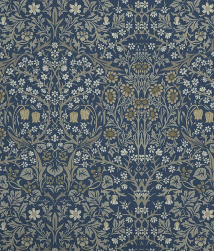
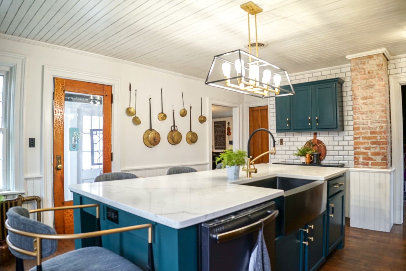
Here’s one of our top picks for green tiles for your kitchen. I love the dark emerald green!
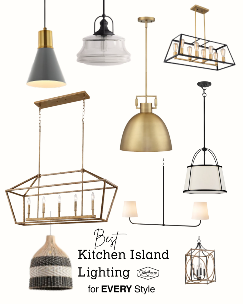
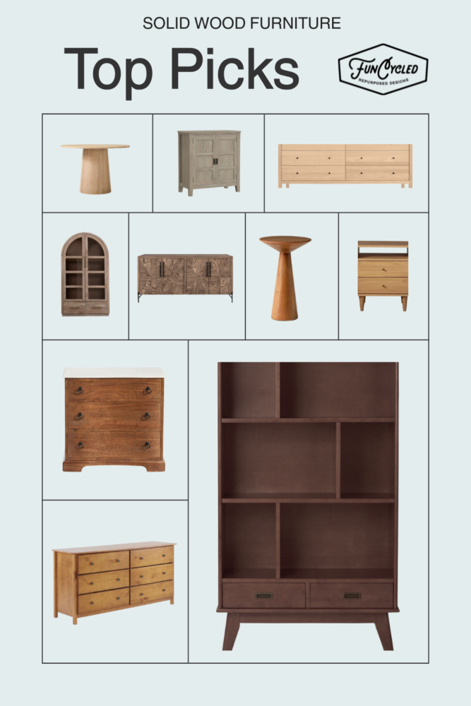
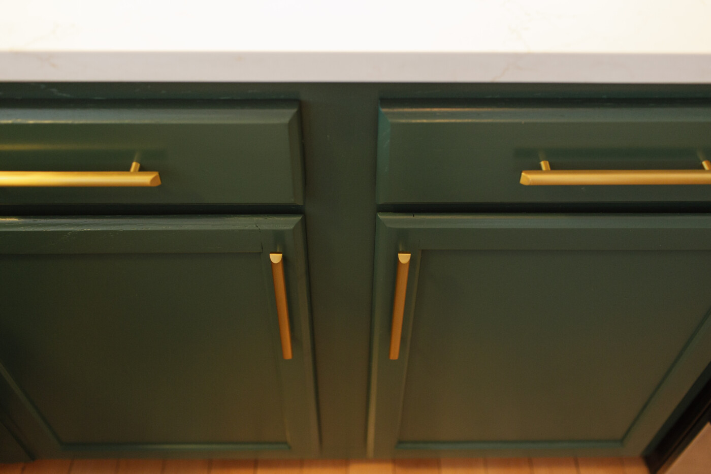
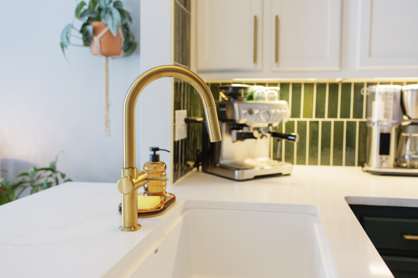
The Finishing Touches: Why We Chose White Quartz & Brushed Gold Hardware
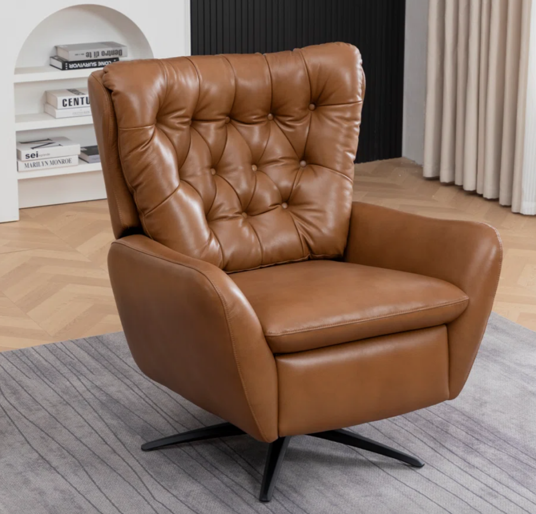
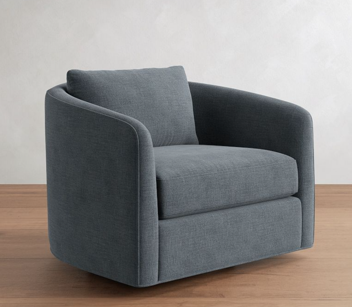
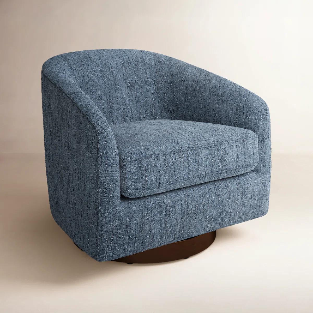
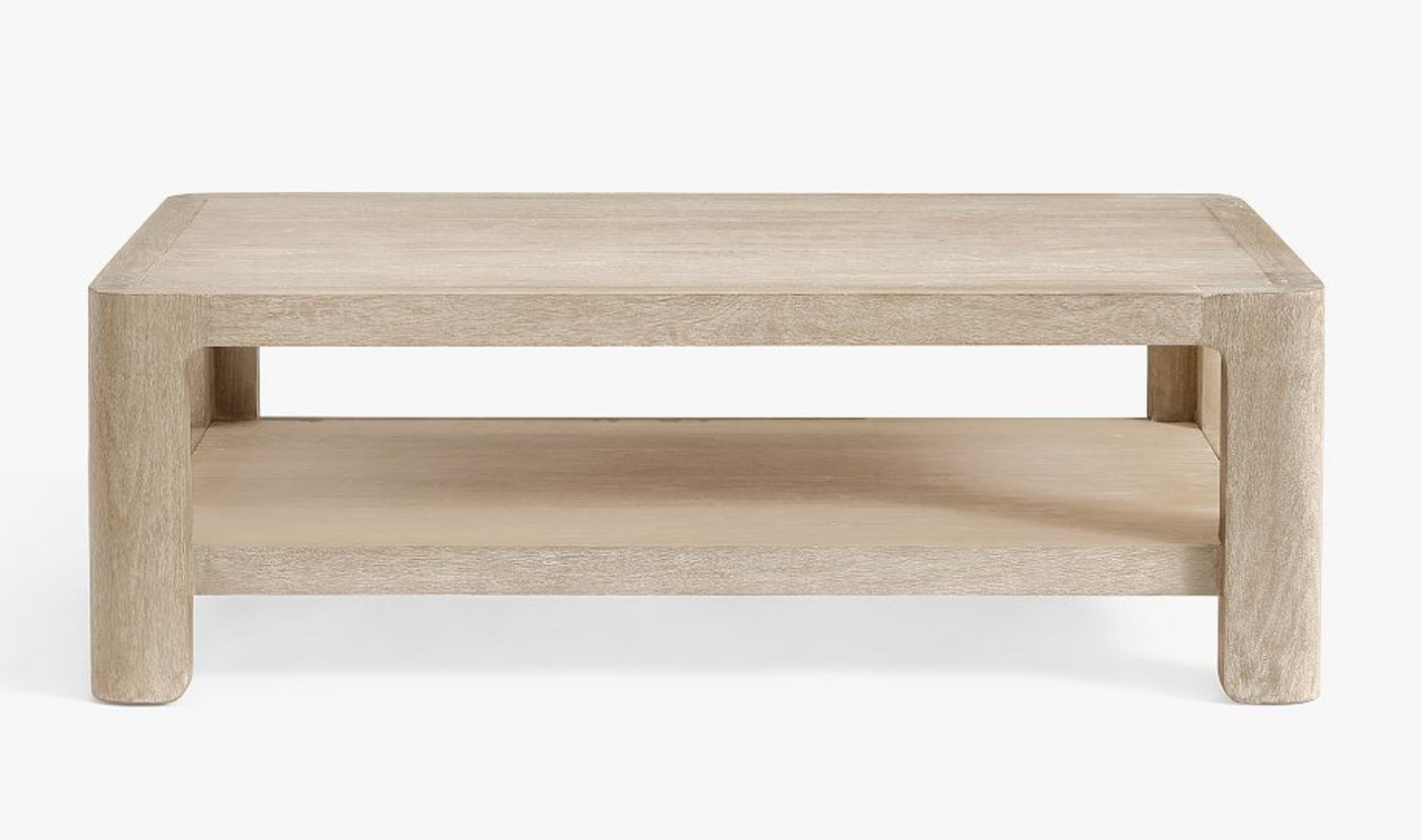
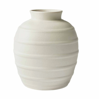
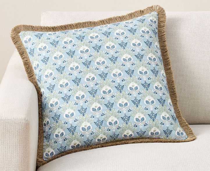
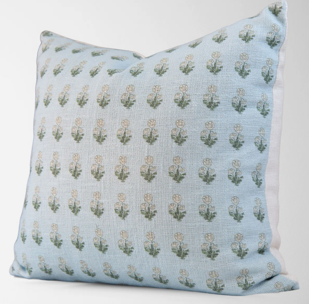
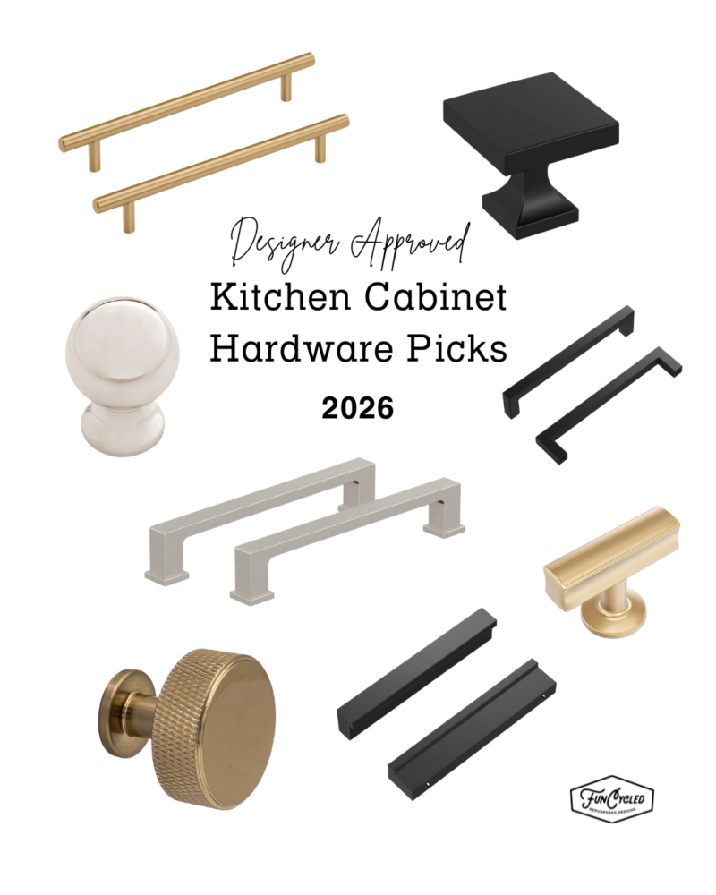
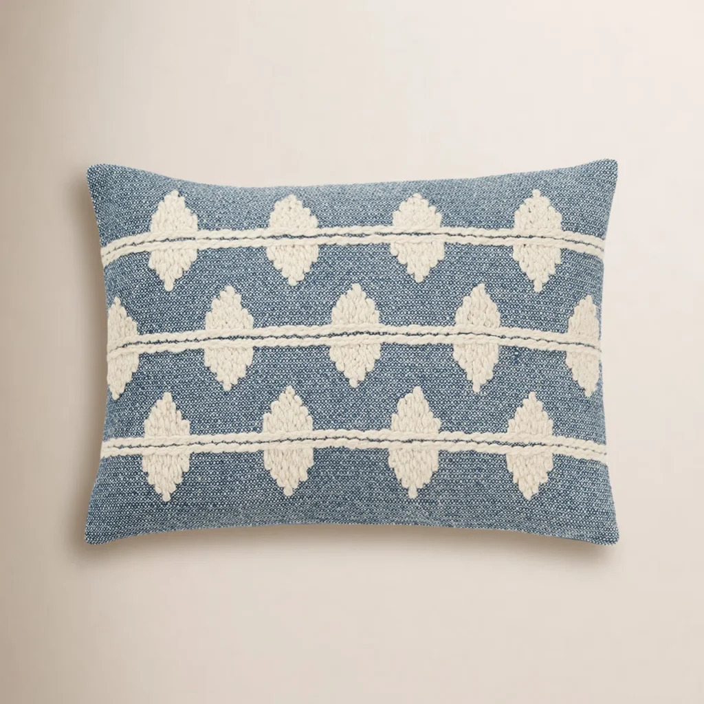
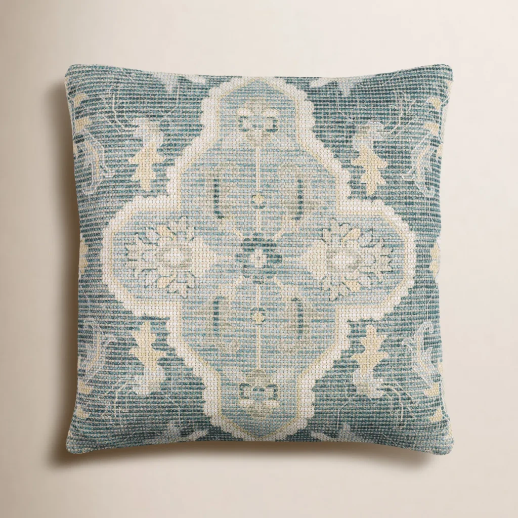
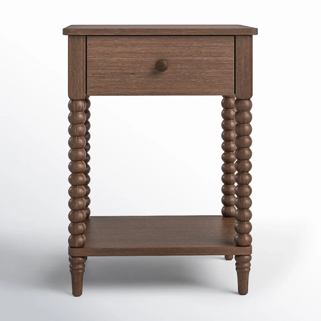
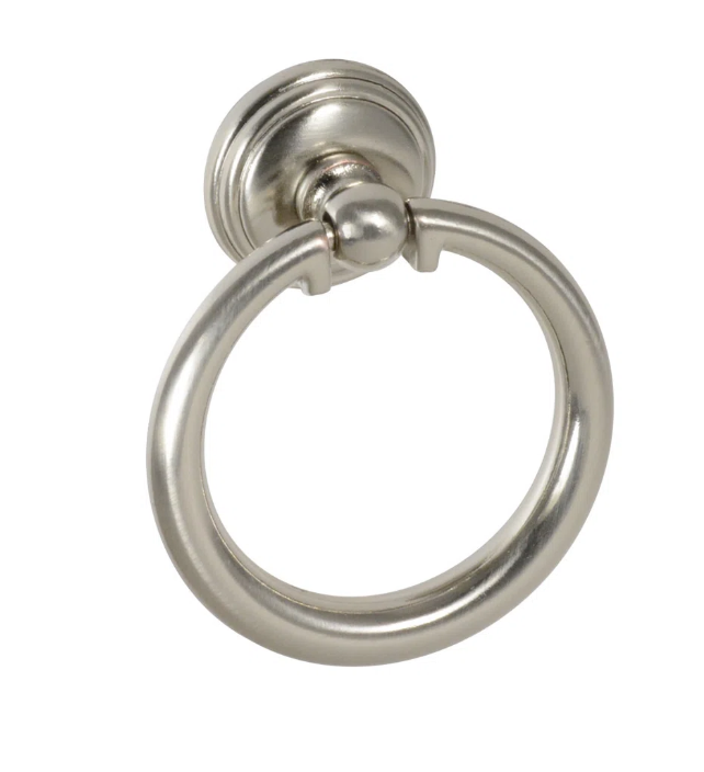
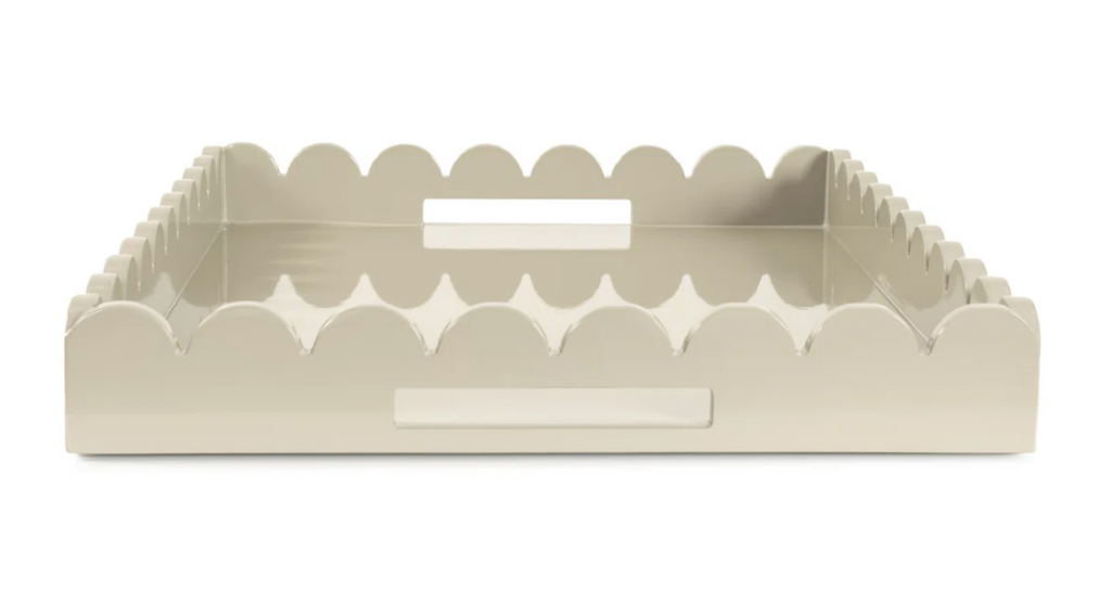
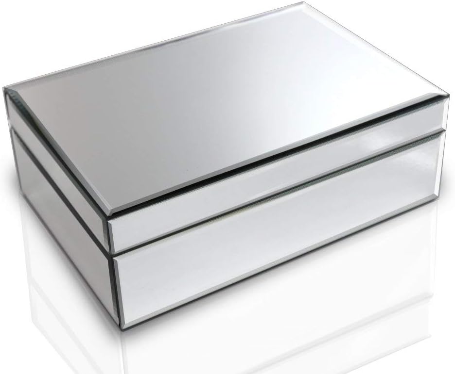
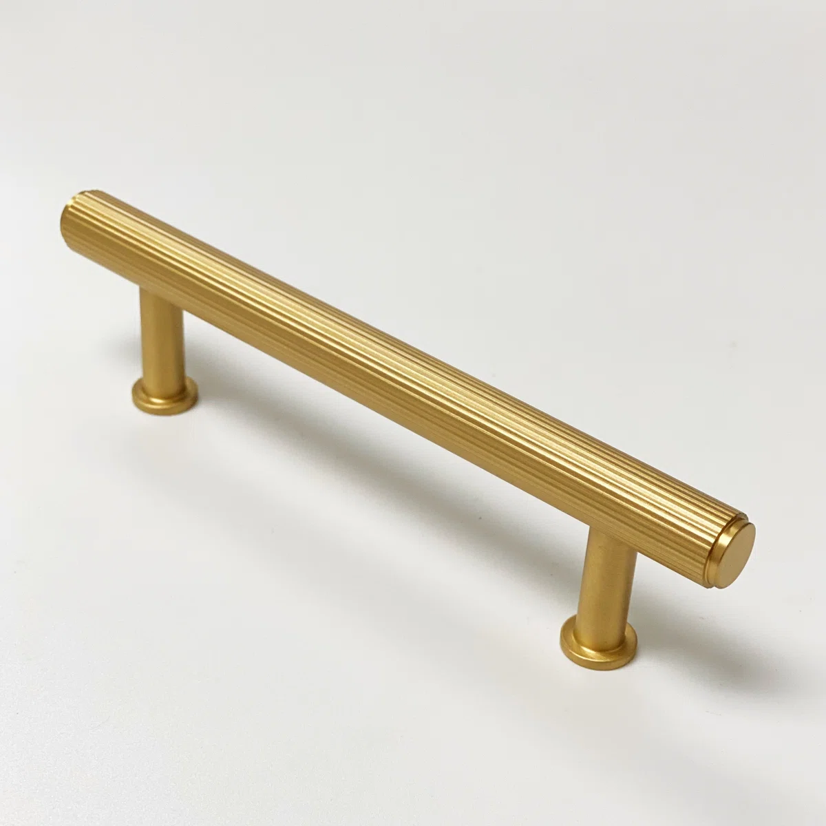
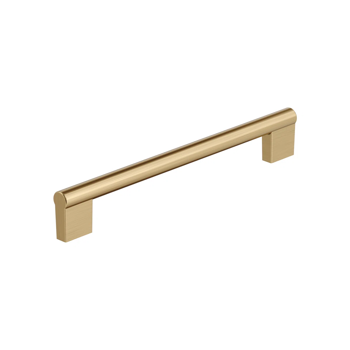
To bring the whole look together, we focused on the “jewelry” of the kitchen: the brushed gold hardware and the white quartz countertops. There is something incredibly sophisticated about the way a warm metallic pop sits against the moody depth of Lafayette Green—it’s an instant elevation that makes the entire space feel curated rather than just “refurbished.”
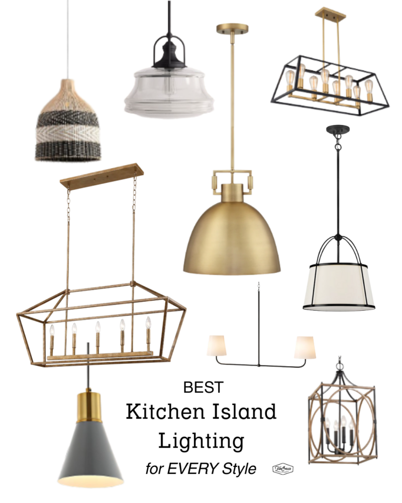
Here are some of our favorite picks for this combo
We paired this with a crisp white quartz that effectively bounces light around the room, providing a clean, durable surface that bridges the gap between the dark lowers and the bright uppers. This combination is our top recommendation for anyone wanting a high-end, designer finish; the quartz offers the look of marble without the high-maintenance “stain-anxiety,” while the gold pulls provide that final, polished touch that makes the cabinetry truly sing.
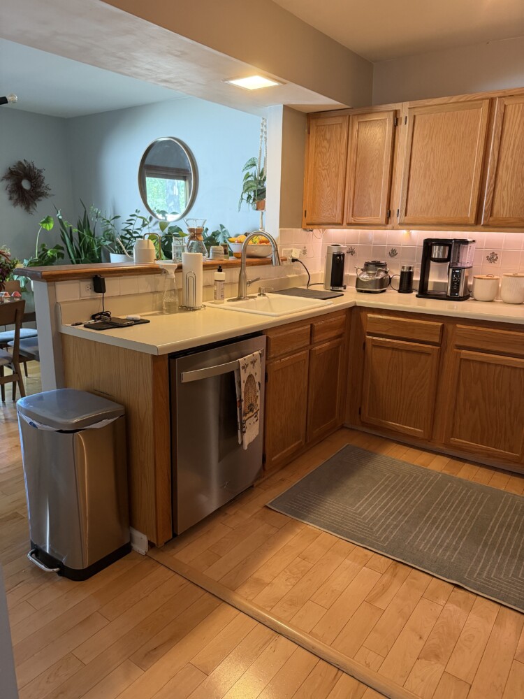
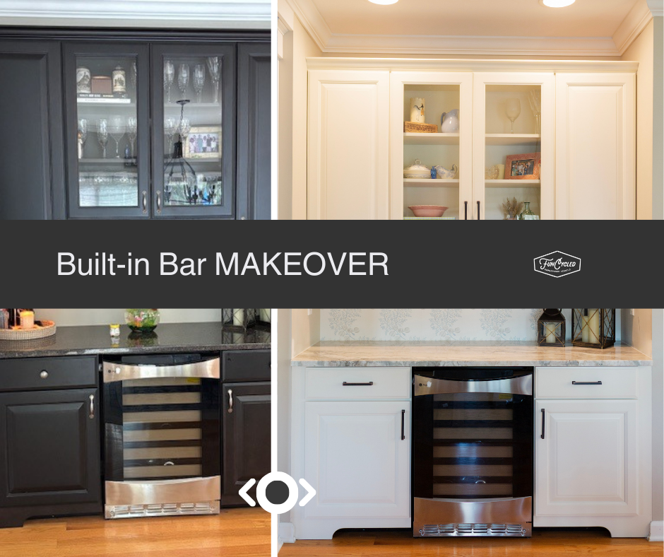
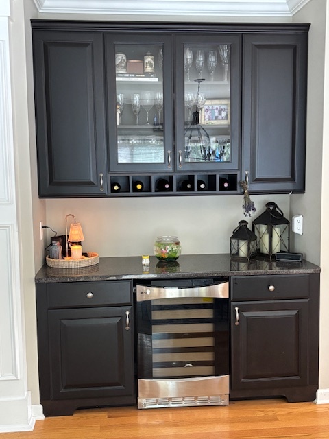
This before photo is a good example of how a ledge/half wall between the kitchen and dining area keeps things closed off & cuts the work area short.
By taking that ledge down, the sight-lines have been opened and our clients have gained additional counter space which can now be used in a variety of ways.
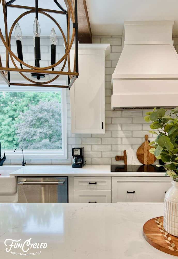
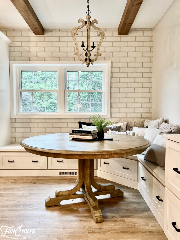
For additional kitchen inspiration, check out these transformations from FunCycled.
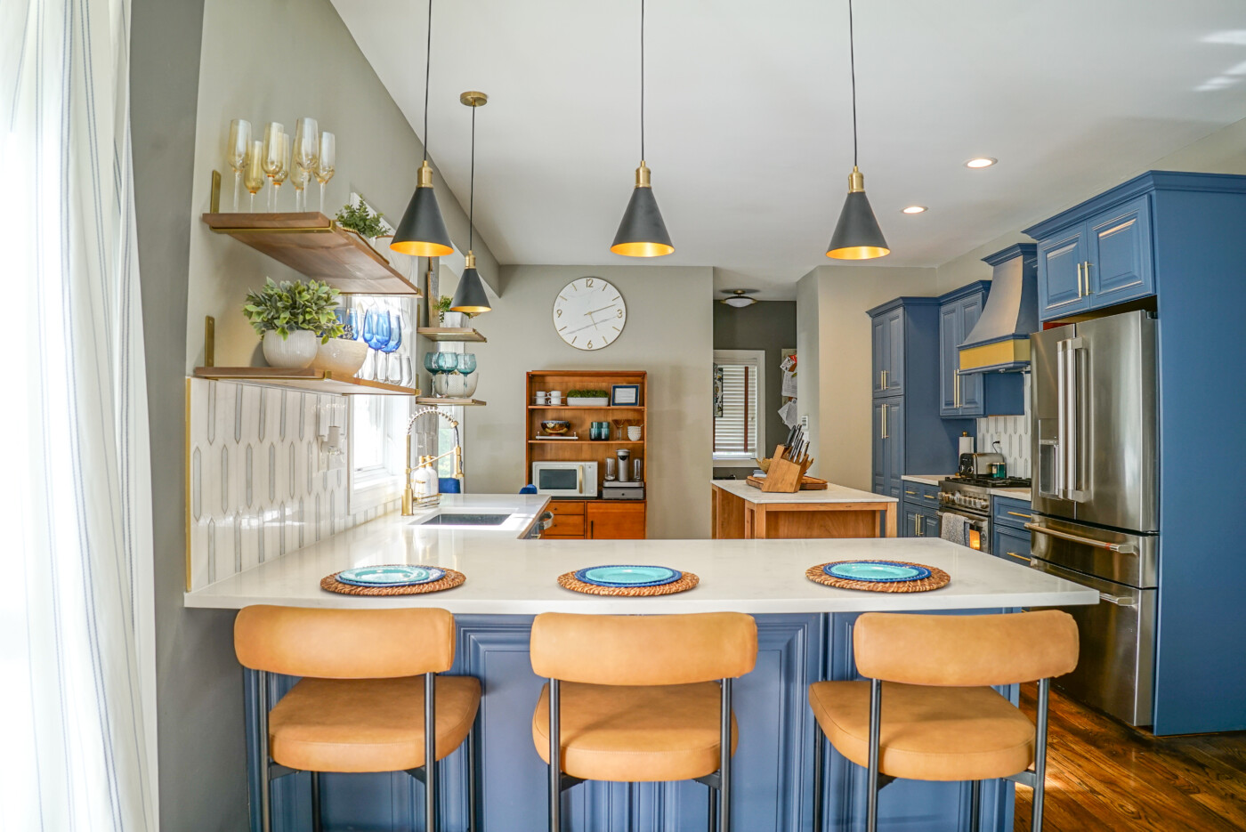
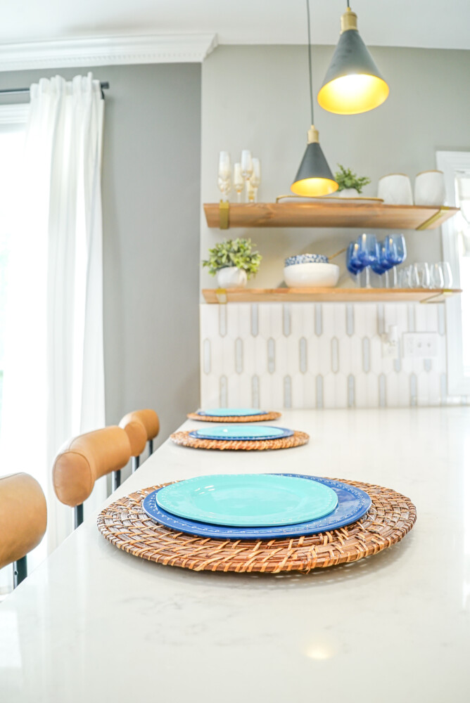
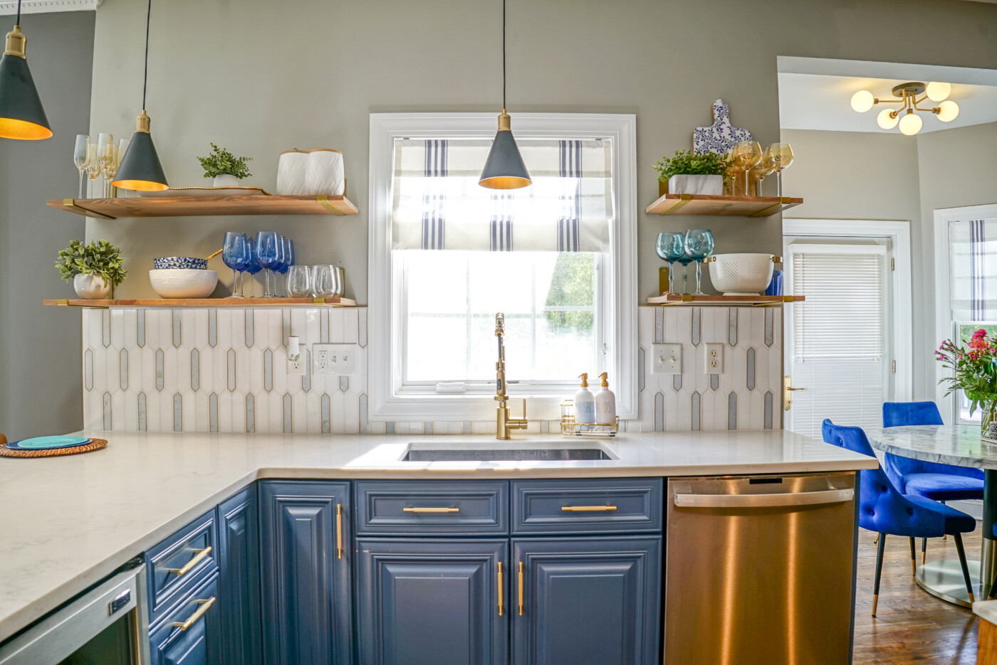
Blue & Gold Kitchen with Open Shelves
Clean and Bright Kitchen Reveal
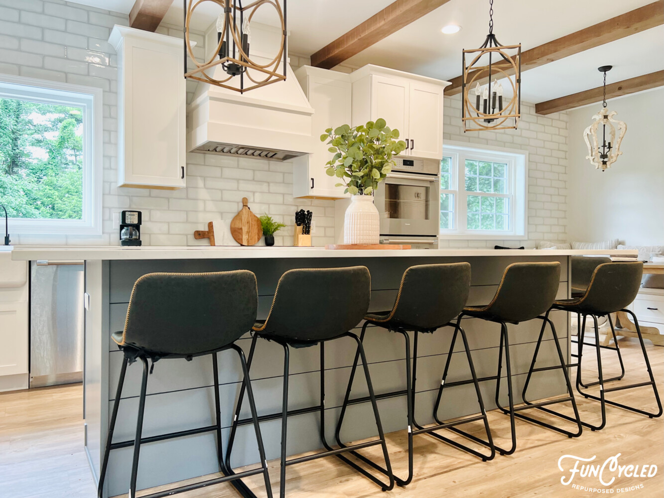
Classic & Farmhouse Feel Kitchen Makeover
Kitchen Makeover Ideas: Warm Taupe Cabinets with Black Island for a Timeless Look
Final Thoughts
I hope you have gleaned some inspiration and perhaps discovered some key takeaways for your kitchen! To see more Green & White kitchen inspiration, check out our design picks for your kitchen. Follow the link below:
Are you considering getting your kitchen cabinets painted (OR MORE!), follow these three easy steps to getting your FREE QUOTE today! If you are even remotely considering a kitchen refresh, I encourage you to CONTACT US today!

Thank you all for following along! If you’d like to get this blog in your email once a week, please sign up for our weekly newsletter by adding your email in the little box below my picture at the top of this page.
If you’ve enjoyed this post, please like FunCycled on Facebook, Instagram and Pinterest if you don’t already. Keep up to date on the newest finds, vote on colors and give your input on our creativity. We share fun tutorials, great before and after, and new design inspirations.
We offer interior design, kitchen cabinet painting, and custom built tables, barn doors, and repurposed furniture. Thank you, again, for working with us and for taking the time to spread the word about what we do.
Happy FunCycling Friends,
Sarah ; )
Exquisite Spaces. Sustainable Designs. Brighter Futures.
Note some of the the links provided are affiliate links, and I may earn from any qualifying purchases.