Posted on

Kitchen Design That’s Made in the USA

Hi friends!

I love this time of year! And even though most weekends are filled with family events and picnics, especially during Fourth of July, the pace of life is a little more casual, some might even say forgiving!

With Independence Day just in front of us, I wanted to share some ways to add some festive and practical items into your home, all with products made in the USA! To help keep our focus, I have pulled together ideas and products that can be incorporated into your kitchen!

If you are having trouble viewing the images, click here.

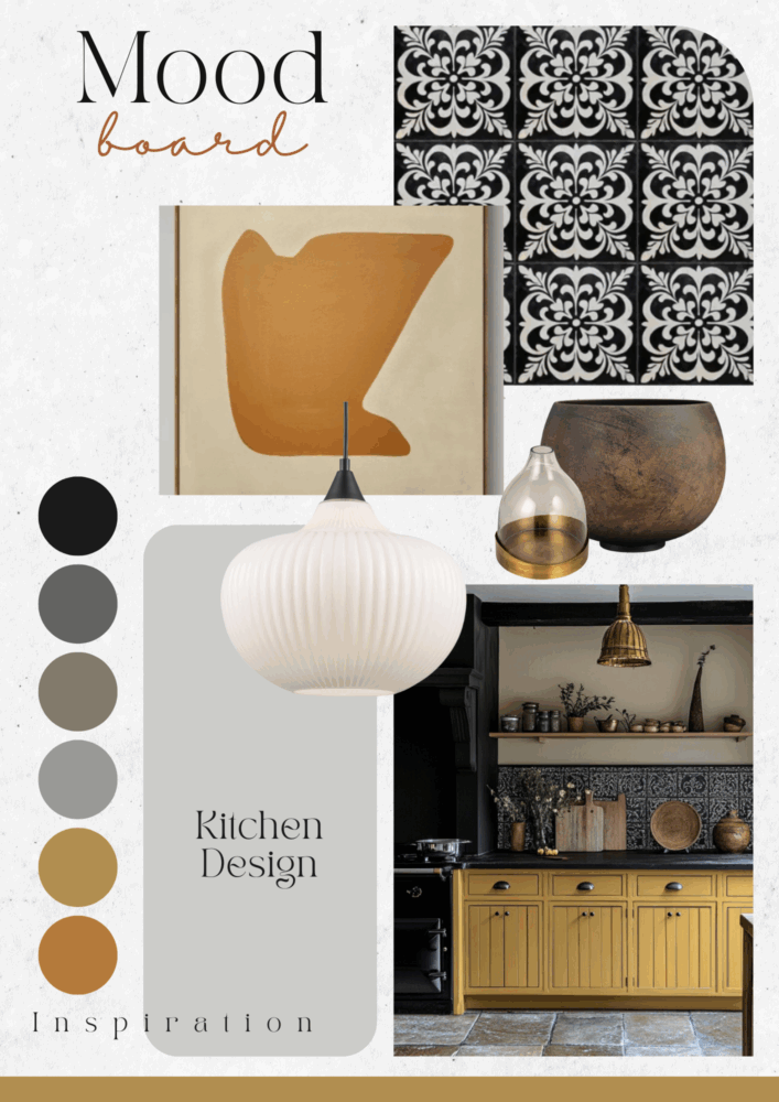
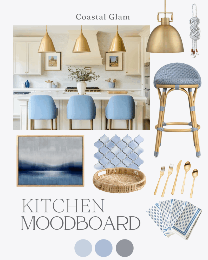
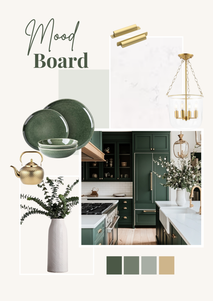
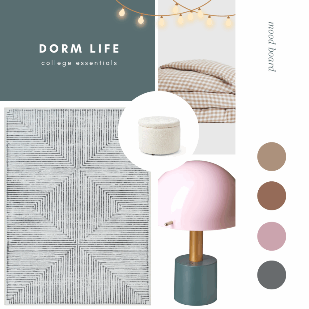
First, let’s talk inspiration! Here is the mood board I put together with the products I want to share with you!

There are plenty of times when I share a full kitchen design with you, and I love featuring our kitchen makeovers! But today, I want to spend time looking at kitchen elements that help surround your design and help support it. You might think of it as your kitchen getting the starring role but it is these elements that are the support cast and really serve to complete the design. With that in mind, let’s dive into the products I have featured on my mood board! And the best part is that I have everything linked up for you, so if you see something you like, go ahead, click and shop! Note some of the the links provided are affiliate links, and as an Amazon Associate, I earn from any qualifying purchases.
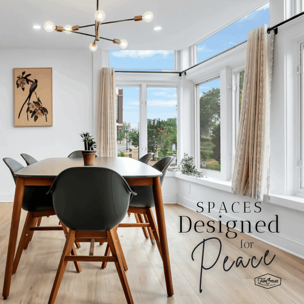
#1 ABSOLUTE ESSENTIALS FOR ANY KITCHEN: Utensils, Skillets, and Linens

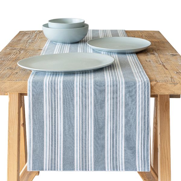
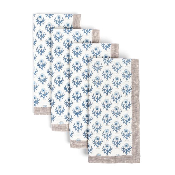
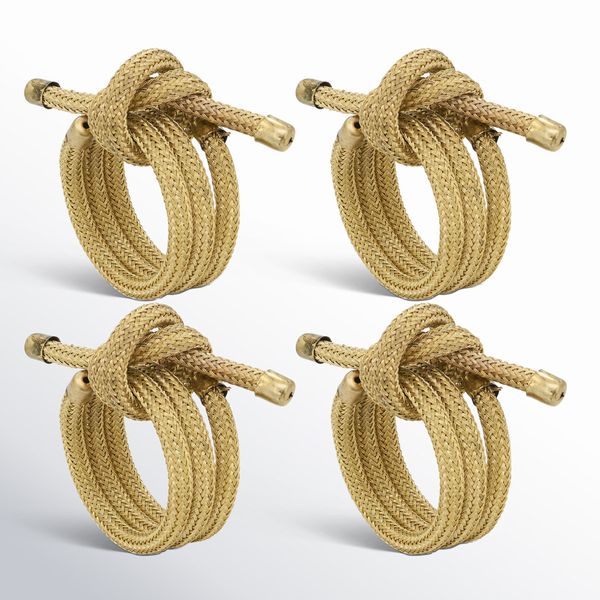
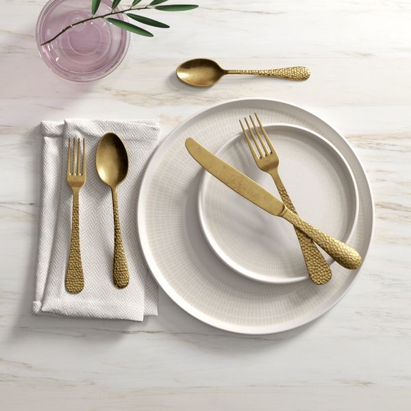
These cooking utensils come as a pack and are made of beautiful teak. The towels come in a set of six and have a really handy loop for hanging. And I am actually featuring this cast iron skillet handle cover made of leather – I just love the graining on it!

#2 HIGHLY RECOMMENDED ITEMS TO ADD: Storage Solutions and a Small Rug or Runner

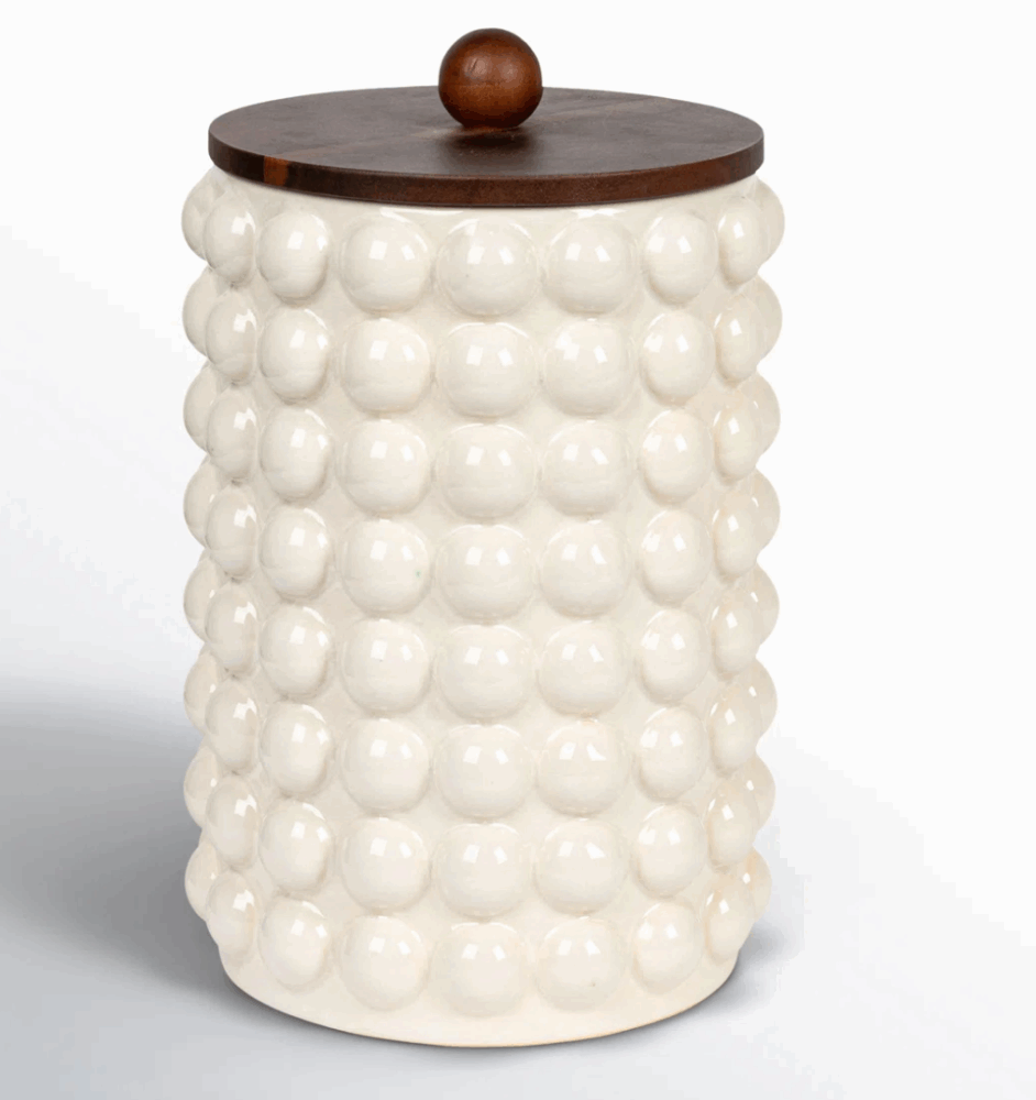
Okay, so here’s the deal, I would say these things would actually be considered more essential to a kitchen design, but I understand that not everyone may share my perspective. However, I think it is worth pointing out that having practical (oh, and cute, coordinating) storage solutions for your kitchen drawers or for dry goods is not only helpful, it sets a sort of clean vibe even when tucked behind pantry doors. Take these clear acrylic drawer organizers (which are stackable and could actually be used on a shelf or these glass canisters cute enough to live on your counter or lined up in a pantry, both keep things tidy while helping unify an overall design. That can often be a challenge in a kitchen!

Next, I always suggest a rug for kitchens. Whether you have a small kitchen or one that opens into another area in your home, adding a rug grounds the space and is a great way to introduce visual interest and color to your kitchen! Plus, having this extra cushion beneath your feet while cooking or washing dishes can sometimes feel lifesaving to your back!

#3 ELEMENTS THAT PERSONALIZE YOUR KITCHEN: Make it Inviting and Make it Your Own!

For this section, you may find my choices interesting or even confusing, but I have put them here as a means of inspiring us! First, I suggest a clock (and I do mean analog) in your kitchen. This is because too many times, at least in my experience, something gets bumped and the time on kitchen appliances is interrupted! Plus, I just like the nostalgia of a kitchen clock, eliciting images of family gathered together without the constant glance at smart watches and phones ever at our fingertips! I like this one here. Its retro vibe is so fun and even though I have featured the red color, this company offers other colors that will create that same blast from the past feeling!

Secondly, I am featuring this beautiful tote bag. You might be wondering what this has to do with kitchen design, but I want to suggest a few uses and ideas for you: 1) it could be used to store snips and garden tools for your herb garden (I know you have considered this before) or 2) if you are short on drawer storage and need another place for hand towels, roll and store them in this beautifully crafted satchel and then hang it on a decorative hook on a blank section of wall.

Next, I suggest having a supply of candles on hand. The right kind of scent will not only help with lingering odors (imagine the smell after cutting an onion!) but it is also a way of adding a welcoming touch for guests to your home!

And finally, I have added this product that I think will resignate with a lot of us: reusable food storage made from beeswax. Don’t be fooled by its cute pattern, what you see is not wallpaper! This roll is designed to wrap over food just as you would plastic wrap, but in this case you can use it over and over again! I love supporting companies and ideas that are sustainable and earth conscious!

Well there you have it! Made in the USA kitchen essentials list. I hope you have found this blog helpful and inspiring. It was really fun to put together, and I challenge you (and myself) to think a little more carefully and thoughtfully about the items we add to support the overall design in our homes!

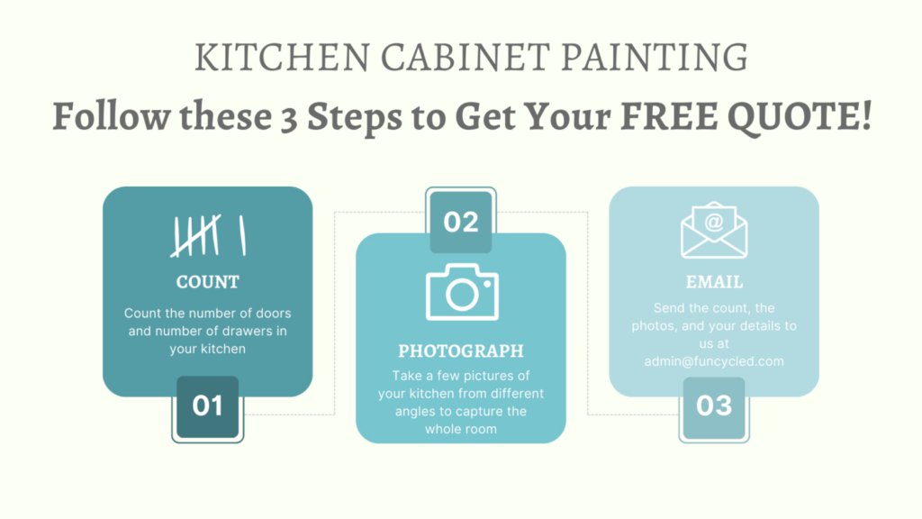
If you are not sure where to get started, I would love to help! You may want to consider our design services or would like a quote for painting your kitchen. You can use our Contact Us form to set up an appointment or to get a quote. Please check out other kitchen projects on our Kitchen Cabinet Painting page. We’ll need to see a picture of your kitchen, a list of how many doors and drawers there are, and where you are located to email you an estimate. This change ups the value of your home and gives you a whole new look at a fraction of the cost of new kitchen cabinets!

Thank you all for following along! If you’d like to get this blog in your email once a week, please sign up for our weekly newsletter by adding your email in the little box below my picture. 

If you’ve enjoyed this post, please like FunCycled on  FacebookInstagram and Pinterest if you don’t already. Keep up to date on the newest finds, vote on colors and give your input on our creativity. We share fun tutorials, great before and after, and new design inspirations. 

We offer interior design, kitchen cabinet painting, and custom built tables, barn doors, and repurposed furniture. Thank you, again, for working with us and for taking the time to spread the word about what we do. 

Happy FunCycling Friends,

Sarah ; )

Posted on

Galley Style Kitchen Makeover in Latham, NY

Hi Friends!

Do you have a kitchen that is ready for an update? This week’s post is a perfect example of how our kitchen cabinet painting, tiling, and new counters can totally transform a kitchen at a fraction of the cost of a new kitchen! I can’t wait to share the story of Tom and Mary Ann and how we transformed their kitchen!

If you are having trouble viewing images, click here.

A couple months ago when I first met with Tom and Mary Ann, I remember being greeted with excitement and joy! For over 20 years they had been waiting to update their kitchen and now the time had finally come!

Here’s a taste of what the kitchen looked like before we did our magic!

Tom and Mary Ann’s kitchen had many of the same features I see in older homes – oak cabinets finished in a medium warm wood tone and encased under a soffit that meets the ceiling, scalloped features around windows or above ranges, counters made from laminate or formica, and hardware and finishes that are basic.

After talking with Tom and Mary Ann, it soon became clear that we needed to look beyond just kitchen cabinet painting. They were ready to make bigger changes to this space and create a kitchen that would reflect their personality!

As you can see, we made a lot of changes in this kitchen. An important thing to remember when you are designing a space, and this is especially true when you are changing or altering a space that is already “done,” you do not need to start over! The small details added together make a huge impact on the design of a space! For this kitchen, we changed the drawer pulls and door handles to a matte black finish. And notice they do NOT need to match, they need to coordinate!

We added this beautiful green subway tile (Mary Ann’s favorite!) and made sure the grout worked with the paint color of the cabinets. We added the Shaker trim around the end of her upper cabinets and added crown molding to the top of the soffit to extend the eye up!

Crown Molding

Here’s a closer look at the before and after when we add crown molding to the top of the cabinets! As you can see before adding the molding and having a contrast between the cabinets and the soffit, everything is broken up, which actually makes the kitchen look choppy and smaller. In the after photo, by adding the detail of the crown molding where the soffit meets the ceiling and then painting it the same color (Benjamin Moore Simply White) as the cabinets, your eye goes all the way to the top, adding height to the cabinets and making the kitchen area seem larger!

New Counters

And look at that new beautiful quartz countertop! What a major difference just that alone makes!

Shaker Style Trim

Take a look at the before and after photos when adding Shaker trim on both the outside edge of the cabinets as well as the inside where the cabinets are next to the window. This really elevated the kitchen and adds such value!

New Sink and Faucet

The sink used to be this old worn out top mounted stainless steel sink. The faucet and handle were worn out and plagued with hard water stains that would not come clean. Our solution, change the sink to an under mounted one (still stainless and divided in two) and change the faucet to match the hardware.

Peninsula Upgrade

I especially love this upgrade for Tom and Mary Ann! We could have just painted the wood paneling that was on the back side of their peninsula, but I knew that adding the Shaker detail and changing the molding at the bottom then painting it would take this to the next level and would tie in the ends of the cabinets (already decked out in Shaker trim)!

And to tie in that green color that Mary Ann loves so much, we decided to paint the back side of this peninsula in Benjamin Moore Cushing Green but we kept the front of the peninsula the same as the rest of the cabinets, Benjamin Moore’s Simply White! Here is the front of the peninsula.

And here are the paint selections:

Making it Your Own

Another important thing to consider is making sure you know how to incorporate some of your treasured items into your newly refreshed and updated space! For Mary Ann, she wanted to find a place for her cow canister as well as be able to reuse the stools she and Tom had only purchased not too long ago. And we did it! Tucked in the corner of her kitchen, dwelling amongst the other canisters, resides the cow, and nestled under a the smooth, bright countertop sit the stools where Mary Ann and Tom’s grandchildren can enjoy snacks and time with their grandparents! Mission accomplished!

Thank you, Tom and Mary Ann, for choosing us to be part of this special project and for hiring FunCycled to do the kitchen cabinet painting, the tile/carpentry work, and the countertop replacement! We loved working with you!

What an beautiful transformation!! 

If you’d like to see how we paint Kitchen Cabinets, click here to check out our video on YouTube. 

Could your kitchen use an update? We’d love to help!! We can help pick out colors, finishes, product and do the cabinet painting, tiling, add new hardware. You can use our Contact Us form to request our design services or a quote for painting your kitchen. Please check out other kitchen projects on our For Sale page. We’ll need to see a picture of your kitchen, a list of how many doors and drawers there are, and where you are located to email you an estimate. This change ups the value of your home and gives you a whole new look at a fraction of the cost of new kitchen cabinets!

Thank you all for following along! If you’d like to get this blog in your email once a week, please sign up for our weekly newsletter by adding your email in the little box below my picture. 

If you’ve enjoyed this post, please like FunCycled on  FacebookInstagram and Pinterest if you don’t already. Keep up to date on the newest finds, vote on colors and give your input on our creativity. We share fun tutorials, great before and after, and new design inspirations. 

In addition to kitchen cabinet painting, we offer interior design, custom built tables, barn doors, and repurposed furniture. Thank you, again, for working with us and for taking the time to spread the word about what we do. 

Happy FunCycling Friends,

Sarah ; )


Posted on

Mid Century Basement Remodel

Mid Century Basement Design

Hi Friends!

I hope the start of summer is filling you with happiness and joy! The longer and warmer days always make my heart happy!

If you are having trouble viewing the images, click here.

If you have been following me for a long time (or even a short time!), it will come as no surprise that I love opportunities to collaborate with other business owners in the Capital Region! I am a firm believer in joining forces and teaming together with other people, both personally and professionally. Last week, one of our designs had the pleasure of coming to life with the assistance and project oversight of an area remodeling company based in Delmar, NY. Thanks to Quality Design and Remodel, what FunCycled saw as vision became reality for Alicia and her family!

When I first met Alicia, over a year ago, she explained her hopes for capturing additional living space in her basement in a way that would be functional and beautiful for her family. Something I can most definitely get behind as an interior designer!

Here are some of the before photos of her basement that were taken when I met with Alicia.

And here are some other before photos, courtesy of Quality Design and Remodel.

After talking with Alicia, we identified the issues that needed to be addressed and discussed some potential ideas for what would need to change. The basic layout of the basement would remain, but it needed to work better for the family. Her basement already accounted for an eating area as well as an area for lounging, but the other space was not used well and did not maximize storage nor account for the overall needs and wishes the accommodate adults and kids. To really capture the whole plan, I created 3 different design boards to account for 3 distinct design areas or zones in the basement.

DESIGN BOARD #1

Below is the first design board which was created to address the outdated stone wall feature and to create an atmosphere where adults could lounge and enjoy conversation within the ambiance of a fireplace and moody and sophisticated vibes!

DESIGN BOARD #2

One thing Alicia mentioned when we met was her desire to incorporate a bar area in their basement. We suggested using the space beneath the stairs for a bar feature (I love making use of untapped or otherwise hidden spaces in homes!) Even though Alicia and her family ultimately chose not to place the bar under the stairs, I wanted to share this design with you. I think it is a great idea!

DESIGN BOARD #3

This area that had been used by Alicia’s children was no longer working for them. The ping pong table was taking up too much room, leaving the rest of the area unusable and without purpose. The idea behind the design was to designate this area still for the kids but to create a space that would aesthetically marry with the other sitting area while maintaining a level of comfortability and practicality for the kids to watch TV, play video games, or just hang out with friends.

HERE ARE THE AFTER PHOTOS

HOW YOU CAN GET THIS DESIGN FOR YOU

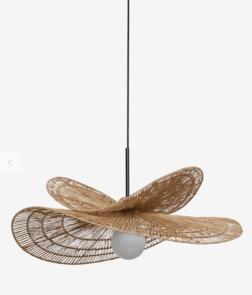
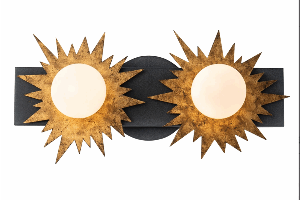
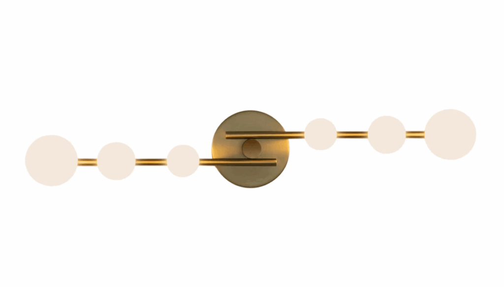
Below I have linked up many of the products I suggested for the three zones of this design. I hope you find some inspiration and will try some out for your own space!

Please note that the final products used and selected for the implementation of the design for this basement may be different than what was created originally on the client’s design board. Sometimes that happens, and it is part of the process of creating a design and bringing it all the way to finished outcome!

PRODUCT LINKS FROM DESIGN BOARDS

Fireplace Seating Area

Table with Chairs and Additional Seating Area

MUCH APPRECIATION

I want to send a special thanks to Alicia for working with FunCycled and asking us to be part of the design process for this project! We loved working with you and hope you and your family are thoroughly enjoying your reclaimed basement! Additionally, I want to give a big shout out to Quality Design and Remodel for their work in implementing the design for Alicia and her family! It looks amazing!

I encourage you to check out the blog that QDR posted a couple of weeks ago, entitled A Midcentury Modern Basement Remodel! There you will see additional photos and get additional insight into the world of design!

OUR DESIGN SERVICES

If you are interested in learning more about our design services, check out our Interior Design Page to read about our 1 Hour Quick Help, our Design Board creation, 2D or 3D layout designs, or our Full Service design services. We would love to help make your space exactly what you want and need it to be!
Thank you all for following along! If you’d like to get this blog in your email once a week, please sign up for our weekly newsletter by adding your email in the little box below my picture. 

If you’ve enjoyed this post, please like FunCycled on  FacebookInstagram and Pinterest if you don’t already. Keep up to date on the newest finds, vote on colors and give your input on our creativity. We share fun tutorials, great before and after, and new design inspirations. 
We offer interior design, kitchen cabinet painting, and custom built tables, barn doors, and repurposed furniture. Thank you, again, for working with us and for taking the time to spread the word about what we do. 
Happy FunCycling Friends,
Sarah ;)

Posted on

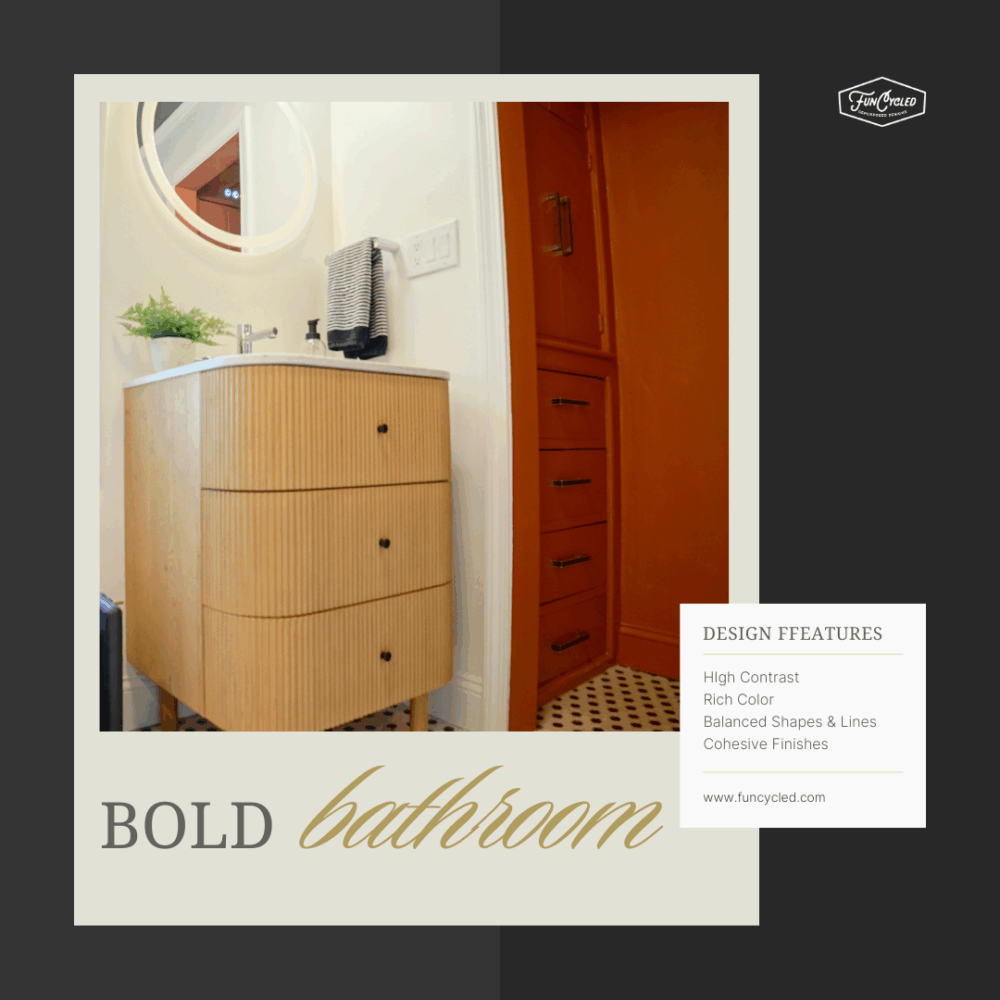
Small Bathroom. Big Design.

Black Bathroom Vanity with Wood floor tile

Hi friends!

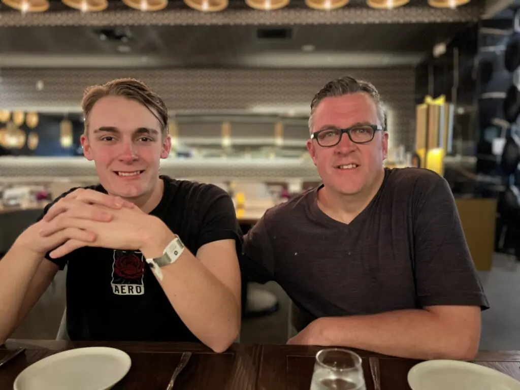
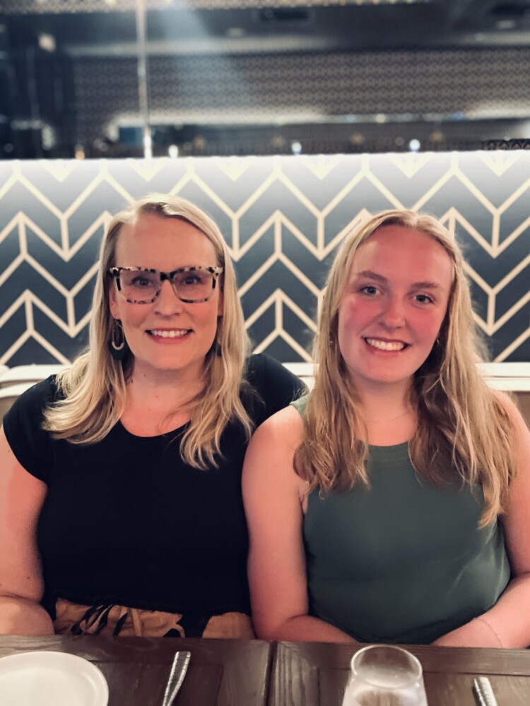
I hope you had a great weekend! My husband, John, and I just celebrated our 21st anniversary and got to spend a really special weekend together! So thankful for him! Here’s a few pics of us over the past year!

If you are having trouble viewing the photos, click here.

At one point in time, I think we can all relate to having one of those rooms in our homes that just falls flat! Maybe there isn’t anything really “wrong” with it and maybe it is even what some would say is outdated, but for some reason, it just feels blah! For one of my clients, that was the case for his bathroom. Although take a close look at the way things have been finished, and I would say that some of the choices are simply not good design.

Let’s walk through some of the things that needed to change and then take a look at how to build a bathroom like this for yourself!

Bathroom Before

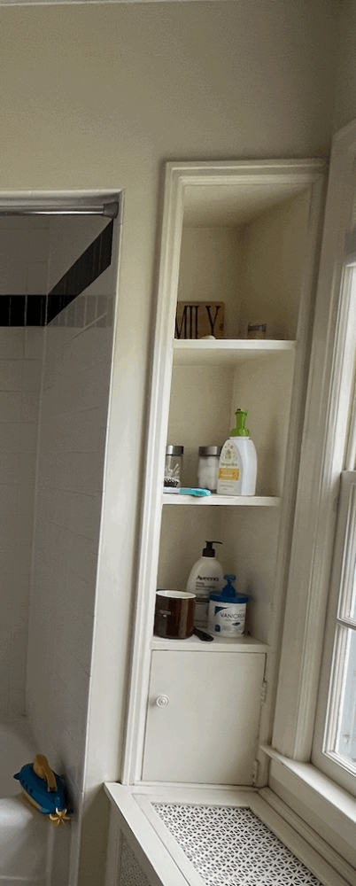
The bathroom was pretty neutral, so okay, that works, but what about what my client wanted? And was this really reflecting his personality and character? And the tub/shower combo, did it still function? Sure. But was it the most convenient? And was the tub really being used? After all, it really is exactly the type of soaking experience one would want in order to relax. And that vanity, it was okay, but the oversized sink took all of the counter top and the piece of trim at that bottom, just not a good look! That meant it was time to go to the drawing board and make some changes!

After we worked out a design concept, this is the final outcome! What a difference! One of the things I love most about this design is taking the wood tiling used for the floor and running it all the way up the wall! Not only does it add so much texture and visual interest, it makes this bathroom look so much bigger because the pattern and color keeps your eye moving forward and up!

To help guide you to creating this look for your bathroom, I have pulled together some products that are similar to those we selected for this bathroom design. Please note the products are NOT those you see in this design; they are just similar. But, they will give you the same look! You will find them linked below.

Tiles for Floor and Walls

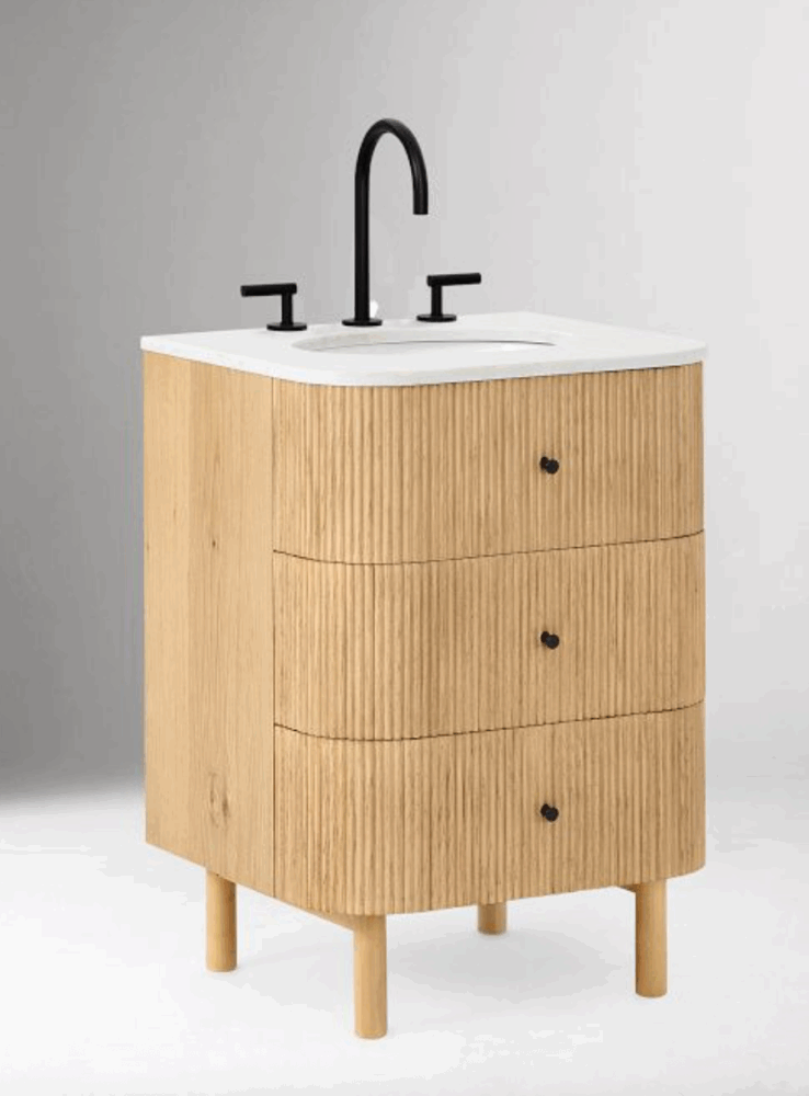
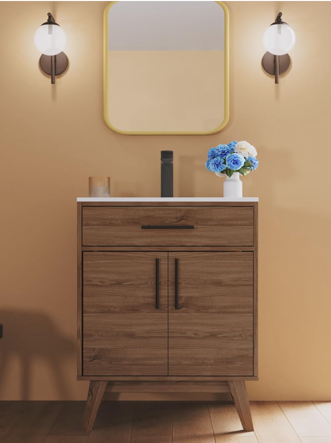
Bathroom Vanity & Wall Mounted Toilet

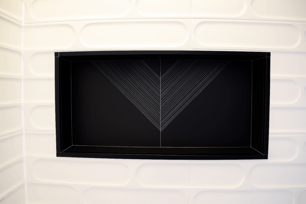
Shower Wall

Shower Head and Faucet

Mirror & Wall Art

I hope this post has inspired you to try something new and different, like using floor tiles all the way up the wall or maybe even just to consider the idea of removing your tub because your bathroom would function better as just a walk in shower! Be encouraged to give it a try!

If you are interested in learning more about our design services, check out our Interior Design Page to read about our 1 Hour Quick Help, our Design Board creation, 2D or 3D layout designs, or our Full Service design services. We would love to help make your space exactly what you want and need it to be!
Thank you all for following along! If you’d like to get this blog in your email once a week, please sign up for our weekly newsletter by adding your email in the little box below my picture. 

If you’ve enjoyed this post, please like FunCycled on  FacebookInstagram and Pinterest if you don’t already. Keep up to date on the newest finds, vote on colors and give your input on our creativity. We share fun tutorials, great before and after, and new design inspirations. 
We offer interior design, kitchen cabinet painting, and custom built tables, barn doors, and repurposed furniture. Thank you, again, for working with us and for taking the time to spread the word about what we do. 
Happy FunCycling Friends,
Sarah ;)

Posted on

Beautiful Buffet Makeover: Restoring a Piece of Family History

Gray Painted Buffet Makeover

Hi friends!

I just love this time of year! The longer days and refreshing spring breeze make my heart smile!

In today’s Tuesday’s Treasure, I want to share the story of how one gift between sisters helped preserve a piece of history for their family!

If you are having trouble viewing the images, click here.

I first met Patti by phone and we exchanged some quick information about the buffet she was hoping to have painted in the hopes of refurbishing it and making it work better in her new home in the Capital District. After seeing a picture of the buffet, I had a few ideas, but I was eager to meet with Patti and see what her vision might be!

When Patti came to the FunCycled studio to meet and make selections, two other ladies accompanied her. With bright smiles, the three ladies introduced themselves. I now learned Patti had brought her sister and daughter to help make selections for this special piece. (I love when clients bring trusted advisors with them!) In just a short amount of time, I came to learn the the buffet had belonged to Patti’s parents, and her sister wanted to ensure the buffet joined Patti as she had recently moved into a new home and was establishing her new home in the Capital Region. What a special thing! The only challenge, the buffet had experienced some wear and tear over the years and was stained much too dark for the new space Patti was now living!

Take a look at this before photo. This buffet looks a little forlorn!

It might be hard to see but there are some scratches along the bottom and some fading and scratching on the top. All things Patti was hoping to remedy. As we began to talk about this piece of furniture, how it would be used, what other colors were in the room, as well as the overall vision Patti desired, it became clear that if we were able to, we should plan to refinish the top of the buffet and paint the bottom. It would be the perfect way to refresh and update the buffet while honoring its history and preserving to remain a piece that could be part of Patti’s new home!

Here are the after photos

Here are the colors we used for this beautiful buffet. Benjamin Moore Kendall Charcoal and Varathane Early American.

A huge thanks to Patti (and family!) for working with us and letting us be part of this special project!

If you want to see how we paint furniture, check out our How to Paint Furniture post.

Thank you all for following along! If you’d like to get this blog in your email once a week, please sign up for our weekly newsletter by adding your email in the little box below my picture. 

If you’ve enjoyed this post, please like FunCycled on  FacebookInstagram and Pinterest if you don’t already. Keep up to date on the newest finds, vote on colors and give your input on our creativity. We share fun tutorials, great before and after, and new design inspirations. 

We offer interior design, kitchen cabinet painting, and custom built tables, barn doors, and repurposed furniture. Thank you, again, for working with us and for taking the time to spread the word about what we do. 

Happy FunCycling Friends,

Sarah ; )

Posted on

Keeping it Classic with this Beautiful Kitchen Makeover!

White & Gray Kitchen Makeover

Hi friends,

I hope you had a good Monday! I always mention our weekends, but really by the time you read this, you and I both have already had a Monday! Anyway, I hope the week is off to a good start!

Last week, I spent some time with my mom at the Troy Hidden Garden Tour. We had a wonderful time! It was such a beautiful day, and the garden was amazing! You should definitely check it out next spring! Take a look at these photos from our outing!

If you are having trouble viewing the images, click here.

In today’s Tuesday Treasure, I am sharing one of our latest kitchen makeovers for new homeowners Brittany and Marco. When I first connected with them, this house didn’t even belong to them. Brittany and her husband were under contract and moving toward closing, but technically, they didn’t own the home yet. So you might be asking how this could possibly work to design a kitchen space without the client living in the home. Well, the answer is, carefully, with patience, and flexibility!

For many of our clients, we are able to meet with them during a one hour design consultation (this can either be at the client’s home for a $300 design fee or at our office free of charge) and complete the design selections at that time. However, in some instances making final selections may require additional meeting and planning time beyond one hour. For Brittany, this was the best choice for her and her husband. It not only worked practically, since they did not live in the home, but is also helped them solidify the best plan for their home! When in doubt, it is worth taking the additional time to make sure everything is settled for your design! We and you want to make sure your kitchen is the best it can be!

Here are the photos Brittany shared with us when they were under contract. The kitchen is certainly a good size and has a lot of good storage, but it was far from the style that Brittany and Marco were looking for. That’s when we stepped in!

We started by selecting the right paint colors and talked through the potential of selecting a different color for the island, which I am so glad they decided to do! When you have such an open kitchen and the island sits in the middle of it all, making the choice to paint the island a different color always makes a statement!

From there, we made selections for the hardware and then moved on to other upgrades and improvements to the overall look and function to the kitchen. For example, they were hoping to update the counters and backsplash (since it was stuck in the 90’s!) and also needed to deal with little quirks like the breadbox that crowded the corner and hindered the full use of the counters.

Here are the after photos!

We painted the cabinets in Benjamin Moore Simply White and the island in Benjamin Moore Oxford Gray.

To bring the backsplash and counter up to date, we selected classic white subway tile and white quartz counters. Isn’t it just beautiful!

During our second consultation with Brittany, we discussed some additional upgrades: replacing the existing sink for a farmhouse sink and removing the built-in breadbox to maximize the counter space in the corner of the their kitchen–it is good and usable space, right?! Check out how what a difference these changes make!

A huge thanks to Brittany and Marco for letting us work with you! We loved this project, and we are so glad you chose FunCycled to to do the kitchen cabinet painting  and accompanying work for you!

It is a beautiful transformation!! 

Could your kitchen use an update? We’d love to help!! We can help pick out colors, finishes, product and do the cabinet painting, tiling, add new hardware. You can use our Contact Us form to request our design services or a quote for painting your kitchen. Please check out other kitchen projects on our Kitchen Cabinet Painting page. We’ll need to see a picture of your kitchen, a list of how many doors and drawers there are, and where you are located to email you an estimate. This change ups the value of your home and gives you a whole new look at a fraction of the cost of new kitchen cabinets!

Thank you all for following along! If you’d like to get this blog in your email once a week, please sign up for our weekly newsletter by adding your email in the little box below my picture. 

If you’ve enjoyed this post, please like FunCycled on  FacebookInstagram and Pinterest if you don’t already. Keep up to date on the newest finds, vote on colors and give your input on our creativity. We share fun tutorials, great before and after, and new design inspirations. 

We offer interior design, kitchen cabinet painting, and custom built tables, barn doors, and repurposed furniture. Thank you, again, for working with us and for taking the time to spread the word about what we do. 

Happy FunCycling Friends,

Sarah ; )

Posted on

Honoring Memorial Day with Modern Americana Interior Design

Hi Friends!

Pretty soon, we will be celebrating Memorial Day (it’s next Monday, in case you have lost track of time!) and, likely, we will find ourselves living in a mix of red, white, and blue. From clothing to housewares, and everything in between, our every day lives will be donned in this classic trio of colors which we know to represent our country, the USA! During this season and the weeks to follow, often well into the summer through Labor Day, we will see flag inspired decor and bric-a-brac decorate our decks and front porches and accompany our side tables and couches in the form of figurines and throw pillows.

If you are having trouble viewing the images, click here.

While homes outfitted in red, white, and blue decor might the image we picture when we hear something like Modern Americana design, in actuality, this design style is so much more than a clever flag display or collage of the display of decor pieces sporting a red, white and blue theme. According to HGTV, “The entire (Americana) genre aims to celebrate the geography, folklore and cultural heritage of the United States” (HGTV Online Article.)

So today, I want to have us explore what it means to incorporate Americana style into our homes and challenge us to see that this style lives beyond flag-themed decor and tchotchkes. Rather, Modern Americana style has roots that run deeper and can serve to help us appreciate the nostalgia, beauty and history of our country. As you read on, we will draw out some elements of this style and share a picture of inspiration that includes these elements and then share where you can go to create this same design in your space!

Elements of Modern Americana Design

As I said, today, I want to walk us through incorporating this design into our homes, so here we go! First, before we begin with our inspiration photo, I have drawn out some style elements that accompany Modern Americana design to help guide us. Here they are:

  • Nostalgia- using antiques, heirlooms, or even vintage inspired pieces that reflect history and heritage
  • Simplicity- an overall style that is clean items are practical and not overwhelming to the space
  • Artisan- incorporating special pieces that honor the artisan community, such as cross stitch, pottery, or hand paintings
  • Craftsmanship- using natural elements in both form and function, such as baskets, urns, or crates
  • Muted Colors – incorporating red, white, and blue is often standard but it is not forced nor firm

Our Inspiration Picture

I love this picture! It features so many of the elements that I have detailed above, conveying the overall Modern Americana design style. But more than this, I love how effortlessly this room depicts an air of national celebration while maintaining its independence from being stuck in an “all things red, white, and blue” mold!

Shopping the Room

Below I have curated similar items from our inspiration picture for you to shop with the idea you, too, could create a similar bedroom in your house. Please note that the items that have been selected below are not exact matches to the pieces seen in the photo. Rather, I have pulled together options you could use that are inspired by the picture. All products are linked to the source where you can purchase, just click on the image to shop. Enjoy!

Large Pieces

Decor Pieces

This Style Brings Me Down Memory Lane

Something that I find interesting as I write this particular blog post is that one of the first times I heard the term Modern America is when my husband John and I were on HGTV’s Flea Market Flip, Season 4, Episode 4, Happy Flipping Anniversary (you can watch on Apple TV). Long story, short. We were assigned 3 different categories for our design flipping projects: Stylish Storage, Mixed Textures, and Modern Americana. At the time, I hadn’t really explored this too much, so my instinct was to take something American made and vintage and upcycle it in a modern way. And that is what we did!

Check out my previous blogs about this fun experience here:

This has been such a fun blog for me! I hope you enjoyed it as much as I have!

If you are interested in learning more about our design services, check out our Interior Design Page to read about our 1 Hour Quick Help, our Design Board creation, 2D or 3D layout designs, or our Full Service design services. We would love to help make your space exactly what you want and need it to be!

Thank you all for following along! If you’d like to get this blog in your email once a week, please sign up for our weekly newsletter by adding your email in the little box below my picture. 

If you’ve enjoyed this post, please like FunCycled on  FacebookInstagram and Pinterest if you don’t already. Keep up to date on the newest finds, vote on colors and give your input on our creativity. We share fun tutorials, great before and after, and new design inspirations. 

We offer interior design, kitchen cabinet painting, and custom built tables, barn doors, and repurposed furniture. Thank you, again, for working with us and for taking the time to spread the word about what we do. 

Happy FunCycling Friends,
Sarah ;)

Posted on

Updating One of My Own Designs… Years Later

Living Room Design Ideas for Guys

Hi Friends!

I hope you had a good weekend and hopefully an opportunity to celebrate the mothers who have an impact on your life! We had a great Mother’s Day! I am so grateful for my mom! Here is a sweet photo of the two of us!

Today, I want to share about my process when I am working with clients on an interior design project. The really cool thing about interior design is that it does not live in a box which means it can be a great opportunity to be creative! But what can sometimes be hard for clients is knowing when and how to design a space. And that is exactly when I love to step in and help!

If you are having trouble viewing the images, click here.

Over the years, I have been able to work on just about every type of space, small or large, and have designed for almost every room in the house–kitchens, bathrooms, living rooms, dining rooms, basements, and beyond! In today’s Tuesday Treasure, I want to share about one of my clients who I have worked with several times, which means I have gotten the chance to create his first living room design and now his third living room design!

Take a look at this before photo of Ramon’s living room. At first glance, the room looks good, and it is, except for my client was ready to make some changes and some of the pieces he selected years ago were beginning to get worn out. So when we met together, we needed to work through what was working still and what needed to be changed

So when we met together, we needed to work through what was still working and what needed to be changed. After we evaluated those things, we came up with an identifiable list of things to change. After our meeting, Ramon requested a design board be compiled with product selection for him to purchase. Here is the Design Board I created to update his living room.

And here is the after photo of his updated living room space. The biggest changes are the couch, the TV console and rug. While the overall color pallet did not alter, the selections we made gave this living a lighter feel than before. We changed the couch from a dark charcoal to a medium caramel and selected a lighter TV console and switched out the plush rug for a low-pile one (which is washable, too, yay!). Then we moved to smaller items, like changing out some wall hangings, lighting, and small decor pieces to reflect a more streamlined look.

The outcome is stunning! Thank you, Ramon, for working with us over the years! We love making your home reflect who you are and function for you the way you need it to!

So When Should You Consider Updating Your Design?

There is no exact timeline for when a person should update the design in their home. The biggest thing to consider when answering this question is does this space still work for me and my family? If the answer to that question is NO, then it is time to update the design! In addition to this benchmark, I suggest evaluating your space in light of other factors. I have listed some questions to consider when evaluating this for your space.

Important Questions to Ask When Evaluating:

  • Has something changed in my daily rhythm causing this space to no longer work for me?
  • Is everything still functional and in good condition?
  • Do I still like the pieces that are in this space?
  • Are there things in this space that are outdated?
  • What are the elements that no longer work for me?

After asking these questions, if you have found that your space is not working for you anymore or so many of the items need to be replaced or updated, then it is time to think about redesigning your space so it can work for you again!

Here’s Where to Start:

If you are interested in learning more about our design services, check out our Interior Design Page to read about our 1 Hour Quick Help, our Design Board creation, 2D or 3D layout designs, or our Full Service design services. We would love to help make your space exactly what you want and need it to be!

Special Recognition

I also want to share some really great news with all of you! FunCycled has been recognized as a finalist and third place winner of the Capital Region Living’s 2024 Bestie Awards: People and Places in the category of interior design services! We are so thrilled for this honor and want to give a shout out to our clients and the community! To read the Capital Region Living Magazine that features all the area winners, including us, you can click here.

Thank you all for following along! If you’d like to get this blog in your email once a week, please sign up for our weekly newsletter by adding your email in the little box below my picture. 

If you’ve enjoyed this post, please like FunCycled on  FacebookInstagram and Pinterest if you don’t already. Keep up to date on the newest finds, vote on colors and give your input on our creativity. We share fun tutorials, great before and after, and new design inspirations. 

We offer interior design, kitchen cabinet painting, and custom built tables, barn doors, and repurposed furniture. Thank you, again, for working with us and for taking the time to spread the word about what we do. 

Happy FunCycling Friends,
Sarah ;)

Posted on

Beautiful Hope Chest Makeover

White Hope Chest with Bird Decal

Hi Friends!

I hope you are having a good start to your week! Every Sunday, I am reminded to be thankful for whatever might lie ahead for the coming week, and here we are on a Tuesday, already part way through, and it is joyous!

Also, over the weekend, we celebrated our son’s 16th birthday! Can you believe it?! I took this picture of him when we were in Ireland, and I just love it!

In this week’s Tuesday’s Treasure, I want to share with you a reminder for all of us, and it comes by way of a piece of furniture. If you aren’t familiar with the term, trousseau, get ready to learn a few things while being reminded to pay attention to the special details that bring us hope every day!

If you are having trouble viewing the images, click here.

The term trousseau is derived from the French verb, trousser, which means “to truss” or “to tuck” (Merriam-Webster). When we hear the word trousseau, a natural association is to think of a wedding or bride, and rightfully so. A trousseau is a large chest that is used to house keepsakes and important items. In previous generations, a trousseau often served as a way for a woman to store and save up special items and valuables for the day when she would marry. A more modern term we may be familiar with is the word hope chest (or okay two words!) Although the word hope chest finds its origination dating back to the 15th Century in Italy, it was introduced to the US during the 20th century (Brides online article). In turn, a hope chest functions exactly as a trousseau, and these terms are relatively interchangeable. In today’s furniture flip, this hope chest was given new life, to bring some hope into someone’s home and life!

True to it’s character, this chest is large, and it is designed to hold and keep things in safe keeping (hint this is the secret of the cedar lining used in closets, chests, drawers, etc. ) Take a look at the before photo. Does not exactly stir up the kind of sentiment you would think of given its history, but there is always hope, right?

And here is the after photo! So different, right?

The chest is painted in Benjamin Moore’s Simply White (a FunCylced go-to color!), and the top remains refinished and stained in a warm medium brown tone, Jacobean. The bird and branches are hand painted, and we added the black cup handles on the drawers to provide a nice contrast. Here’s a peek at some of the elements that make this chest both practical and beautiful. Gorgeous solid wood, deep drawer for additional storage and organization, and cedar lined. This chest is made by the Lane Furniture Company, meaning it was proudly made in the USA!

This beautiful chest has already been sold, and we know it is bringing great hope and joy to its new owners!

If you have a chest (or old piece of furniture) and would like it to have new life again, reach out to us on our Contact Us page. Or you can always browse our furniture inventory, by visiting our shop page.

Want some helpful tips on how to complete your own furniture flip, check out this how-to blog: HOW TO PAINT FURNITURE LIKE A PRO!

THANK YOU TO THE CAPITAL REGION CHAMBER

I also want to give a big shout out to the Capital Region Chamber for highlighting us this past week and sharing the FunCycled story and our dedication to the Capital District. As a proud member of the Chamber, I am honored and pleased to share the full story highlight with you! You can read it here.

Thank you all for following along! If you’d like to get this blog in your email once a week, please sign up for our weekly newsletter by adding your email in the little box below my picture. 

If you’ve enjoyed this post, please like FunCycled on  FacebookInstagram and Pinterest if you don’t already. Keep up to date on the newest finds, vote on colors and give your input on our creativity. We share fun tutorials, great before and after, and new design inspirations. 

We offer interior design, kitchen cabinet painting, and custom built tables, barn doors, and repurposed furniture. Thank you, again, for working with us and for taking the time to spread the word about what we do. 

Happy FunCycling Friends,

Sarah ; )

Posted on

Tips for an Affordable Family Trip To Ireland

Hi Friends!

How was your weekend? I hope all is going well there! If you follow us on FunCycled’s Facebook or Instagram, you saw that we went on a family trip to Ireland over spring break, and I promised I’d share more details on our blog so you can consider a trip like this, too!

If you are having trouble viewing the images, click here.

I HIGHLY recommend Ireland, and especially at this season of life that we’re in. Because Ireland is so much about the ocean and the castles, I think a trip like this would be tricky if you had small kids or if you and had trouble climbing stairs. We climbed SO many steps! We loved every minute of it, and so did our teens (14 and 15).

We chose to go oversees because we looked into flying to Phoenix for the week and the airfare alone was $3,900 for our family of 4. We went on Great Value Vacation’s site for trips under $1,000 and shared with our kids the lists of places that came up (and NO they didn’t sponsor this post lol). Their top 2 picks were Rome or Ireland. I thought Ireland would be better because Rome may bore them after 4-5 days of walking and looking at old buildings. It was such a great spot because it came with a rental car, and jet lag was no joke for us. I think if we didn’t have driving each day where the kids could sleep in the car, it wouldn’t have been enjoyable. They needed the rest!

We started our trip in Dublin! When we were in the airport getting ready, we met a college student from Dublin who was so sweet and looked through my itinerary to give me her tips for the best places to go!

We spent the first day in Dublin, and went to Trinity College first. It was such a beautiful campus and you can also view the Book of Kells while you were there. Unfortunately, we didn’t have time but really wanted to. So many people recommended it to us!

If you walk from Trinity to Grafton Street, you’ll see some amazing stores, an icecream shop called Murphy’s and the best hot chocolate I had in Ireland at Butler’s Chocolate Cafe. I was sad that Ireland’s hot chocolate didn’t compare to Paris or London’s. This was the only spot that I liked the hot chocolate!

We also had a really good breakfast at the Lovely Food Co.

We rented a car for this trip, but driving in Ireland is nothing like here in the States. The roads are more narrow than our driveway, you drive on the opposite side of the road, there’s no shoulder, and the speeds allowed feels like there’s no way you could actually go that fast. We headed to the Hoban Hotel in Kilkenny. I liked this hotel the best of all the ones we stayed in. Really cute design, comfy beds, and pretty good food.

Day 2

We headed out to Kilkenny Castle for a tour! This castle was really beautiful and very ornate inside. What set this castle apart from the other castles on our trip were the gardens. They were really beautiful, and it was built next to a river.

Be sure to go across the street from the castle for the restaurant, shops, and gardens. They were really cute!

My therapist told me her favorite spot in Ireland was the Rock of Cashel, and it definitely did not disappoint! It was built in 1101, and that’s hard to even wrap my head around. I felt like I shouldn’t even be stepping on the stones.

We headed to Celtic Ross Hotel, and it was just ok. It wasn’t that comfortable, and it felt really out of the way from the places we were going. Our very favorite meal was a restaurant right near this hotel though! It’s called Jack’s at Pilgrims Rest ; they forage everything from 10km or less from the restaurant, and you could tell. It was all so fresh, creative, and unique. I also loved the design of the interior.

Up next we visited the Blarney Castle which was beautiful in a different way. It was more like ruins, but it had beautiful grounds and an old house and carriage area you could tour. We didn’t give ourself enough time for this. I would recommend 2-3 hours! Oh, and YES the kids kissed the Blarney Stone.

When we asked the locals about what we should do, they recommend that we drive on the Wild Atlantic Way. There aren’t many places to pull over and get good photos in Ireland, but here are a few spots we were able to so you can see how beautiful Ireland was!

We also went to a town called Dingle (insert every inappropriate joke here). It was cute, but I’m not sure it was worth the drive. If you’re in the area, you should definitely stop by! We found an adorable cheese shop called The Little Cheese Shop and bought cheese and fresh bread for lunch. Cheese in Europe is so much better than in the States.

We also stopped by a spur of the moment castle on our drive back to the hotel at Ross Castle, and it was such a special surprise. It was completely rebuilt to an original state, and it was beautiful!

After that tour, we had dinner at Murphy’s Bar in Killarney. This was our favorite dinner during the trip! Definitely stop by if you’re in the area. We actually wished we had skipped on Dingle and spent more time in this town. We didn’t get to spend any time walking around to the different shops.

Then we moved to the Inn at Dromoland and stayed there. It was really pretty inside! Up next was our favorite part of the trip; we went to Bunratty Castle which is a huge village and castle with so much to do! We wished we had gone earlier in the day. You could easily spend 5 hours at this stop. They have a medieval dinner option in the castle, and we weren’t originally going to, but we changed our mind last minute and went. It was SO MUCH FUN! We ate with our hands, they had live music, and it was such a unique experience. Definitely worth the money.

The next day we drove of to the Cliff’s of Moher which is one of the most iconic spots to see in Ireland. The only day we had to go was during a huge storm with strong wind warnings. It was the most powerful wind I’ve ever felt! Despite that, it was absolutely beautiful, and I highly recommend it. We couldn’t even get a good photo because the wind was so painful. This might be my favorite family photo of the trip though. 😂

The waitress at Jack’s at Pilgrims Rest told us that if we were up at the Cliffs of Moher, we needed to make the trip to Burren Perfumery so we did! This was my second favorite spot on the trip. They have flower gardens you can stroll through, a place where you can make your own perfume, and a shop where you can buy perfume from them. I bought their Winter Woods scent and LOVE it!

We drove up to Aillwee Caves after the perfumery! It was a quick cave tour, nothing that unique since we have cave tours that are bigger in upstate NY, but the drive there was absolute stunning!

The next day (Sunday), we drove to Elevate Community Church in the morning on our way back to the final day in Dublin. Everyone was so kind, the music was great, and we really enjoyed the preaching, too.

Once we got back to Dublin, we went to EPIC the Irish Immigration Museum. The kids didn’t love it to be honest, but it was good to learn about the history in Ireland.

Then we walked to the oldest pub in Ireland, The Brazen Head for an early dinner. My airport friend told me only to go during off times or we’d never get in so we went to dinner at 3pm, and it was still full. Thankfully, we were seated right away, there was security outside, and the place was hopping with Irish music. People were smoking inside which I didn’t expect, but it was such a cool experience. So glad we did it!

Then we walked from there to the Guinness Store house! I was unsure if I wanted to bring teens to a beer factory, but most people that we asked who were from the area said it was their favorite thing to do in Dublin so we tried it. Once again, so glad we did! It was such a beautiful factory, they had a Celtic concert we were able to go to with dancers and a band. If you go to the top of the building you can see the whole city of Dublin and there was even a rainbow over the whole city! What a perfect way to end out trip! Then we took a carriage ride back to our car.

Many people ask if we’d go back. Maybe one day, but I felt like we saw so much and really have a good feel for the country. We’ll probably try somewhere new next time! I highly recommend going though! It was as peaceful, beautiful country with friendly people everywhere!

f you end up visiting Ireland and find other spots you like, drop the in the comments for other readers to see and enjoy! 

There is a box at the top right of this page to enter your email address to receive notifications by email when I post something new on this blog. Please sign up today! 

Happy FunCycling Friends,
Sarah ;)

If you like what you see, please like FunCycled’s Facebook page to keep up to date on the newest travel tips, interior design trends, and kitchen and furniture repurposing projects. 

Send us a note with if you’re interested in our design services or custom furniture using our contact pageOr buy something that we’ve already designed from our furniture for sale page.