Hi Friends!
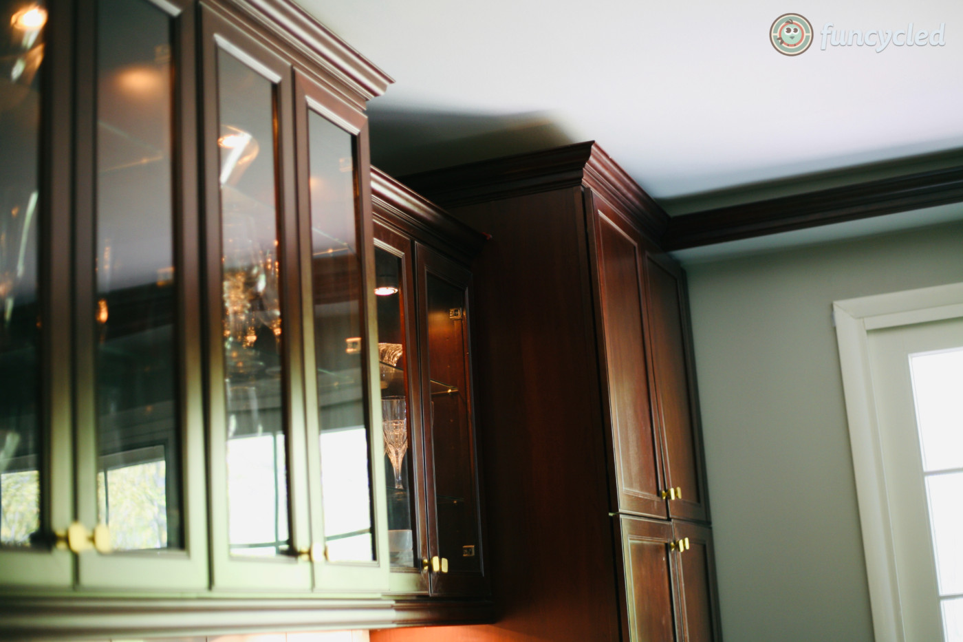
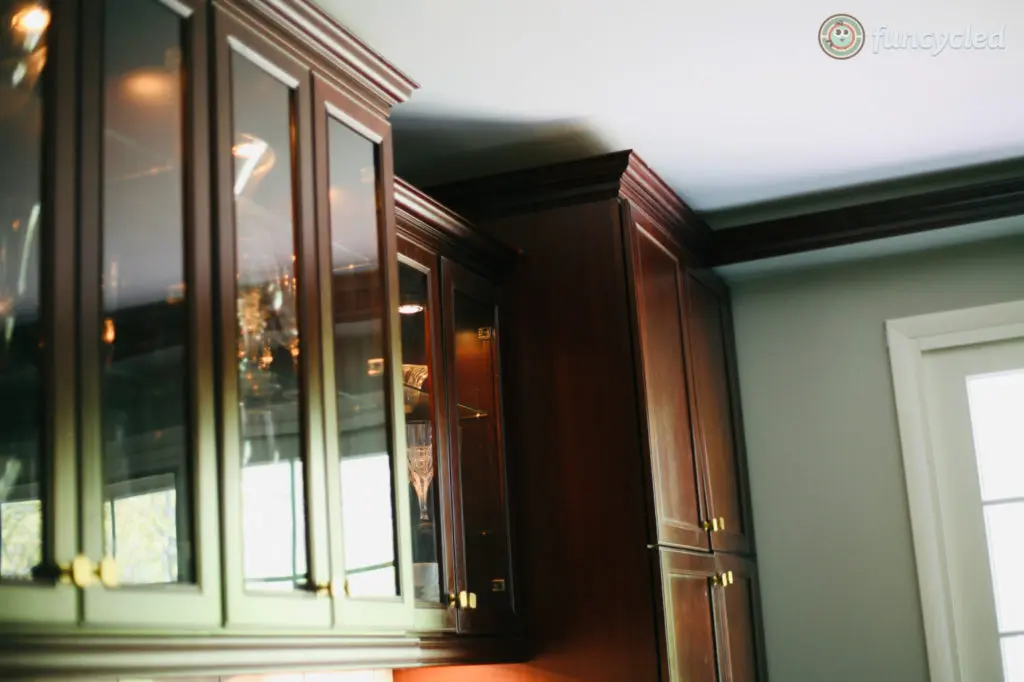
Say what?!?! Keep the cherry cabinets?? If you know much about us, you know that painting the cabinets are almost always my first go to, but in this case, our design client, Andrea, wanted me to make her kitchen feel more updated without painting all the cabinets. Part of doing repurposed designs is looking for ways to keep what’s existing and make it work again. In many cases, painting the cabinets is the way to go. In this case, the coloring wasn’t orange or yellow so I thought it was doable and got to work seeing how I could make it work for her.
Check out the kitchen at her design consult: (don’t mind my paperwork and laptop on the island)
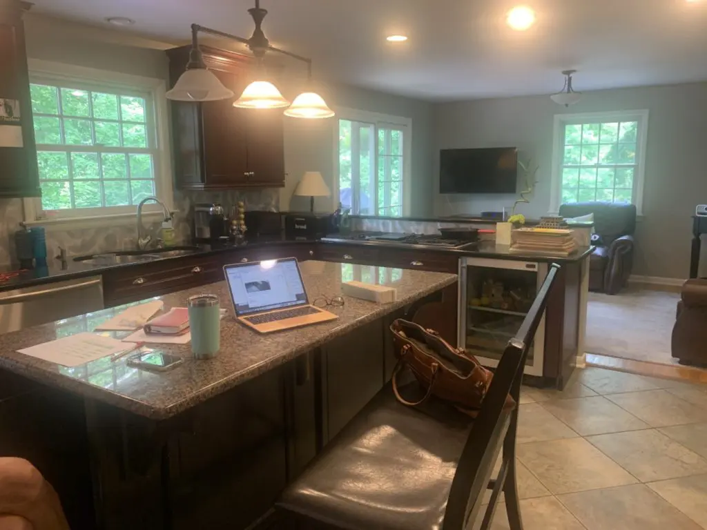
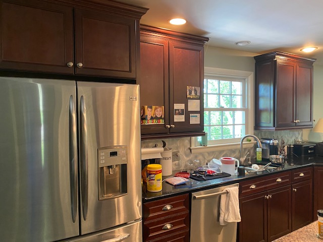
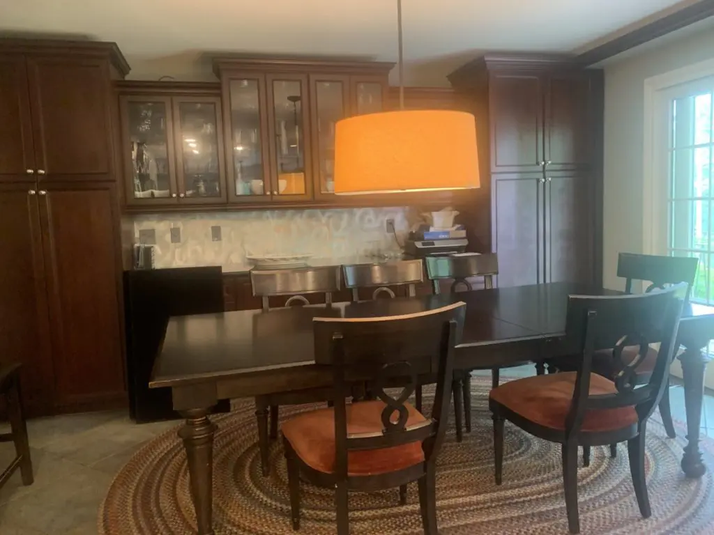
Not only were the cabinets staying, but the flooring was staying as is. The flooring had a mixture of green and gray in it so we decided to bring in some hunter green color in the space. That happened with the hunter green stools that Andrea found and I LOVE them.
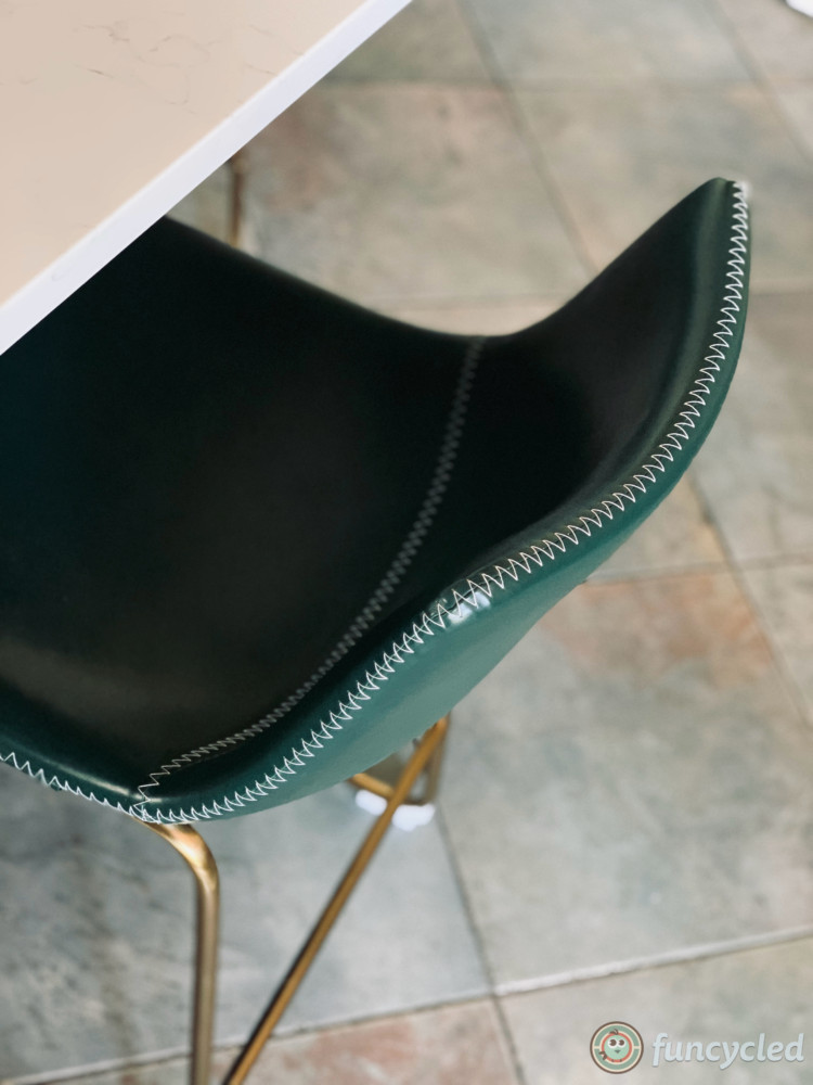
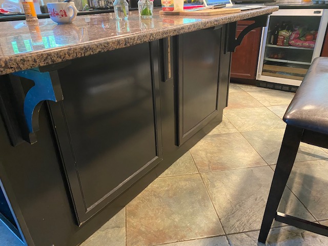
Even though the majority of the cabinets were going to keep their original finish, Andrea was ok with painting the island Benjamin Moore’s Black, adding an X to either side. One side is a door so she can have storage behind it and the other side is stationary because there isn’t room for storage. She also had quartz installed on the top of the island. The outside counters are black granite already so I felt like they could work with the design, but the granite on the island made the kitchen feel outdated.
Check out the island alterations:
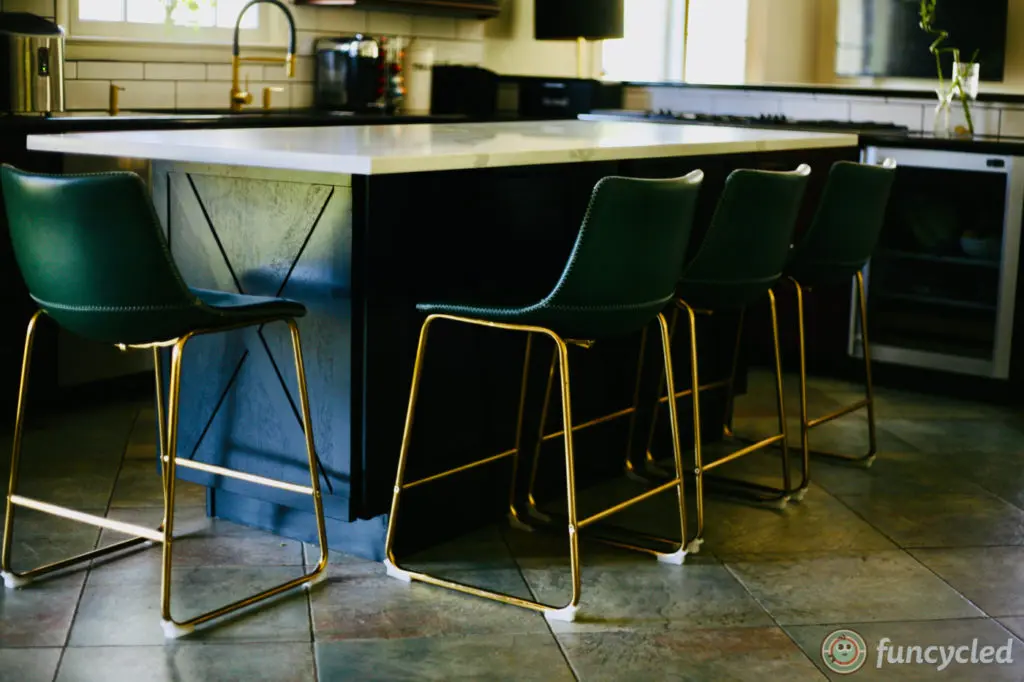
See how the gold, black and hunter green bring in all the coloring the floor, but make the kitchen feel updated now? Such a HUGE difference in this kitchen.
Another big change in this kitchen/dining area is the lighting. Check out the new light over the table.

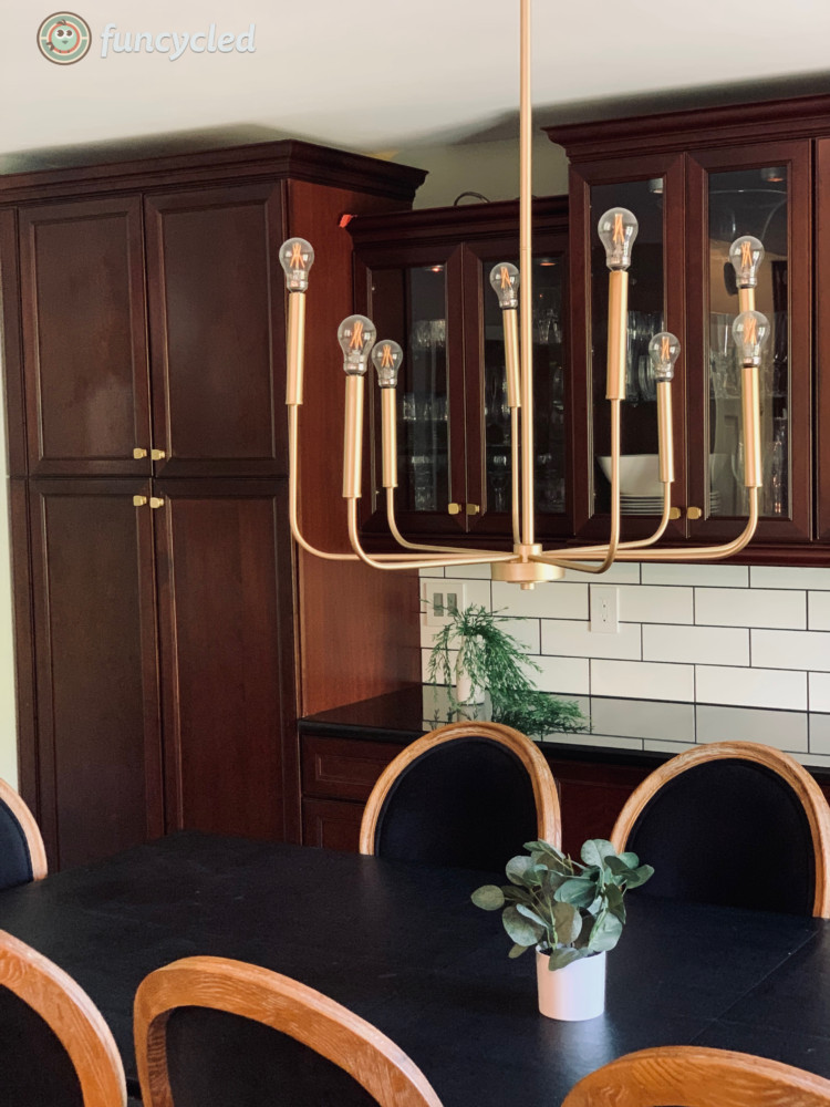
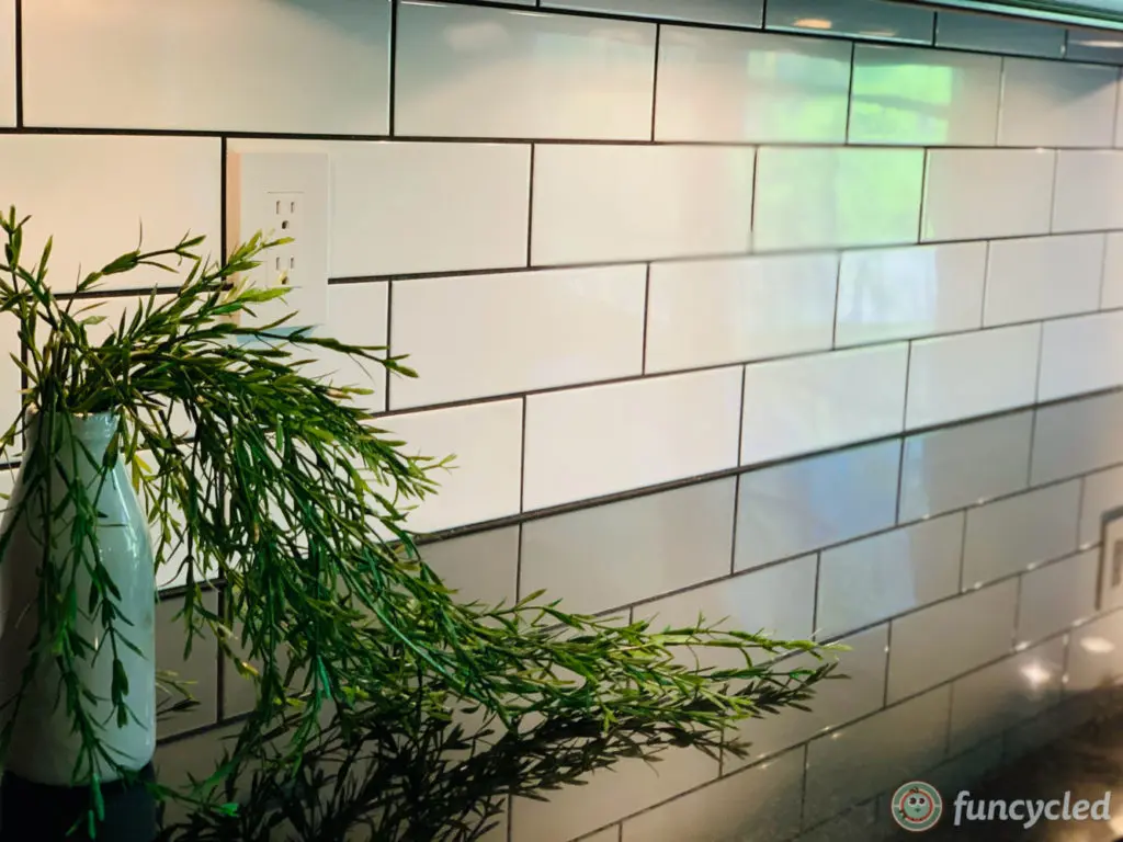
The backsplash in this kitchen was aluminum sheets and that definitely made it feel outdated. So we switched it out to an oversized subway tile with black grout. Black grout was key because it feels more modern and brings in the black on the island and dining room chairs.
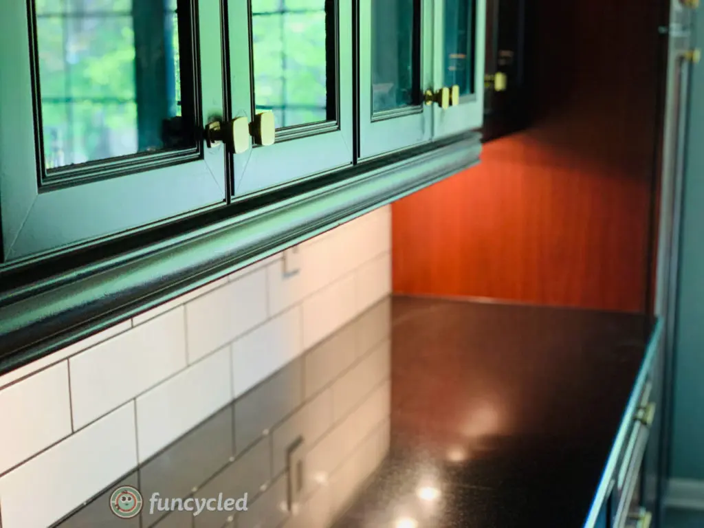
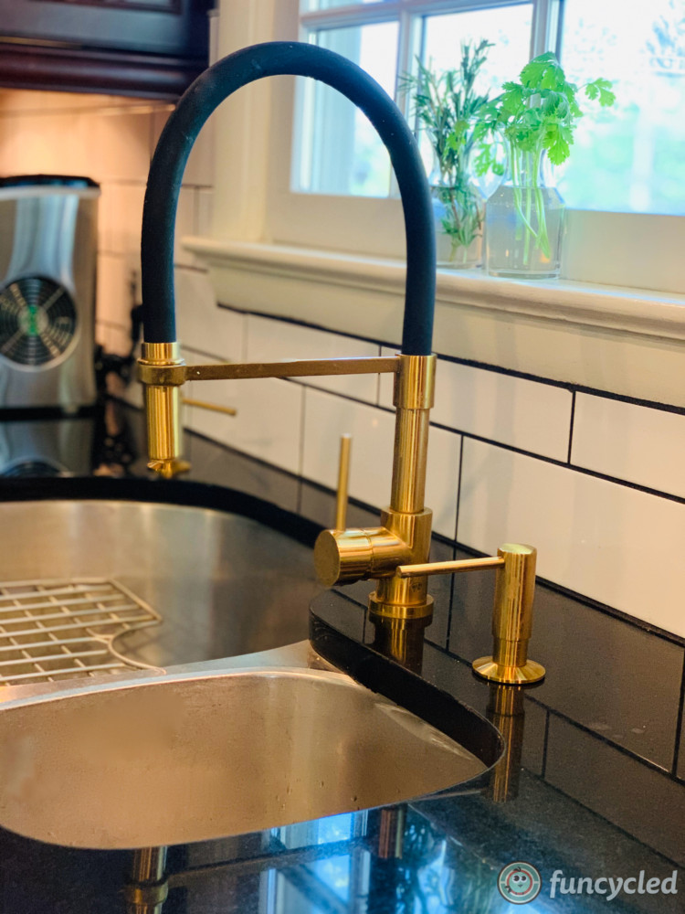
When you’re working with existing wood cabinets and you want to modernize them, you should try a bold finish like gold and a more modern style to make a stark contrast against the cabinets and bringing them a more updated feel.
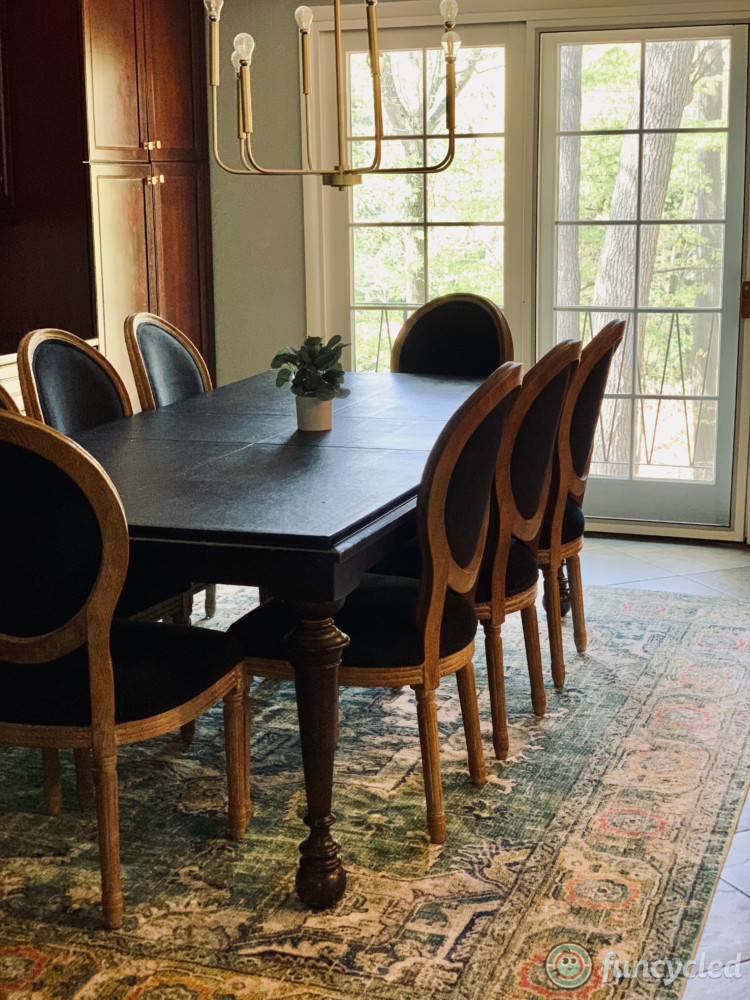
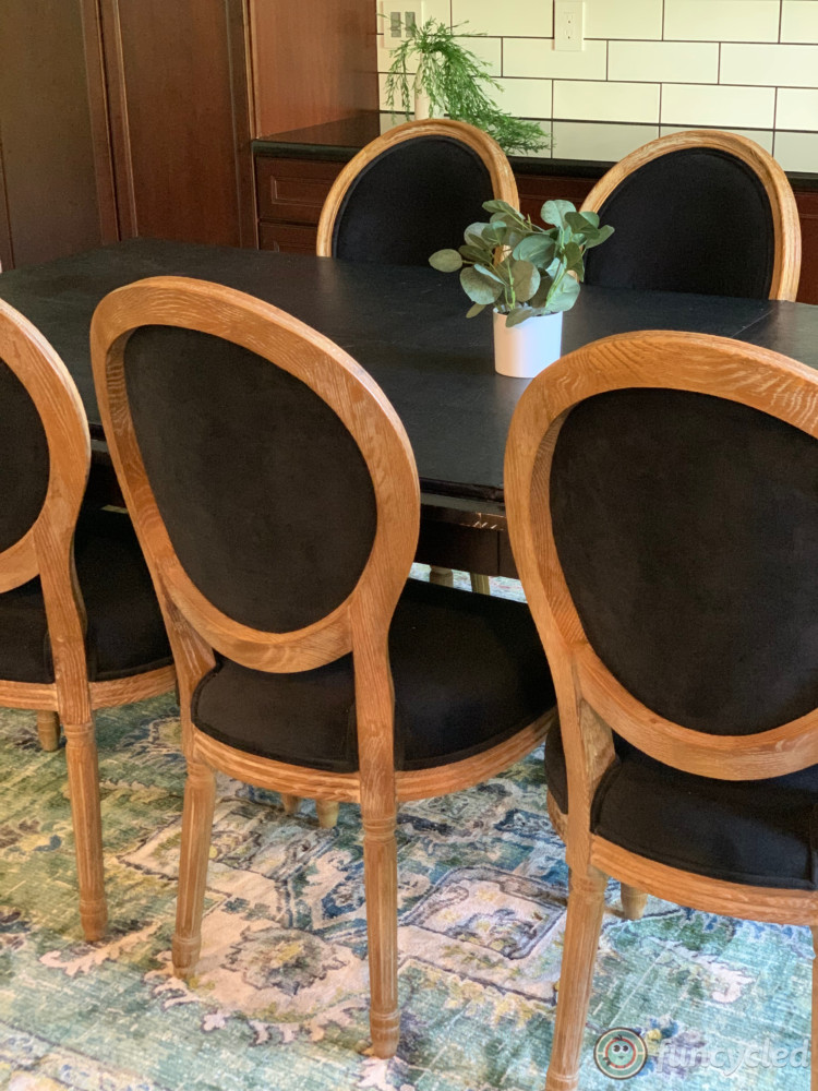
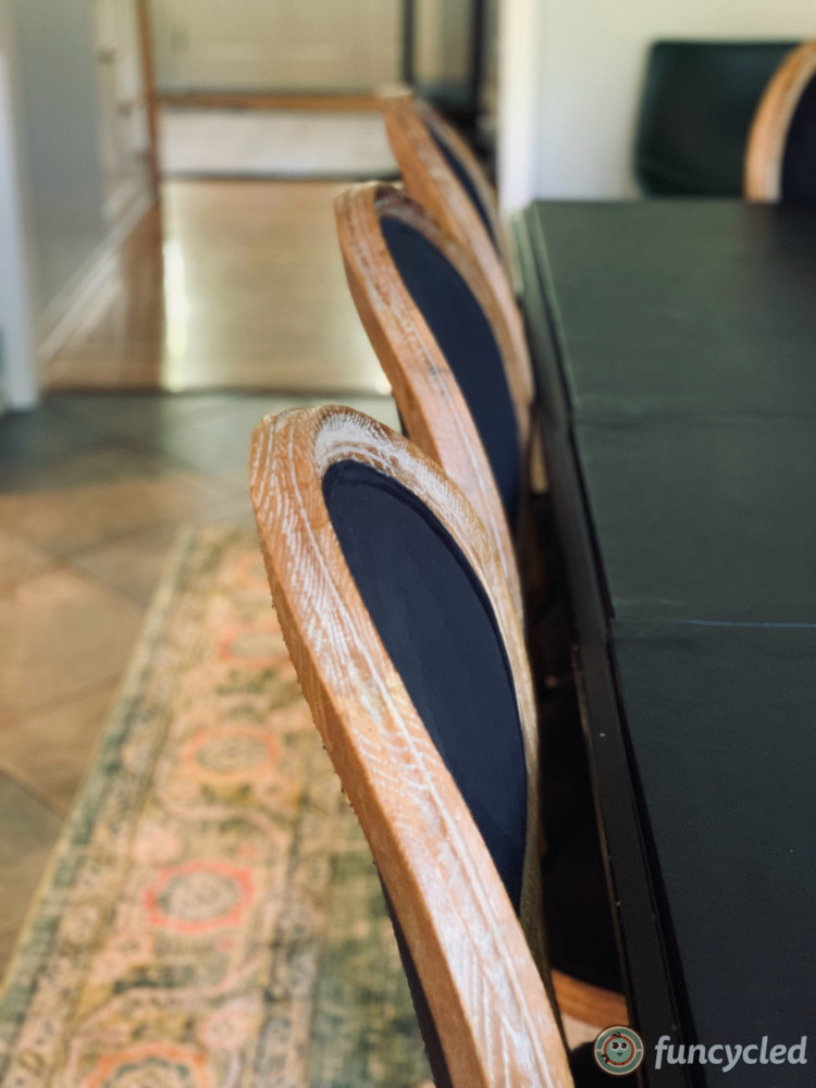
In the eating area, we kept the original table, but added new chairs and a new rug.
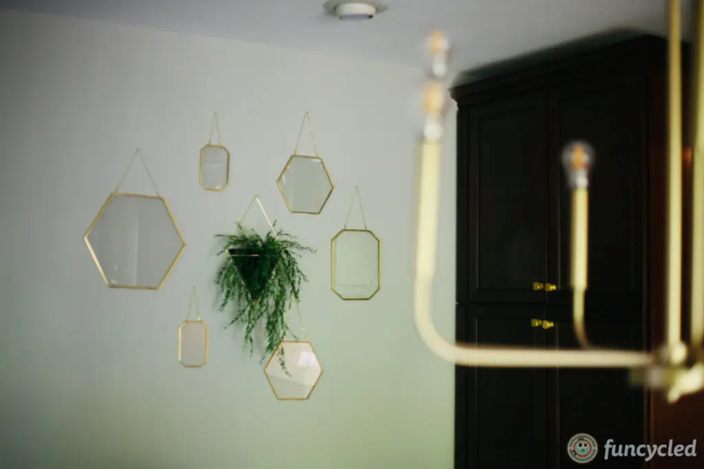
We also created a little gallery wall (we still have to add the flattened greens to the glass), but you get the idea.
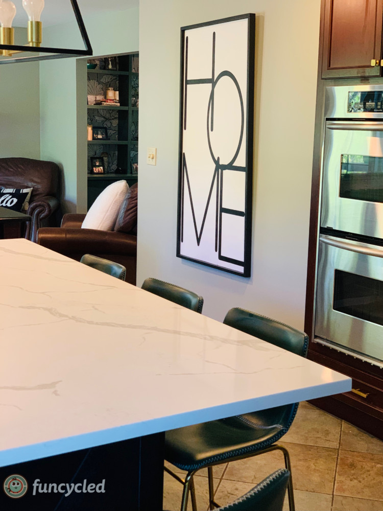
Oh, and we custom built an oversized sign for her that said HOME. It’s about 4′ tall!
Here’s the whole kitchen repurposed design!
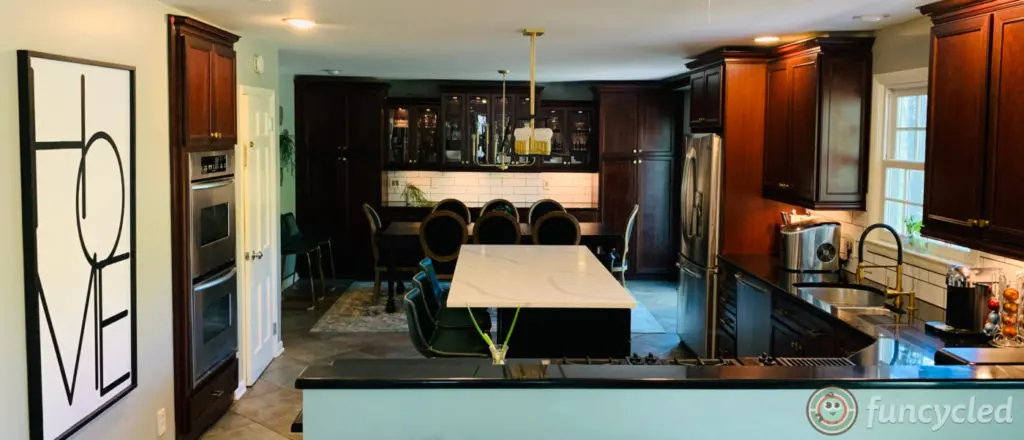
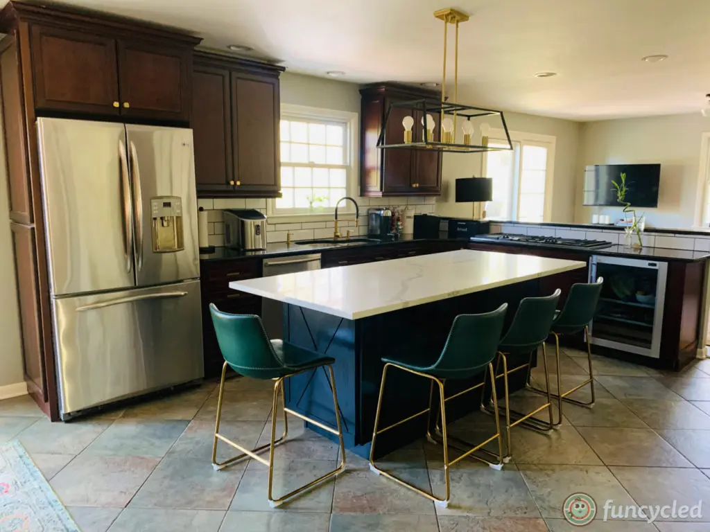
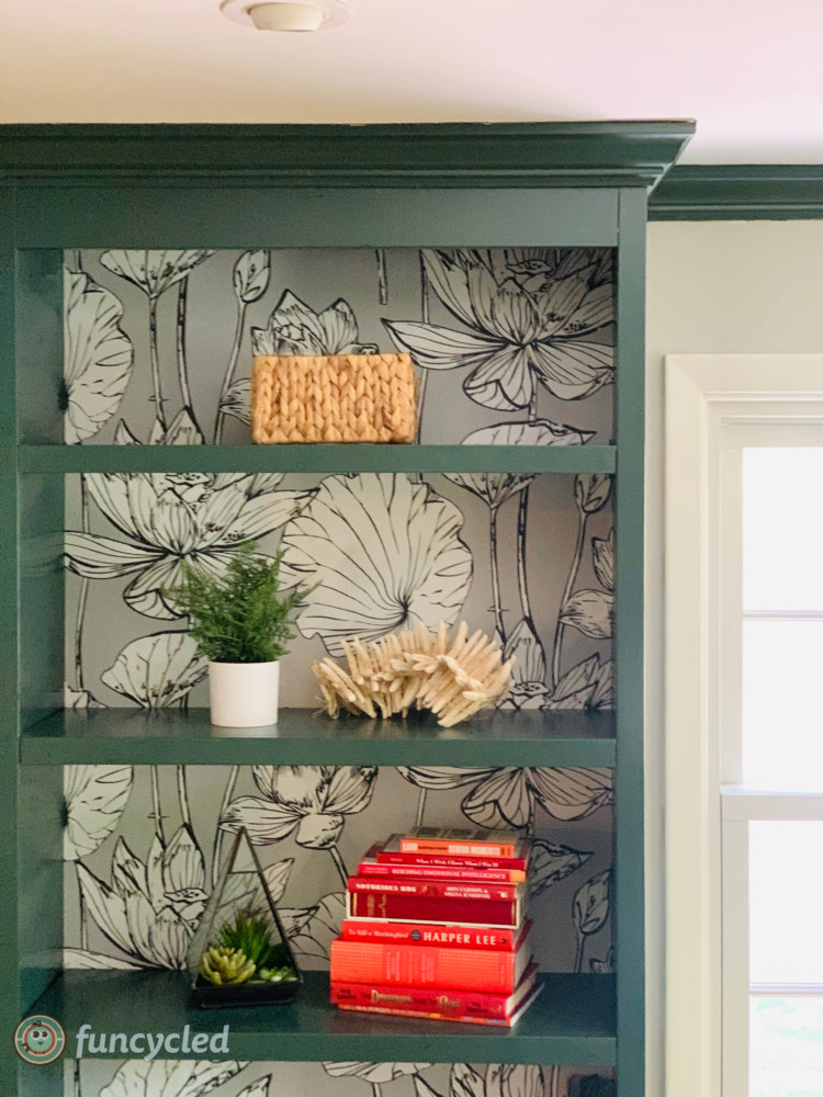
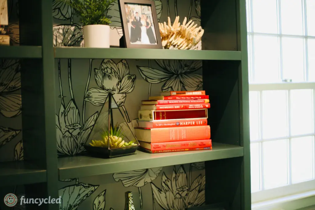
What a difference a good design can make in an outdated kitchen, right?? Thank you so much for the business, Andrea! I loved working with you on this and on your living room makeover. Oh…. and just so you can all see, we added green to her built ins in the living room off this room. Look how pretty! This color is Goodwin Green CW-555.
Could your kitchen use an update? We’d love to help!! We can help pick out colors, finishes, product and do the cabinet painting, tiling, add new hardware. You can use our Contact Us form to request our design services.
Thank you all for following along! If you’d like to get this blog in your email once a week, please sign up for our weekly newsletter by adding your email in the little box below my picture.
If you’ve enjoyed this post, please like FunCycled on Facebook, Instagram and Pinterest if you don’t already. Keep up to date on the newest finds, vote on colors and give your input on our creativity. We share fun tutorials, great before and after, and new design inspirations.
We offer interior design, kitchen cabinet painting, and custom built tables, barn doors, and repurposed furniture. Thank you, again, for working with us and for taking the time to spread the word about what we do.
Happy FunCycling Friends,
Sarah ;)

