Hi Friends!
I’m sooooooooo excited to share our first ever kitchen makeover with you!! Do you like Fixer Upper? If so, you’ll probably enjoy this kitchen makeover. It started back in June with the Interior Design phase. Ann hired me to be the interior designer for her dining room and entry way. The week we finished the entry way, she stopped by our store and said, “what room would you like to design next?”. I felt weird about telling her a room needed a makeover but she promised not to have hurt feelings! So I jumped at the idea of redoing her kitchen! She has a small kitchen but I knew we could breathe new life into it and make it a fun place to have friends over. Ann had other people give her quotes to redo the kitchen but they wanted to rip walls down and make it a major renovation project. Ann didn’t go for it and loved that I wanted to keep the original shape and size, but give it new life again.
To share the pictures of the kitchen after the remodel wouldn’t be the same without showing the before pictures.
Here we go!
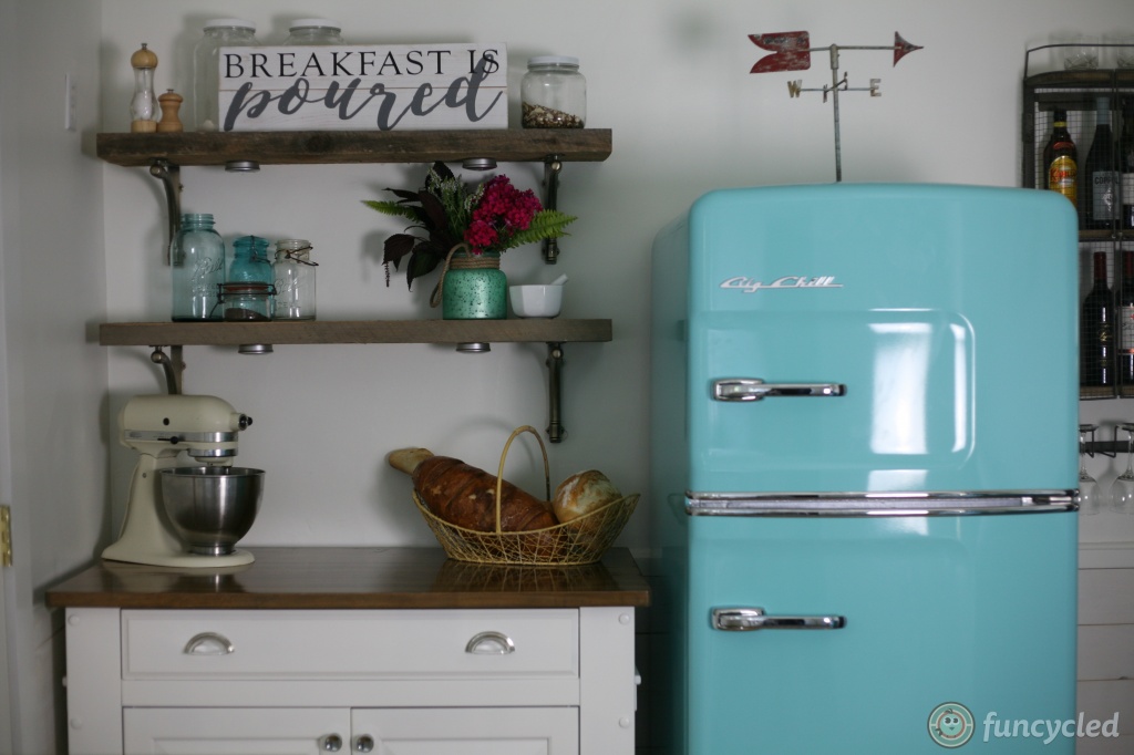
 Let’s start with the fridge wall, shall we? I didn’t like the placement of the fridge or that the island was all wood. You’ll see in the next few pictures that there is very little kitchen cabinet space so I wanted to make the island look like the rest of the cabinets and add exposed shelving above it. I sent Ann three different design ideas for the kitchen but my favorite design was one that included all retro style appliances from Big Chill. With such a small room, a retro design could incorporate fun appliances. I was elated to find out that she wanted to go with the retro appliances plan!!!
 We also added white shiplap to the bottom half of the wall to add even more texture to the space.
 I wanted to make the fridge the focal point of the room so I moved it to the middle, then put the island on the left and built exposed shelving to go above it. We also added LED lights under each shelf to brighten up that corner.
  Let’s move on to the wall with the stove. The stove needed to be replaced, but I felt like this space also needed more storage. Here it is before:
 Storage was tricky because behind the butcher block was a heater that couldn’t be covered. We decided to build a cabinet that looked like a counter but with metal on the bottom to let the heat out but still give her work space and built a custom cabinet to also provide more storage.
 Scroll back up and take a look at the door to the left of the stove. The rest of Ann’s house has beautiful mahogany doors and I wanted these to match so we stripped off all the paint, sanded them down and stained them to match. I love the timeless look that gives this kitchen. Refinishing the doors was probably Johns least favorite part of this renovation. Now check out the difference!


Let’s take a look at the ceiling now… not so pretty wood that was an orange/brown.
 With a light that needed to go for sure!
Here it is now… sooooooo pretty, right?
 Moving on to the sink section. The dark color of the cabinets made this space feel small.
  The doors and drawers were really basic so John added decorative trim to make it seem more modern and high end. Here’s a close up on those:
 John also build the counter top from scratch using solid maple. That was probably the hardest part of the remodel. Not the install, but the build itself. It was definitely worth it though!
We went with a GE retro dishwasher because we wanted white. The hardware is all from Restoration Hardware. What would a kitchen makeover be without a farmhouse sink anyway??


 The rug added another deign element that made the kitchen fun and fresh. The tile is from Lowes and we went with a dark gray grout. Since the windows look out to her back yard, I wanted to skip on curtains and leave it open and sunshiney.
Ann already had this antique coffee grinder and I definitely wanted to incorporate it into the kitchen design. Isn’t it awesome?!?
 The cabinets, trim, and ceiling are painted with Benjamin Moore’s Simply White in Semi Gloss. The walls are painted with Benjamin Moore’s Simply White in Satin. When Ann walked into the house for the first time after the remodel and sent me a text saying, “I can’t stop smiling”… and that says it all friends.
Here are some other pretty pictures that we thought you might like!


We can help design or remodel your home! If you’d like help with either, use our Contact Us form! We would love to create one of a kind deigns for you!
We also have lots of one of a kind furniture for sale right now if you’re in need of that. Here are a few of those pieces:
There is a box at the top right of this page to enter your email address to receive notifications by email when I post something new on this blog. Please sign up today!
Happy FunCycling Friends,
Sarah ;)
If you like what you see, please like FunCycled’s Facebook page to keep up to date on the newest finds, vote on colors and give your input on our creativity. Last but not least, let us customize a furniture piece for you. We create custom furniture and will deliver for customers in upstate NY and also ship throughout the US. Send us a note with what you would like using our contact page. Or buy something that we’ve already designed from our furniture for sale page.

