
Each year, the announcement of the Paint Colors of the Year gives us an exciting glimpse into the moods, aesthetics, and design directions shaping our homes. While last year was defined by quiet sophistication and heavy, grounded neutrals, 2027 is ushering in a sense of fresh optimism, tactile warmth, and cozy nostalgia.
From bright botanical greens and chalky plaster pinks to warm gray-blues and earthy terracotta, this year’s palettes encourage us to create spaces that feel both invigorating and deeply comforting. Whether you’re planning a full house remodel, refreshing your cabinetry, or simply hunting for trending paint inspiration, these standout shades set an incredible stage for the year ahead.
Sherwin-Williams 2027 Color of the Year: Celery
Sherwin-Williams’ Celery brings a crisp, refreshing energy into the home. Unlike the muted sages of recent years, this light, yellow-toned green feels like a splash of morning sunlight. It’s playful yet soothing, striking the perfect balance between bringing the outdoors in and keeping spaces feeling bright and open.

What Colors to Pair
- Creamy Whites & Warm Linen
- Bold Teal & Deep Blues
- Natural Rattan & Light Woods
Recommendation: Add coordinating throw pillows to bring a cohesive design to a living room.

Glidden 2027 Color of the Year: Artifact
Glidden’s Artifact is a warm, smoky blue that carries the easy, comfortable feel of a broken-in pair of denim jeans. Sitting right between a soft navy and a muted teal, Artifact gives rooms a tranquil, reset quality without feeling cold or overly formal.

Design Tip from Sarah Trop:
Artifact is a perfect choice for a color-drenched room, like an office or even a breakfast nook. The smokey depth of this color will truly anchor a space while offering a strong backdrop to support a variety of design styles.
What Colors to Pair
- Soft Blush & Warm Wood Tones
- Crisp Off-Whites
- Charcoal & Muted Greens
Graham & Brown 2027 Color of the Year: Rose Earth
Graham & Brown’s Rose Earth is a chalky pink with soft clay and warm mineral undertones. Far from a sweet “bubblegum” pink, this muted terracotta shade feels deeply grounded and plaster-like, offering an elegant, warm base that brings instant sophistication.

What Colors to Pair
- Warm Brass & Gold Hardware
- Soft Beiges
- Deep Charcoal or Forest Green
Behr 2027 Color of the Year: Grounded
Marking the brand’s 10th Color of the Year, Behr’s Grounded is a rich, mossy olive green. Designed around our evolving definition of comfort, this brand-new shade leans into organic warmth and earthy depth, making it an ideal choice for creating cozy, enveloping environments.

What Colors to Pair
- Creamy Off-Whites
- Pale Smokey Blues
- Brushed Brass & Warm Woods
Design Tip from Sarah Trop:
Mossy greens like Grounded are perfect for cozying up a study, mudroom, or bedroom! Try painting the walls and trim in the same shade for a seamless, high-end custom look that lets warm wood furniture truly pop.
Recommendation – Use subtle wallpaper on the ceiling or an accent wall.

Valspar 2027 Color of the Year: Cottage Door
Embracing the cozy, lived-in appeal of the cottagecore trend, Valspar’s Cottage Door is a warm, mid-tone gray-blue. Reflective and versatile, this personal hue works effortlessly indoors and on exteriors as well.

What Colors to Pair
- Soft Peaches & Pinks
- Warm Grays
- Natural Stone & Warm Wood Accents
Recommendation – Add pillows with coordinating blues with touches of bold coral to bring a subtle punch of color to a bedroom or reading nook.
I love this cross-over pillow that embraces cottage vibes in a bold way.
FLORAL PILLOW FROM POTTERY BARN

Dutch Boy Paints 2027 Color of the Year: Deep Rooted
Dutch Boy’s Deep Rooted is a rich, earthy terracotta orange inspired by the familiar warmth of nature. Full of optimism and comfort, this grounded hue serves as an inviting foundation for layered textures and artistic, personal design.

What Colors to Pair
- Antique White & Creamy Neutrals
- Felted Blue & Denim Tones
- Timbered Green & Deep Wood Finishes
Recommendation – Give a piece of furniture new life with this hue and then line the drawers with a coordinating peel and stick wallpaper.
Choose from any style like Mid-Century to Heirloom.
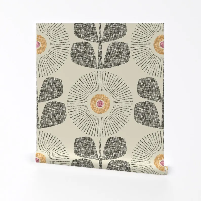
OR THIS HEIRLOOM PATTERN BY WILLIAM MORRIS

Need a Little Help?
Love one of these patterns but not sure how to pull it all together? We would love to help! Start with booking a 1 Hour Design Consultation to get started today. To lean more, visit our Interior Design Services Page.
Final Thoughts
Thank you all for following along! If you’d like to get this blog in your email once a week, please sign up for our weekly newsletter by adding your email in the little box below my picture at the top of this page.
If you’ve enjoyed this post, please like FunCycled on Facebook, Instagram and Pinterest if you don’t already. Keep up to date on the newest finds, vote on colors and give your input on our creativity. We share fun tutorials, great before and after, and new design inspirations.
We offer interior design, kitchen cabinet painting, and custom built tables, barn doors, and repurposed furniture. Thank you, again, for working with us and for taking the time to spread the word about what we do. This post may contain affiliate links. I may earn a small commission at no extra cost to you. As always, I only recommend products I genuinely love and trust.
Happy FunCycling Friends,
Sarah ; )
Because home is where peace begins.