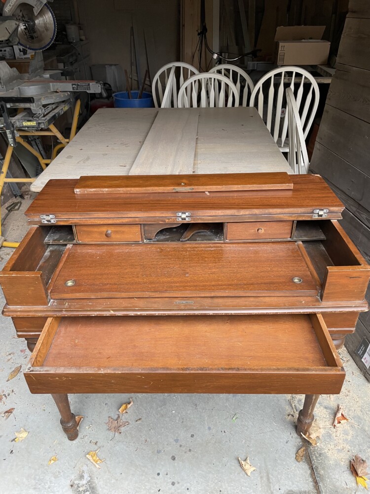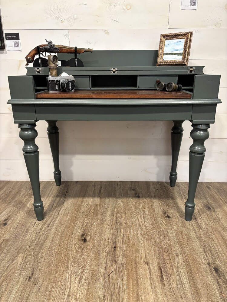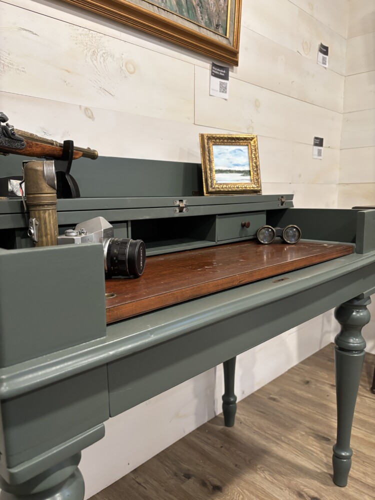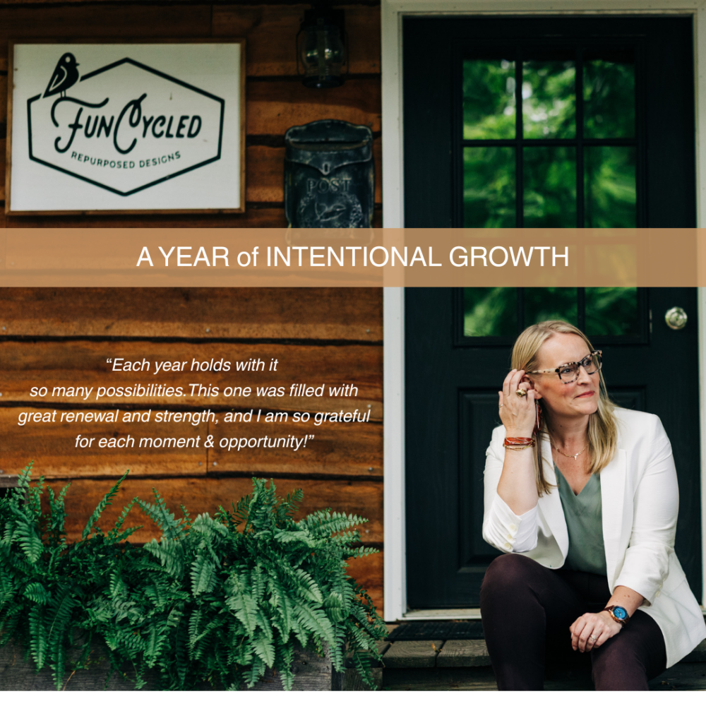
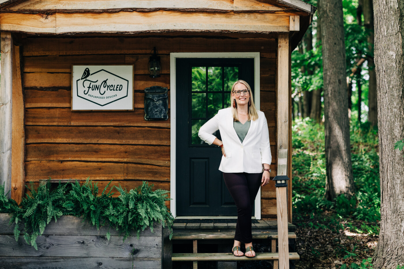
Every year offers its own kind of transformation, but this past one invited me into a deeper, more intentional season of growth: creatively, professionally, and personally. As a creative entrepreneur, it’s easy to get caught up in output and momentum, but this year challenged me to really evaluate what’s in front of me, pay attention to the things that matter, and step out and trust in ways I didn’t expect.
From stepping into new professional communities to rediscovering parts of myself I had laid aside, this has been a year of rebuilding from the inside out. I found myself creating more boldly, caring for my health more consistently, and saying yes to opportunities that stretched my confidence and broadened my world.
This reflection isn’t just a recap of milestones; it’s a look at what those experiences taught me about creativity, resilience, and the kind of life and business I want to build going forward.
Professional Growth That Reshaped My Business
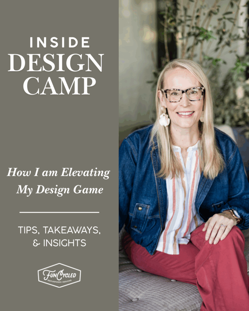
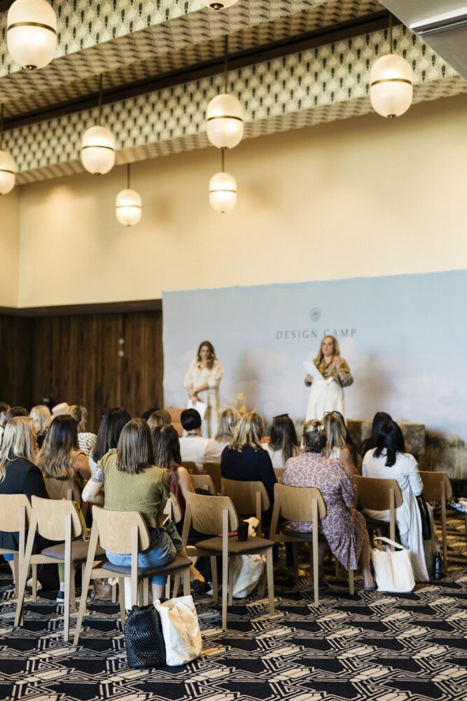
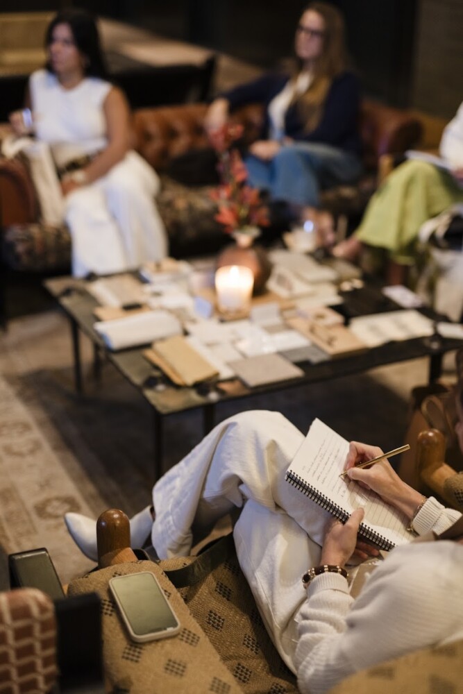
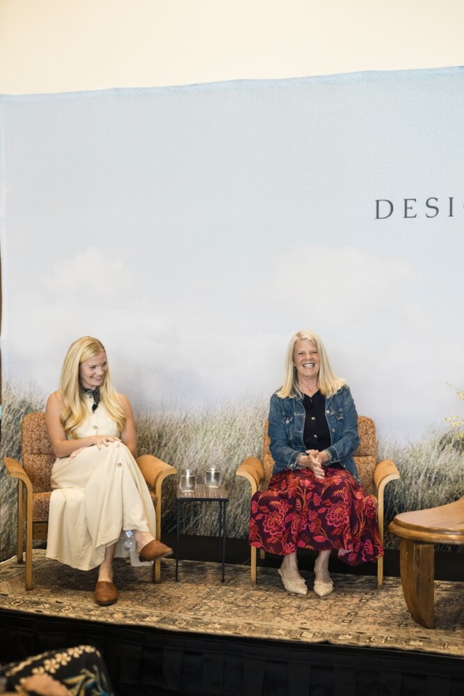
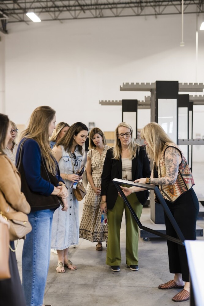
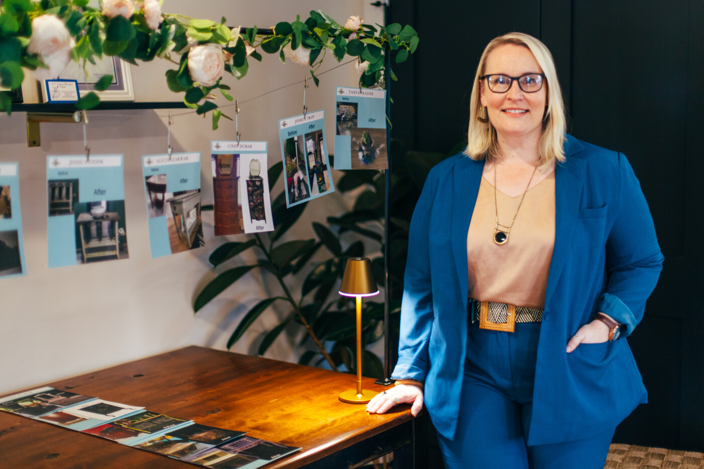
This was the first year I truly stepped into the wider design world. Not just as a participant, but as someone eager to learn, connect, and grow. Attending professional design conferences for the first time opened my eyes to new perspectives and pushed me to elevate my work in ways I didn’t anticipate. There’s something powerful about being in a room with people who understand the creative process, the challenges, the long nights, and the deep joy of making something beautiful. They have proven to be invaluable. In particular, I gleaned SO MUCH from the Design Camp conference earlier this year.

If you work in the creative world or even if you just own a small business, I encourage you to read the full blog post. I think it serves as a place to really help entrepreneurs and small business owners to consider professional development designated for your niche!
Professional Memberships
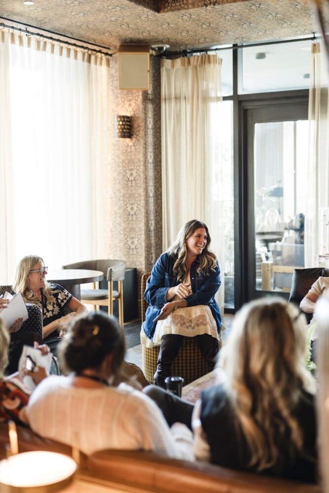
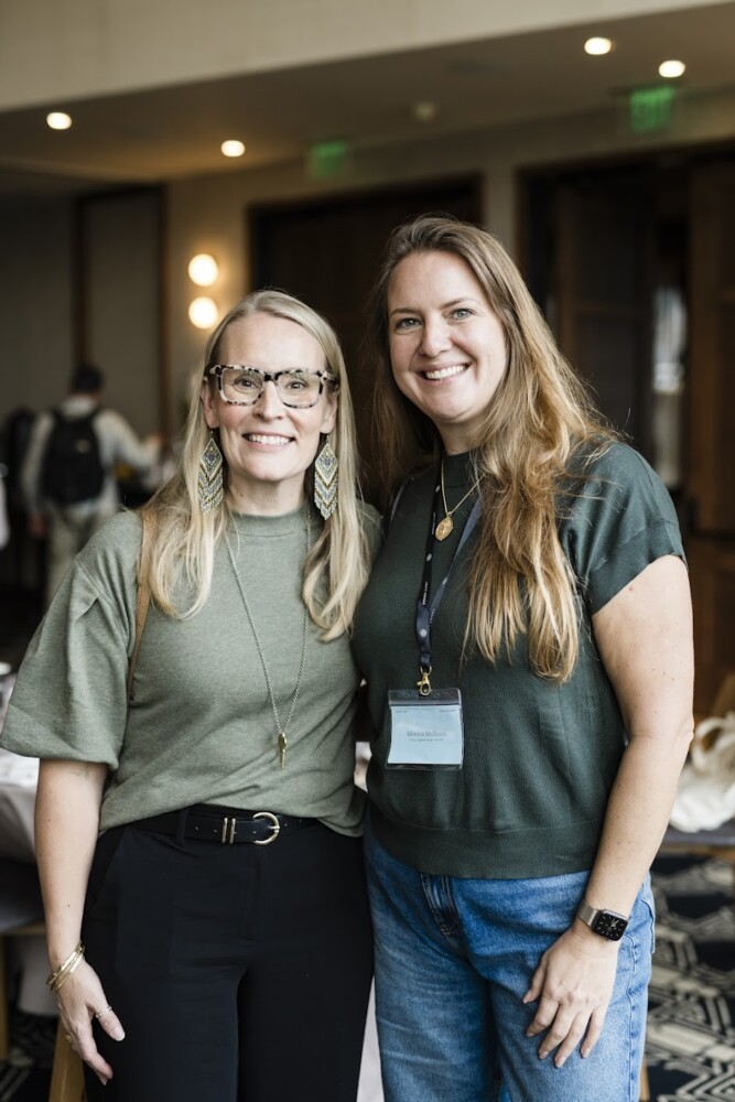
Joining the Capital Region Chamber and EO (Entrepreneur Organization) Albany added another layer to that growth. Suddenly I was surrounded by leaders and business owners who challenged me to think bigger, refine my operations, and see my work through a clearer strategic lens. These communities brought accountability, encouragement, collaboration.
Business growth is never meant to happen in isolation.
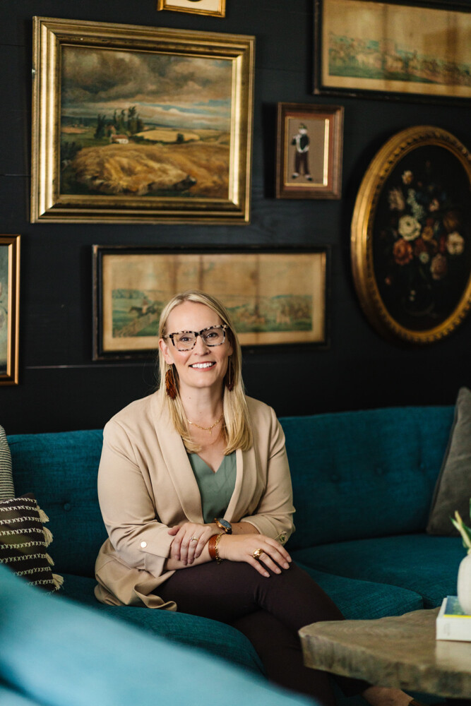
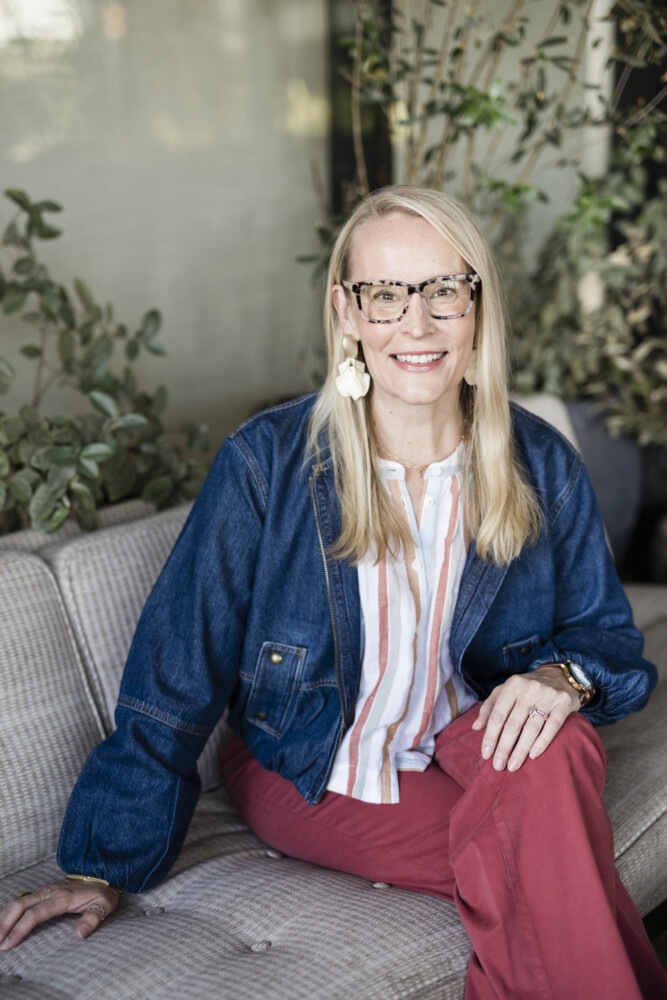
Sarah Trop
More than anything, this professional expansion helped me step more fully into my identity as both a creative and a CEO. And that shift has already begun to shape the future of my business in meaningful, sustainable ways.
Stepping Back Into My Creativity
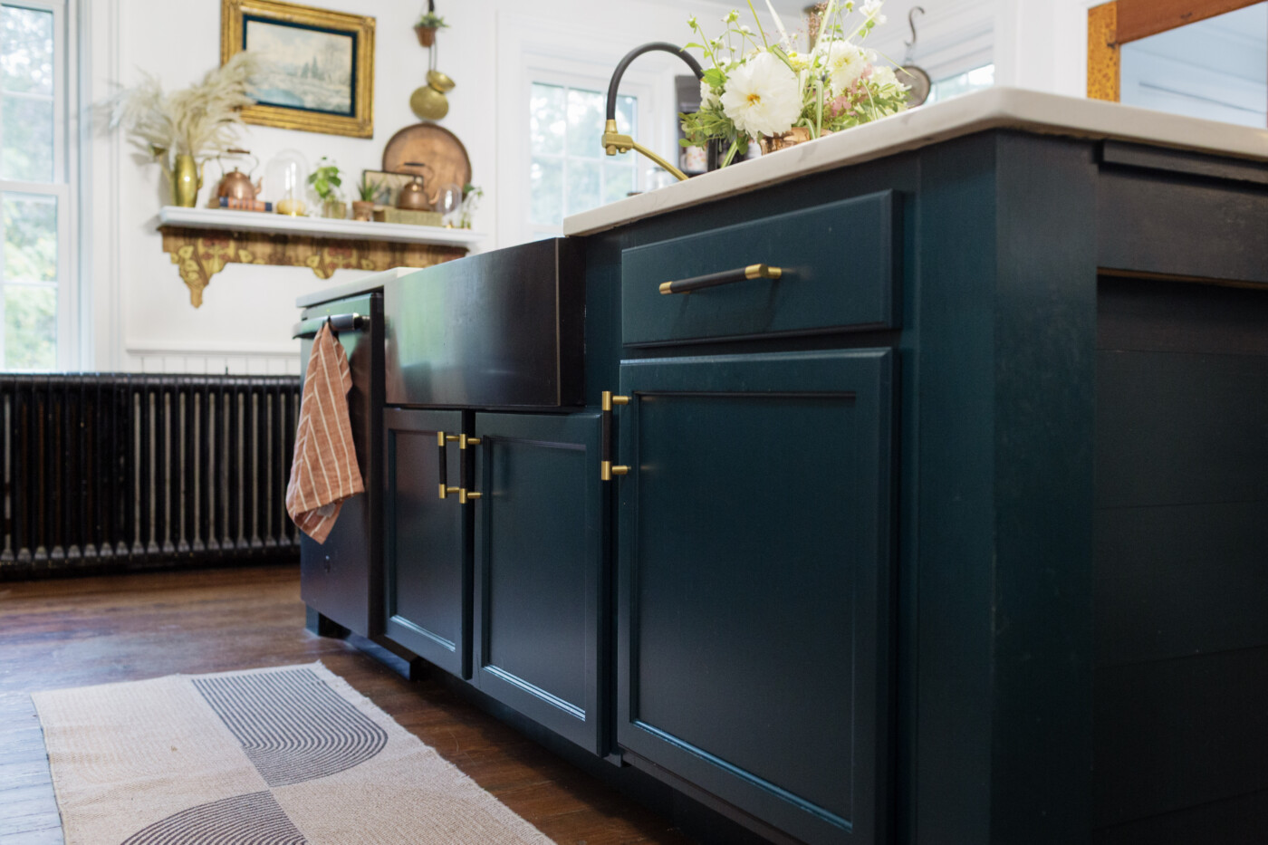
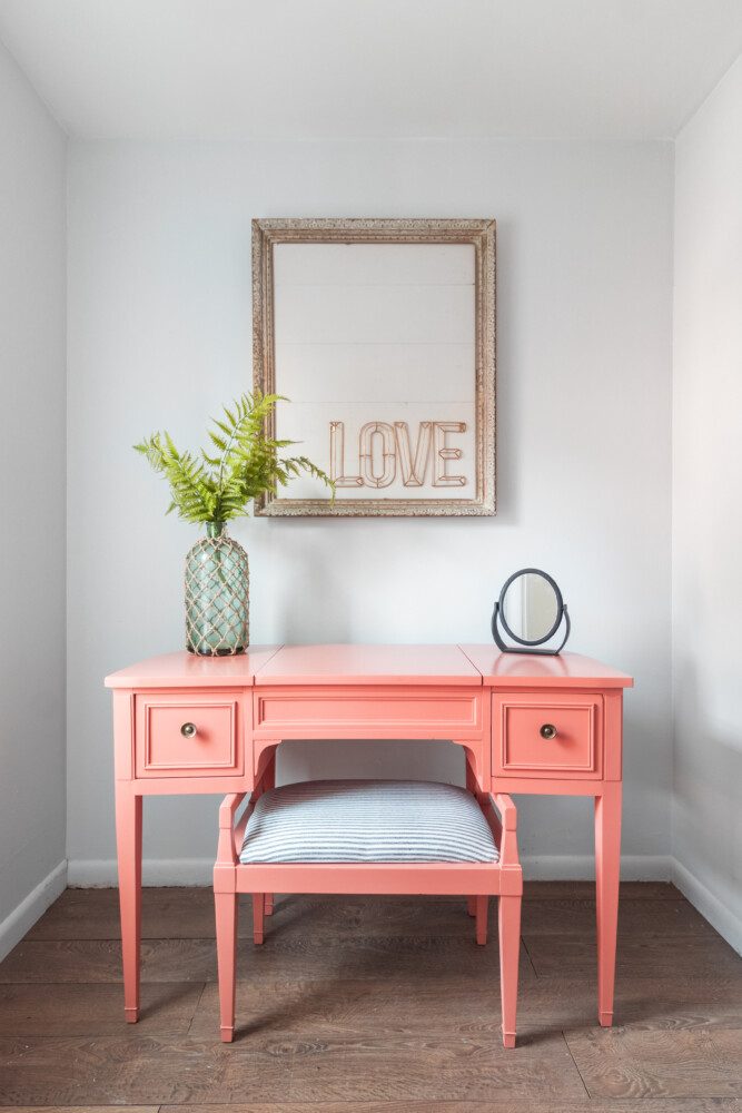
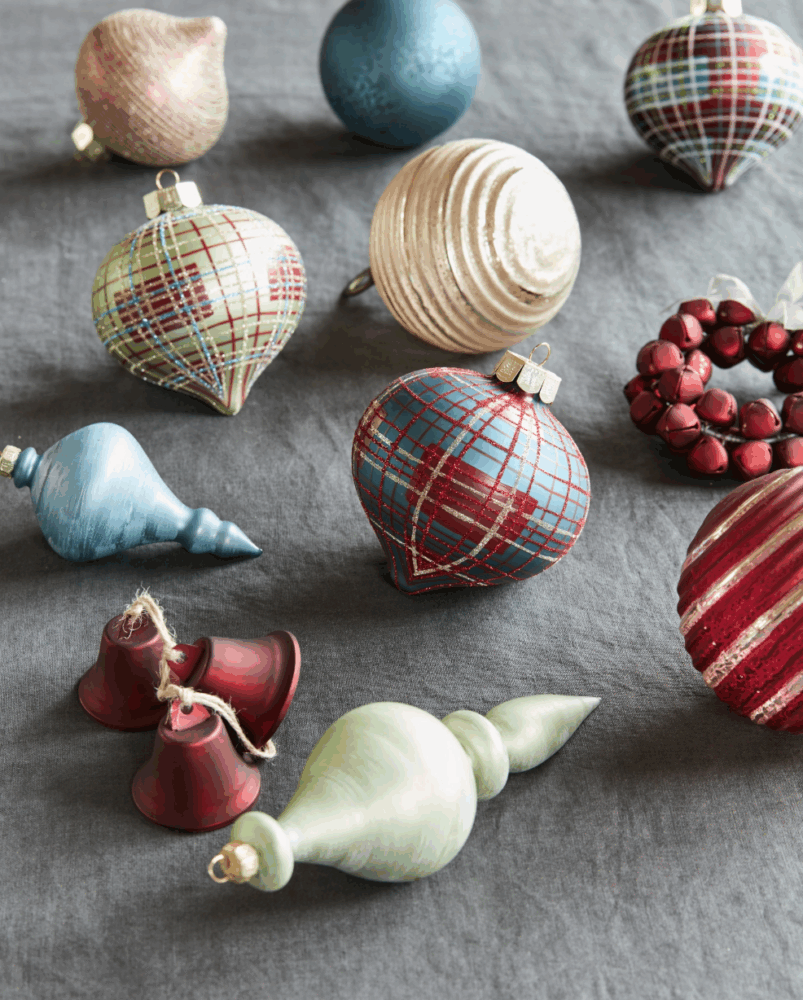
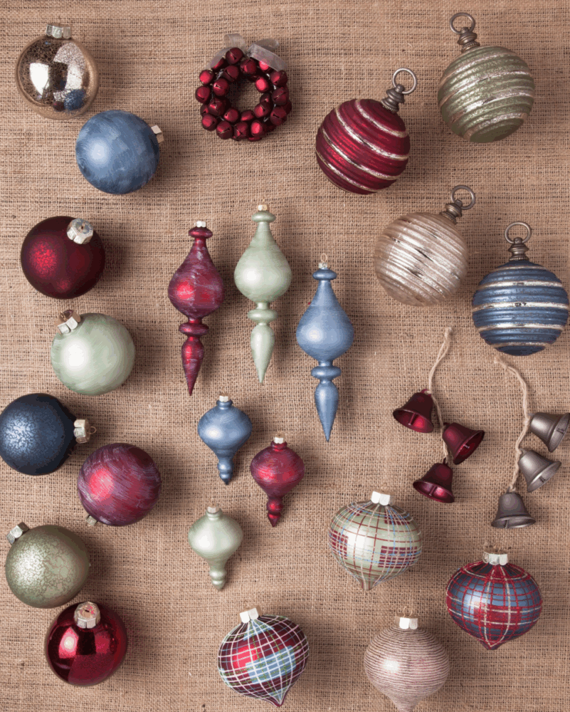
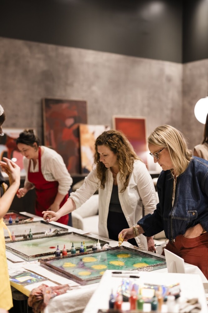
Another defining part of this year was returning to the kind of creativity that feels like home. I picked up a paintbrush again after letting that part of myself sit quietly for far too long. It was so restorative to have a renewed sense of creativity in this area of my life. Painting reminded me that creativity isn’t just a skill; it’s a way of breathing, thinking, processing, and being.
From that renewed creative energy came something I never expected: the launch of my first collection of original paintings. I created pieces that reflected not just what I saw, but how I have been growing – the colors, movement, texture, and emotion. Putting that collection out into the world was equal parts vulnerable and exhilarating, and it taught me that creativity flourishes when we make space for it, not when we force it into the leftover corners of our schedules.
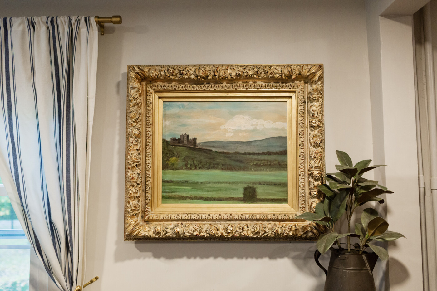
Of all my paintings, this one is absolutely at the top of my list. It was inspired from our trip to Ireland.
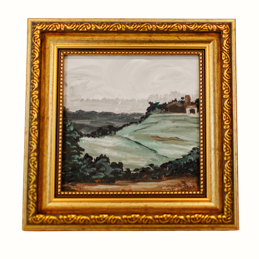
I am also happy to share that my collection of small 5 x 5 paintings available and ready to ship anywhere in the US! Here is one of my favorites here:
To view more of the whole art gallery and see what is still available, you can click the link below:
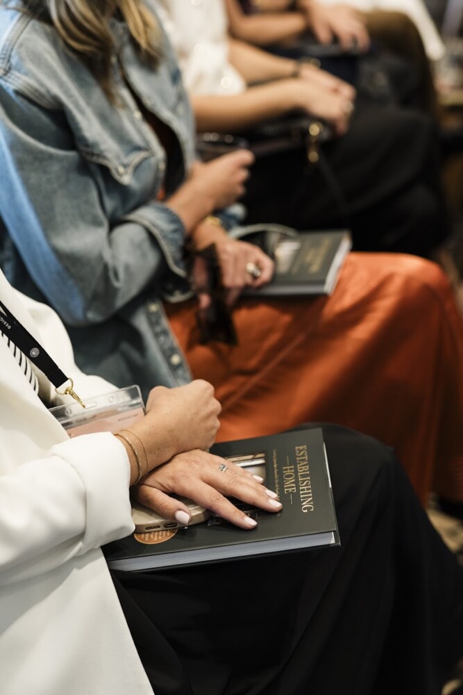
Beyond excited doesn’t even begin to describe the feeling I had when one of my favorite designers, Jean Stoffer from the TV show The Established Home, asked me if she could carry a line of my original art in her store in Grand Rapids Michigan. If you’re out that way, stop by Stoffer Home and check it out.
Here’s a simple but profound truth I learned this year.
When I nurture my creativity, every part of my business benefits.
Sarah trop
Personal Transformation That Fueled My Work
Perhaps the most profound part of this year happened beneath the surface. I made a commitment to my health that led to losing over 100 pounds. This experience has reshaped not only my body but has encouraged me to reevaluate my whole life and how I am approaching everything. My confidence, energy, and how I am showing up in both work and relationships have all served to benefit from such a profound change and commitment. For me, it wasn’t solely about a number, it was about reclaiming the kind of life I wanted to live.
Meaningful Experiences
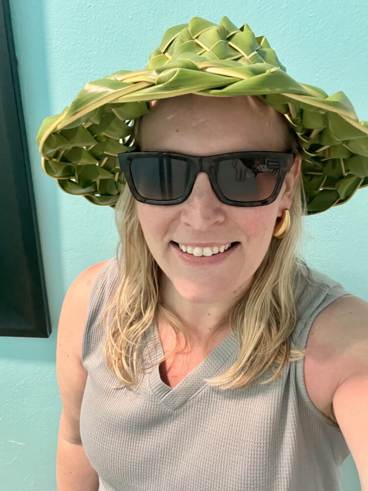
Travel is always a part of my cadence and rhythm. This year, maybe more than ever, I saw how distinctly this part of my life shapes and impacts me and the work I do. Getting out of my everyday environment gave me space to breathe, dream, and notice what truly inspires me. Each trip shifted my perspective in small but meaningful ways, reminding me that creativity often grows best when we step away from the familiar.
Here are a few of my favorite photos that help capture the essence of traveling.
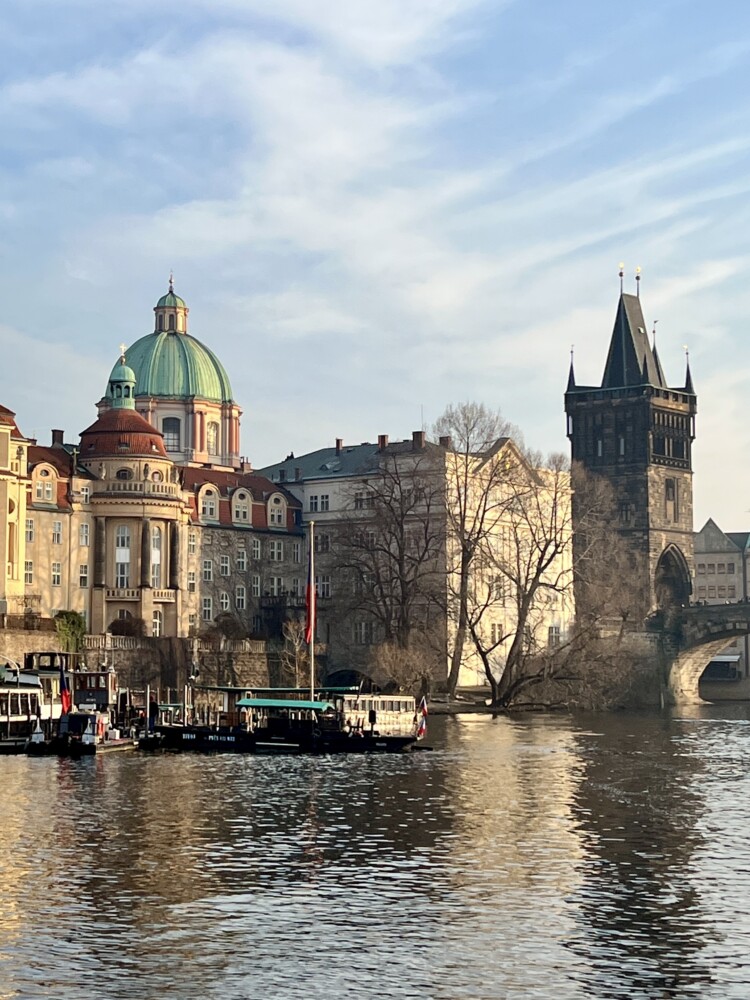
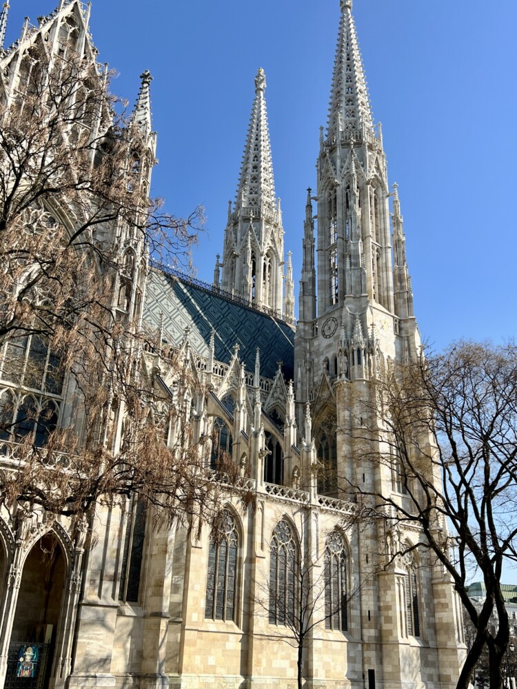
Here’s a list of the places I have traveled to over the last year. Each place is linked to a full blog post. Within, I share travel tips and offer advice on how to travel on a budget and where to spend your time!
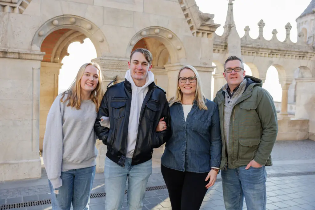
Budapest: Tips for a Real Hidden Gem of a Trip
Traveling to Vienna: Top Picks and Travel Tips for Families
One Day in Prague: Best Places to Visit in 24 Hours
Puerto Rico Family Vacation: Relaxation & Rainforest Adventures in Rio Grande
You can also read about all of my travels on my travel blog page, linked up below.
Giving Words to My Creativity
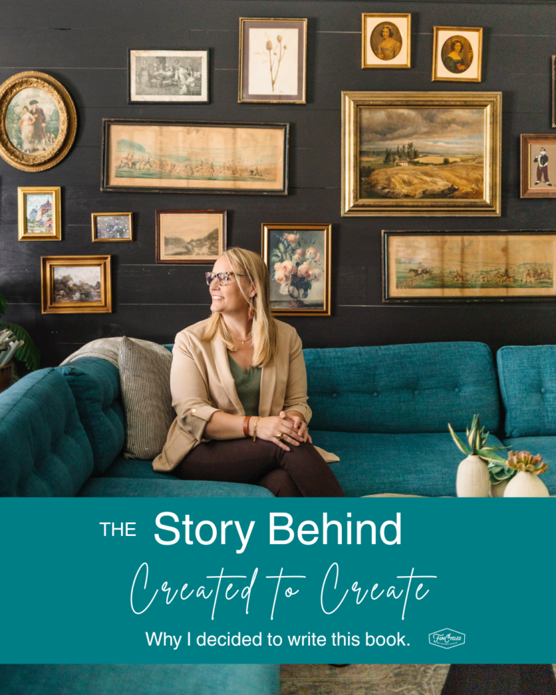
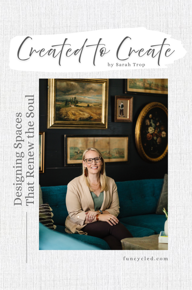
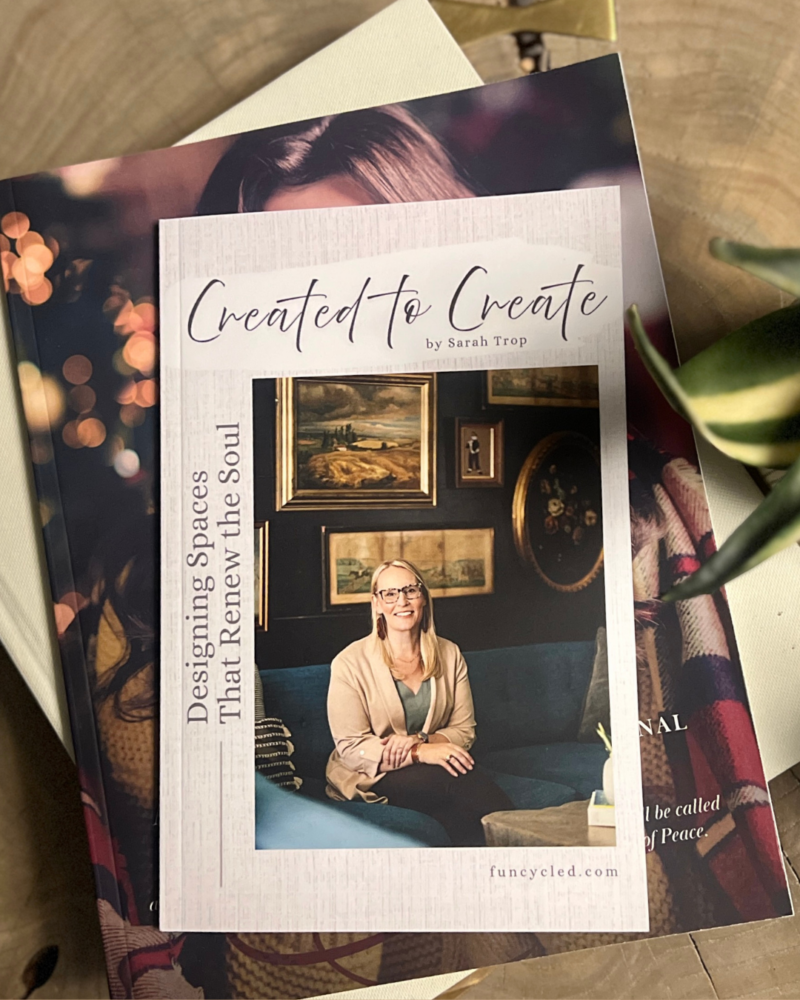
For so long, I have held glimpses of what it would be to give voice to the heartbeat behind my business and why I am so passionate about being an interior designer. So this year, I decided to put pen to paper and began (and launched) my first book. Writing Created to Create stretched me in ways I hadn’t anticipated and grounded me in others. Exposing the passion of why I do what I do required me to disciplined and honest. Writing any book holds with it a sense of vulnerability, and I needed to surrender any fear or hesitation I held onto. I am so grateful that I completed the book and have released it to the world, giving voice to this sacred work and glory to the One who is the Designer of all!
My First book
Walk with me in this faith-filled journey as I explore the relationship between design, neuroscience, and soul restoration.
Available in digital or full color print.
Thanks for Following Along
I hope you have been inspired to take a bit of time to reflect on your year. Consider what has worked well and what may need to change with the new year in front of us. And remember, be gracious with yourself as you ponder!
If you’d like to get this blog in your email once a week, please sign up for our weekly newsletter by adding your email in the little box below my picture at the top of this page. If you’ve enjoyed this post, please like FunCycled on Facebook, Instagram and Pinterest if you don’t already. Keep up to date on the newest finds, vote on colors and give your input on our creativity. We share fun tutorials, great before and after, and new design inspirations.
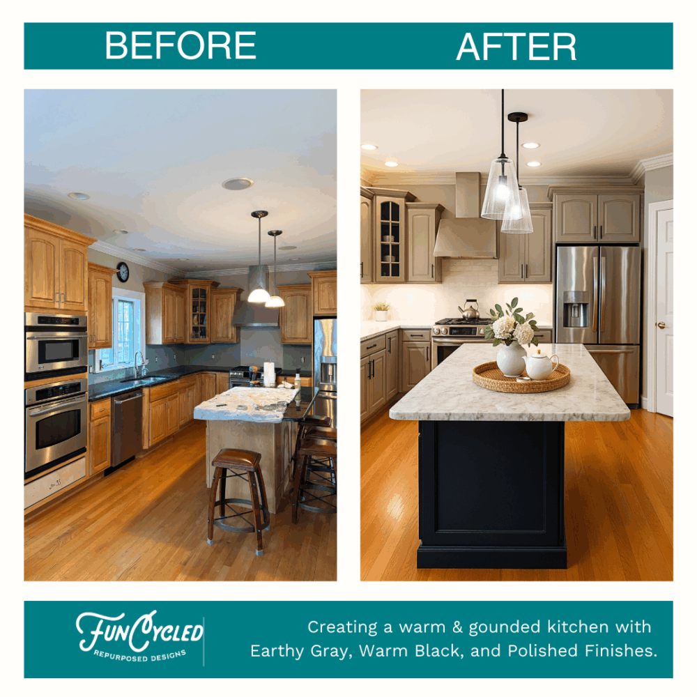
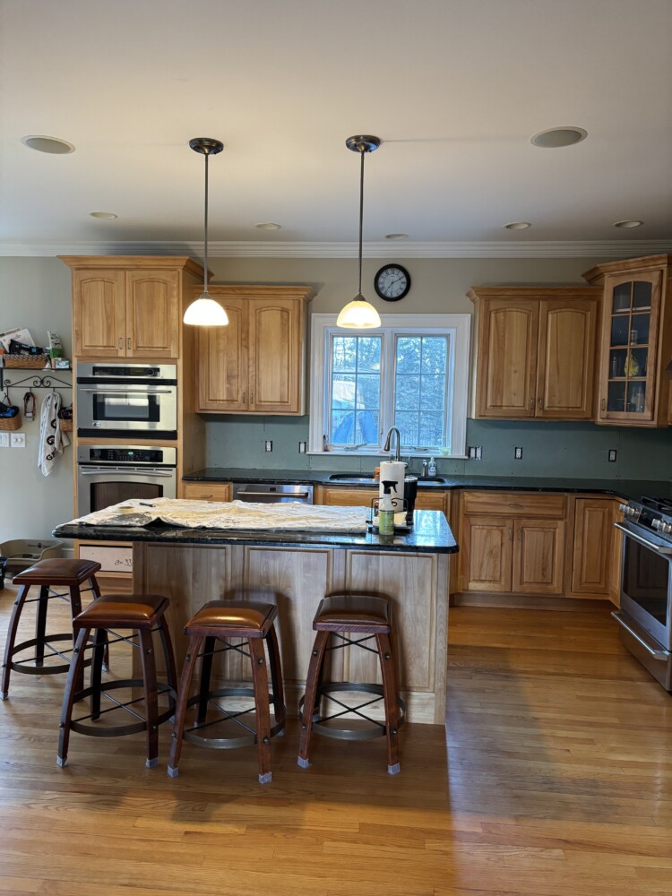
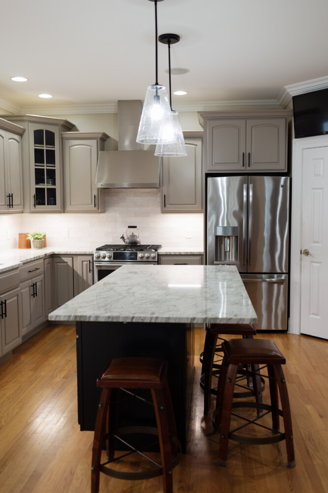
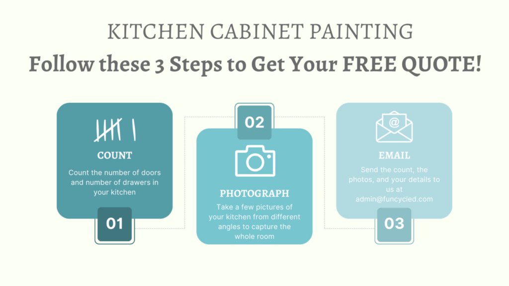
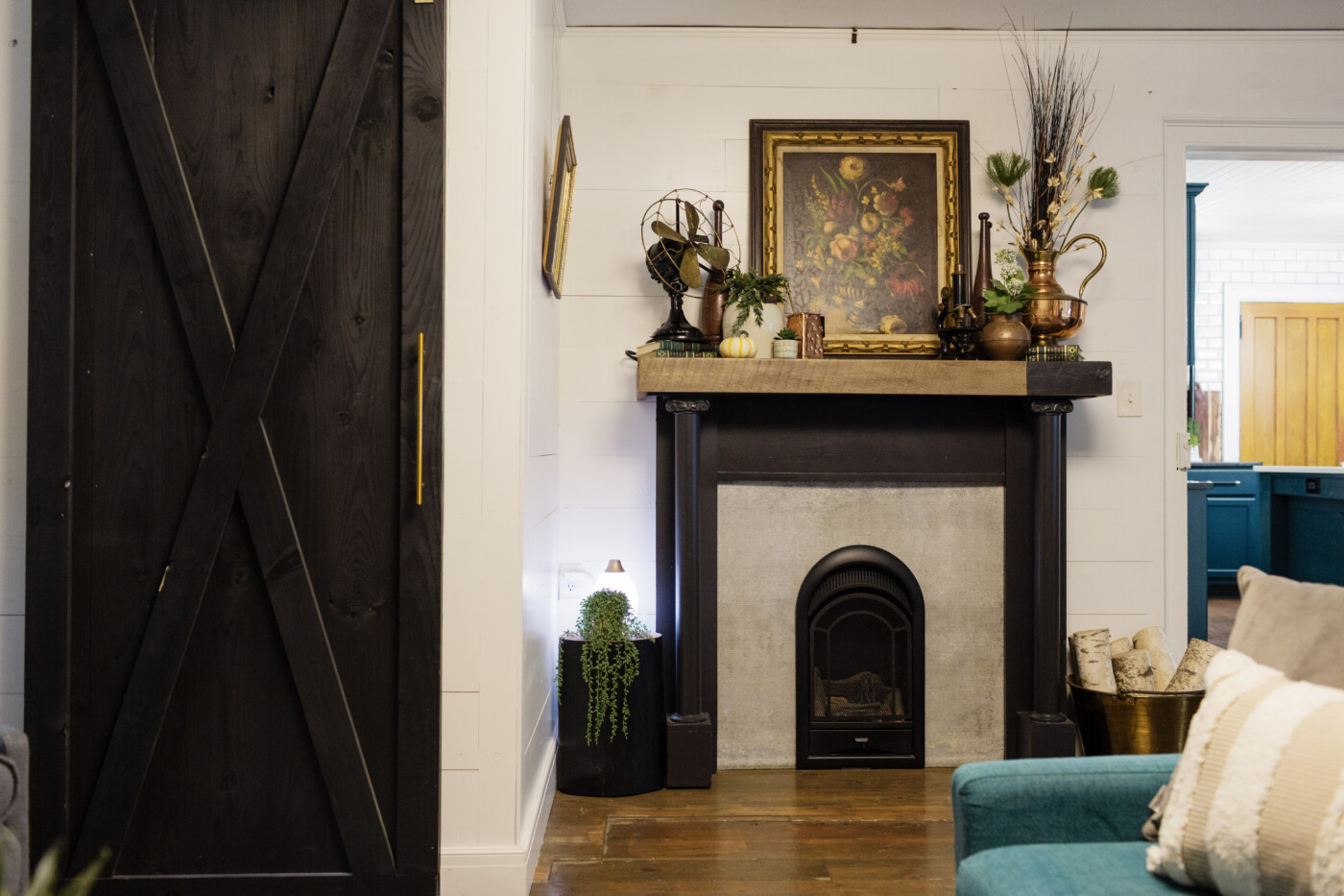
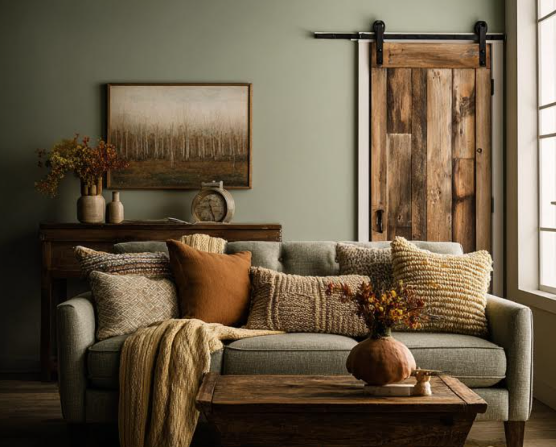
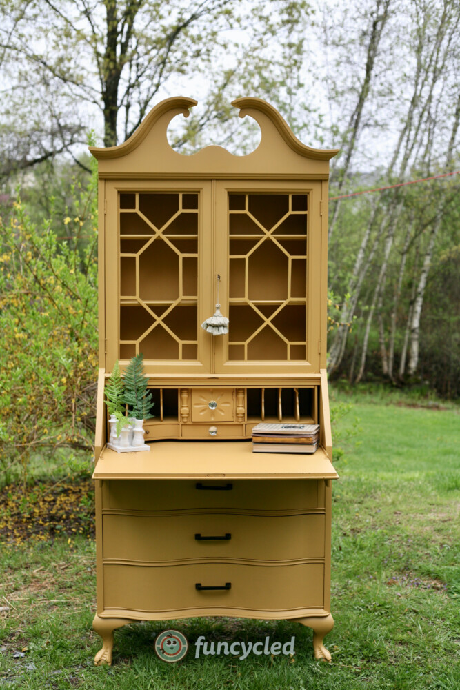
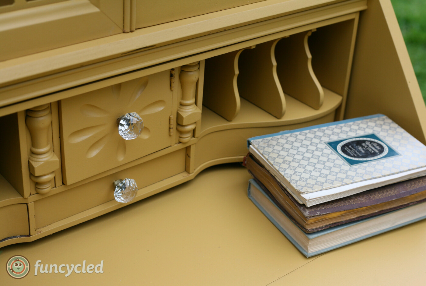
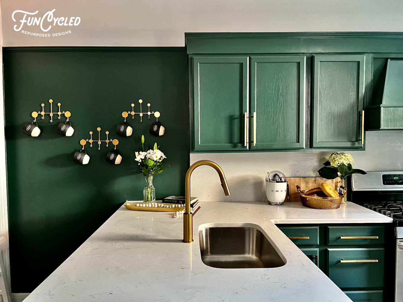
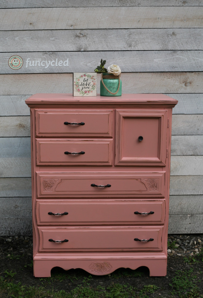
We offer interior design, kitchen cabinet painting, and custom built tables, barn doors, and repurposed furniture. Thank you, again, for working with us and for taking the time to spread the word about what we do.
Happy FunCycling Friends,
Sarah ; )
Note some of the the links provided are affiliate links, and I may earn from any qualifying purchases.